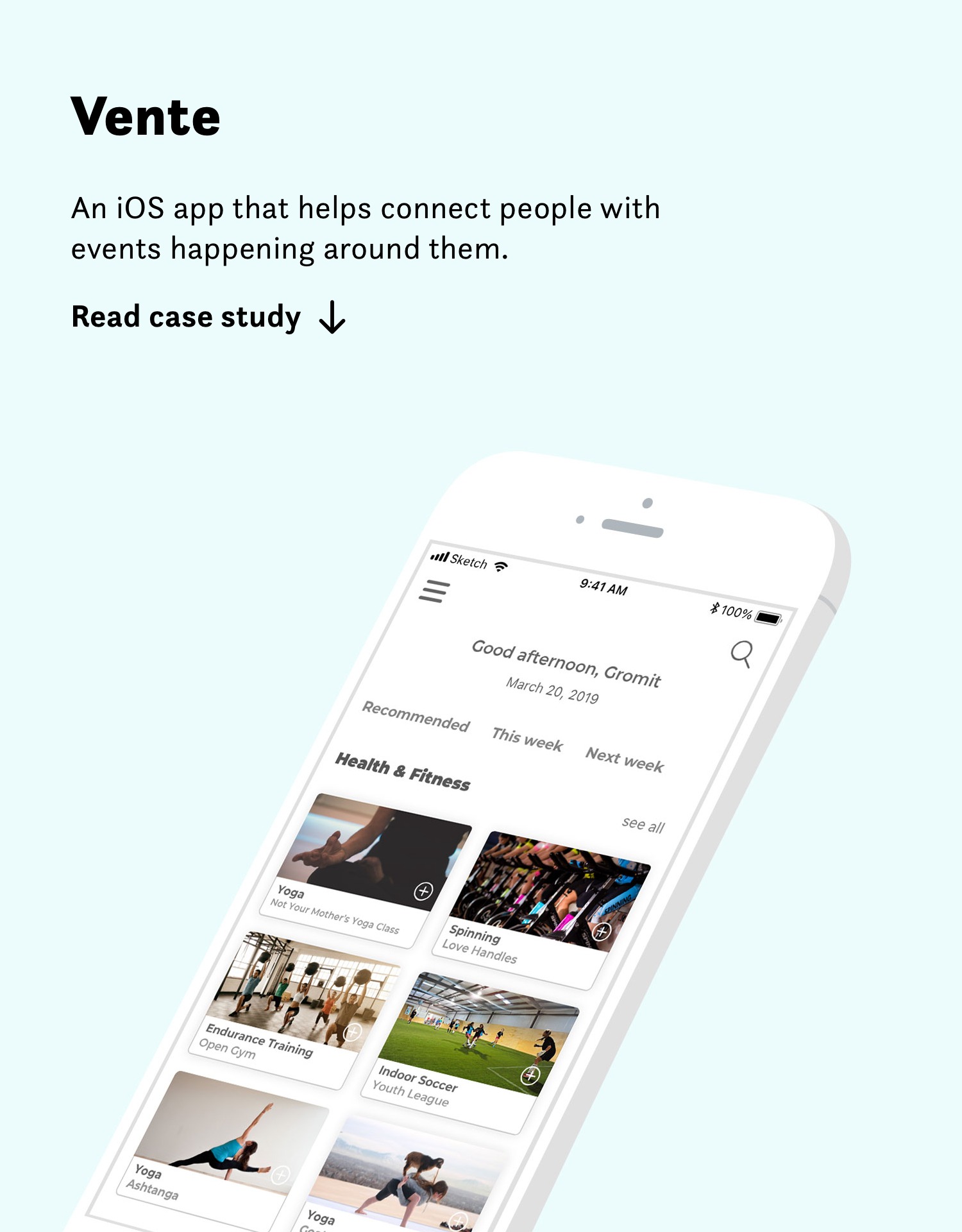
Vente
Finding what's good around you.
Project: Vente
Role: UI/UX designer
Tools: Sketch, Illustrator, InVision
Duration: 5 week-long sprints
What I did
Competitive analysis
Branding
Mood boards
Style tiles
Wireframe redesign
Logo
Web design
High-fidelity mockups
High-fidelity prototype
Responsive marketing site
UI kit
Style guide
Future recommendations
OVERVIEW
Vente is an iOS app that helps people find nearby activities and events based on their preferences. In this five-week project, I was tasked with the creation of the visual design for a mobile-responsive platform that reimagines how people search for and find activities, events, and meetups that reflect their interests. I took user research that had been conducted by an external UX team and produced high-fidelity designs. Our audience was primarily event junkies and city lovers.
THE CHALLENGE
There is an information overload with local scenes’ shareable information. Oversaturated consumers feel overwhelmed by a deluge of local events, meetups, and group activities. There is a dissonance between an overabundance of things going on, yet people still struggling to find activities that they find meaningful.
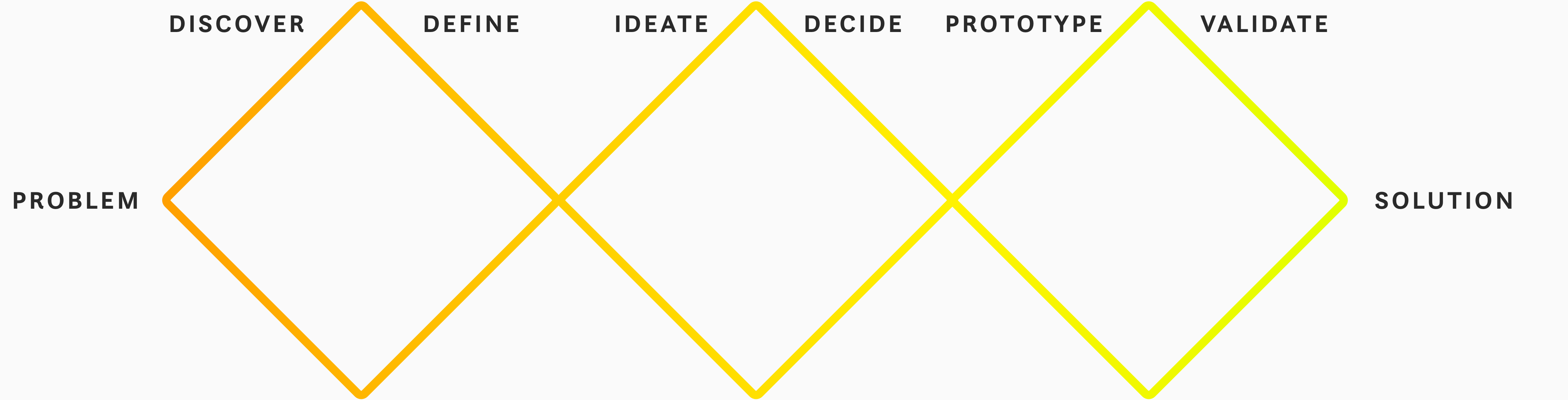
Process
Google Ventures design sprints
Research
In an effort to better understand the product, domain, and its users I analyzed two user personas, which helped me understand who my user was and things to consider when designing for them.

Amy Grant
CITY LOVER
During the day, Amy is a project manager at a small tech startup. When she is not working, she loves to explore the city, attend local events, and maintain a healthy lifestyle.
Motivation: Have fun and stay healthy.
Goal: Stay active and up to date.
Frustration: Lack of time to search for local events.
Nate Young
EVENT JUNKIE
Nate writes for a local magazine. The city scene is his passion. He loves writing about the community, music,
ongoing events, and health.
Motivation: Stay current with the local scene.
Goal: Get a complete scoop on local classes, events, and meetups.
Frustration: Too much happening all locally to keep up with it all.
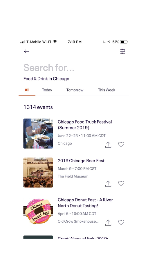
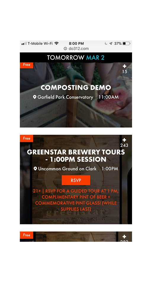
The next step was completing a visual competitive analysis of six other meetup and event companies. It’s crucial to do this at the onset of the design process because without it, we do not have context and therefore we do not have direction. Without direction, we are, at best, only creating for our users which, although helpful in terms of usability, will in the end, greatly reduce the effectiveness of the product as it has no awareness of self, the world, or its direct competitors.
Competitive analysis allows us not only a birds-eye view of the landscape, but in synthesizing results into trends, we can not only see what is currently working but, more importantly, see where things are lacking and we can carve out a niche to separate us from the pack—enter the competitive advantage. Where can we be on the offense? Defense? Current opportunities? Threats? All of these will rise to the surface after competitive analysis.
Eventbrite
Do312
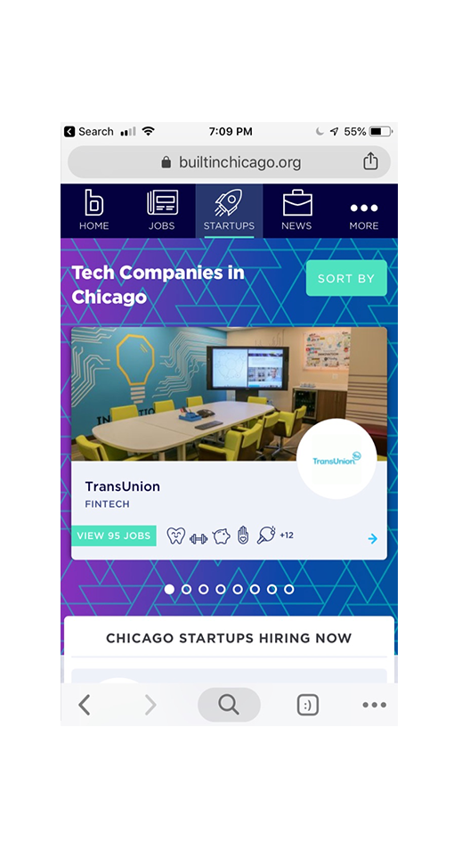
BuiltInChicago
Apps like Meetup and Eventbrite help their users by making searching for events easier with the addition of filters and the ability to compare events. Additionally, by using photography, playful illustrations, and a warm tone with their copy, they help users get excited for their search.
Do312 and Thrillist use fonts with heavier weights and also utilize photos for event listings. The bold aesthetic with eye-catching graphics is visually appealing, while utilizing quirky illustrations also affects the feel.
Built In Chicago and Facebook are more straightforward platforms in the way they display event info. The thoughtfully designed text hierarchy enhances legibility and helps to make the content more readily digestible for the user to quickly scan events.
My key takeaways were: organize content using lists, cards, accordions, filters, and tiles to help users digest a large amount of information; use color to create a sense of fun, energy, and excitement while remaining clean and approachable; thoughtful use of negative space to allow content to breathe and let the user's eye focus on what matters to them most; modern, utilize sans-serif fonts to enhance readability on any device; different weights of grey for visual hierarchy with text; to promote action and complete tasks, Call-to-Action's (CTA's) are bold and bright ; display a minimum amount of content in order to conserve space (expandable once tapped/clicked). My goals for Vente included:
A Dynamic UX
- Adapt to user goals: content for exploration and hyper-efficient paths to complete action
- Explore: a robust list of events versus only the newest events to keep up-to-date?
- Easy discoverability for time-pressed users; intuitive and helpful filtering to reduce signal:noise
- Personalize experience: interest selection during onboarding; machine-learning to offer better suggestions
Scannable
- Focus on creating a strong visual hierarchy; negative space
- Use colors for enhanced readability and/or promote movement through app w/CTAs
- One primary color w/one accent color
Content first
- "Steal like an artist" from social media sites for easy transfer of learning; take what's already working extremely well
- Image and/or video-first; only essential text
Content Audit
There is great intrinsic value in thinking about content as a designer and it can (and should) influence the design’s direction. It is helpful to look at content as part of competitive analysis because both it and the design go hand in hand—when they work well together and are lifting one another up, they only strengthen the experience, but if they’re not meshing, it’s just as possible they’ll butt heads.
Design is not created in a vacuum and a system is only as strong as its weakest link. Content is, especially in this day and age, king. But, more than that, it is the essence of the product and is the true reason why they are using the product.
For example, no matter how cutting edge a certain product's UX or UI might be, if the content is not useful, interesting, or hold some sort of value to the user, they will find no reason to stay and certainly no reason to come back. Design is the envelope by which a user accesses what they’re seeking but, after getting their attention and making it as intuitively accessible as possible, the design, having done its job, must quickly step out of the way to allow the user to engage with the real reason they’re there.
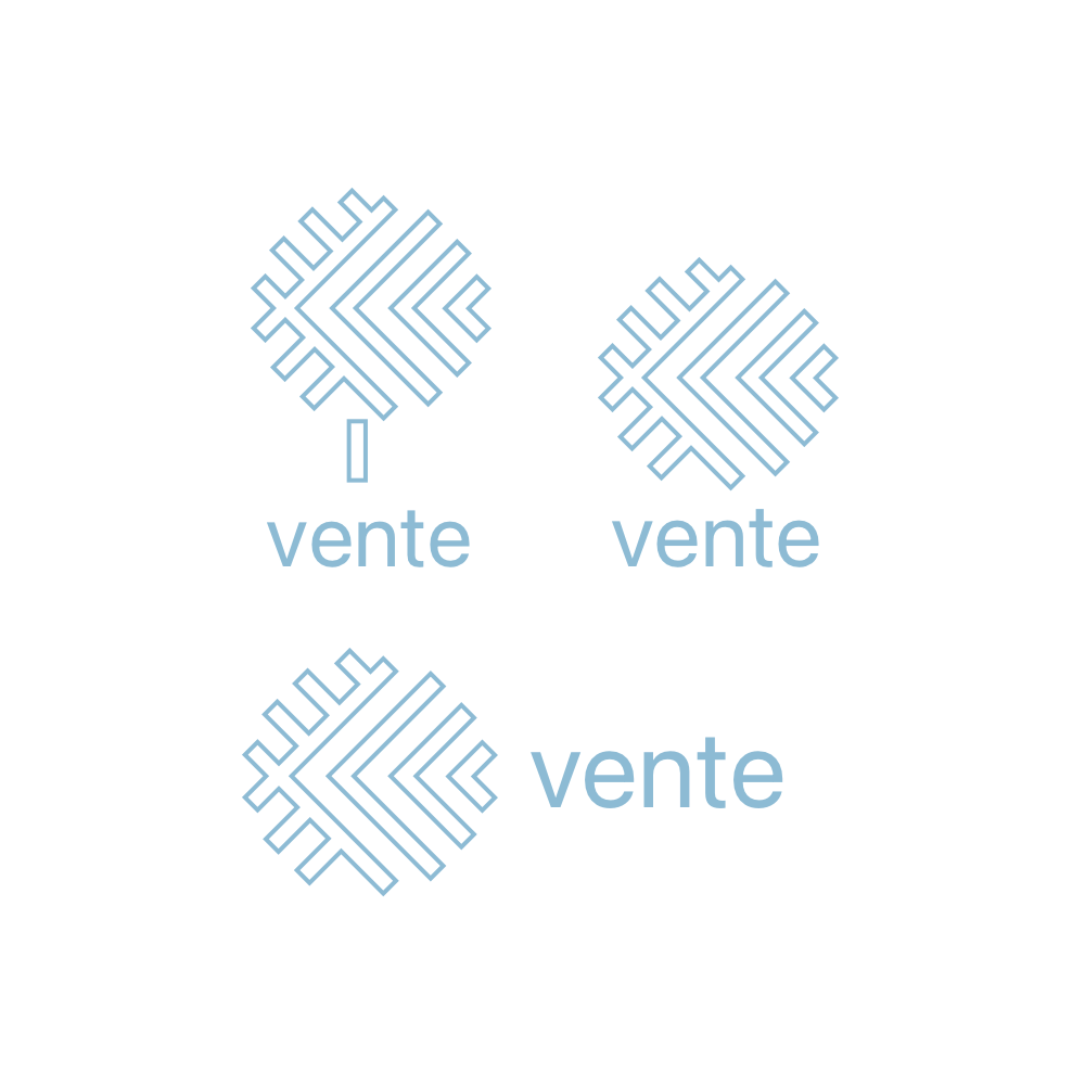
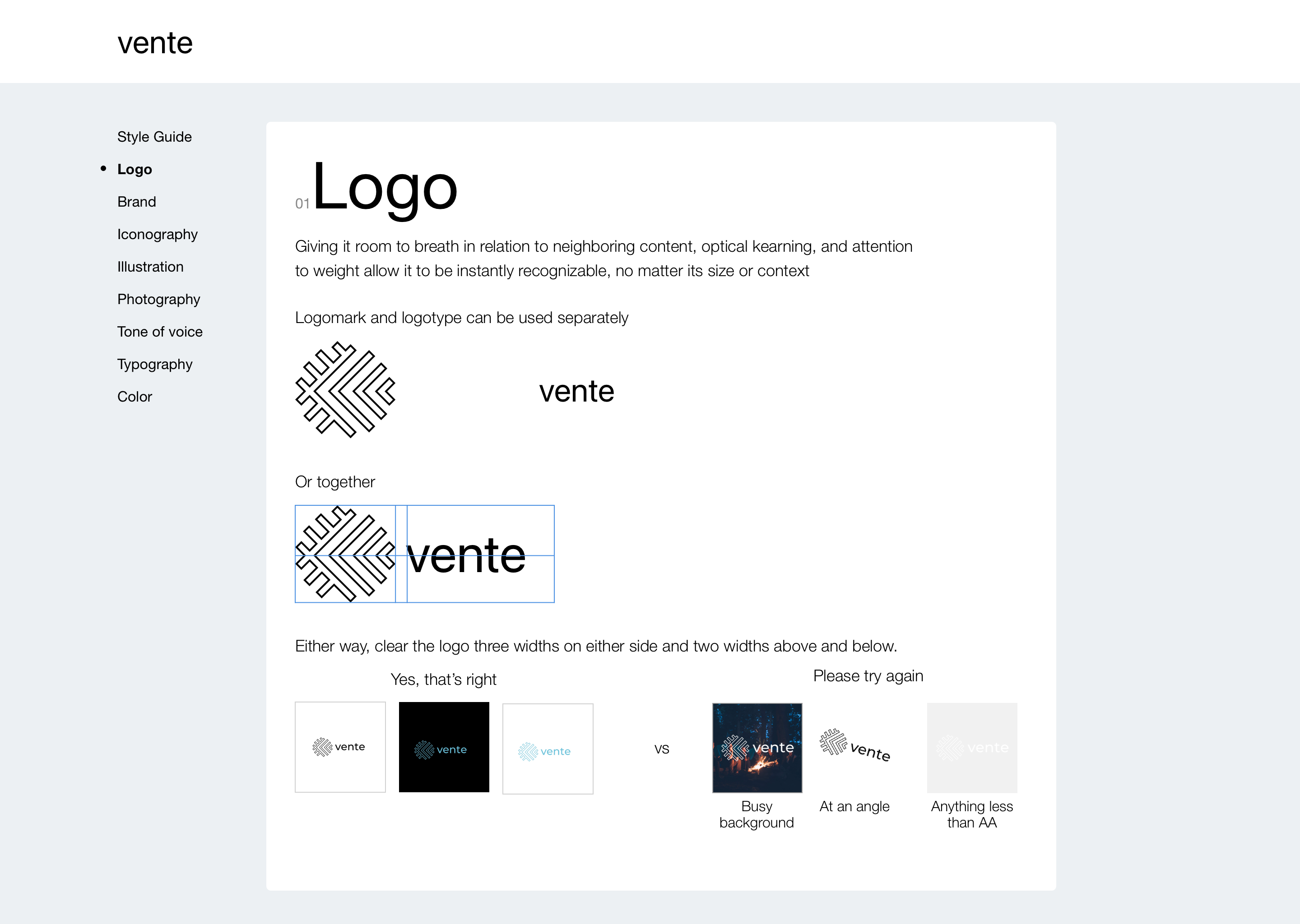
Logo Design
Logo Concepts
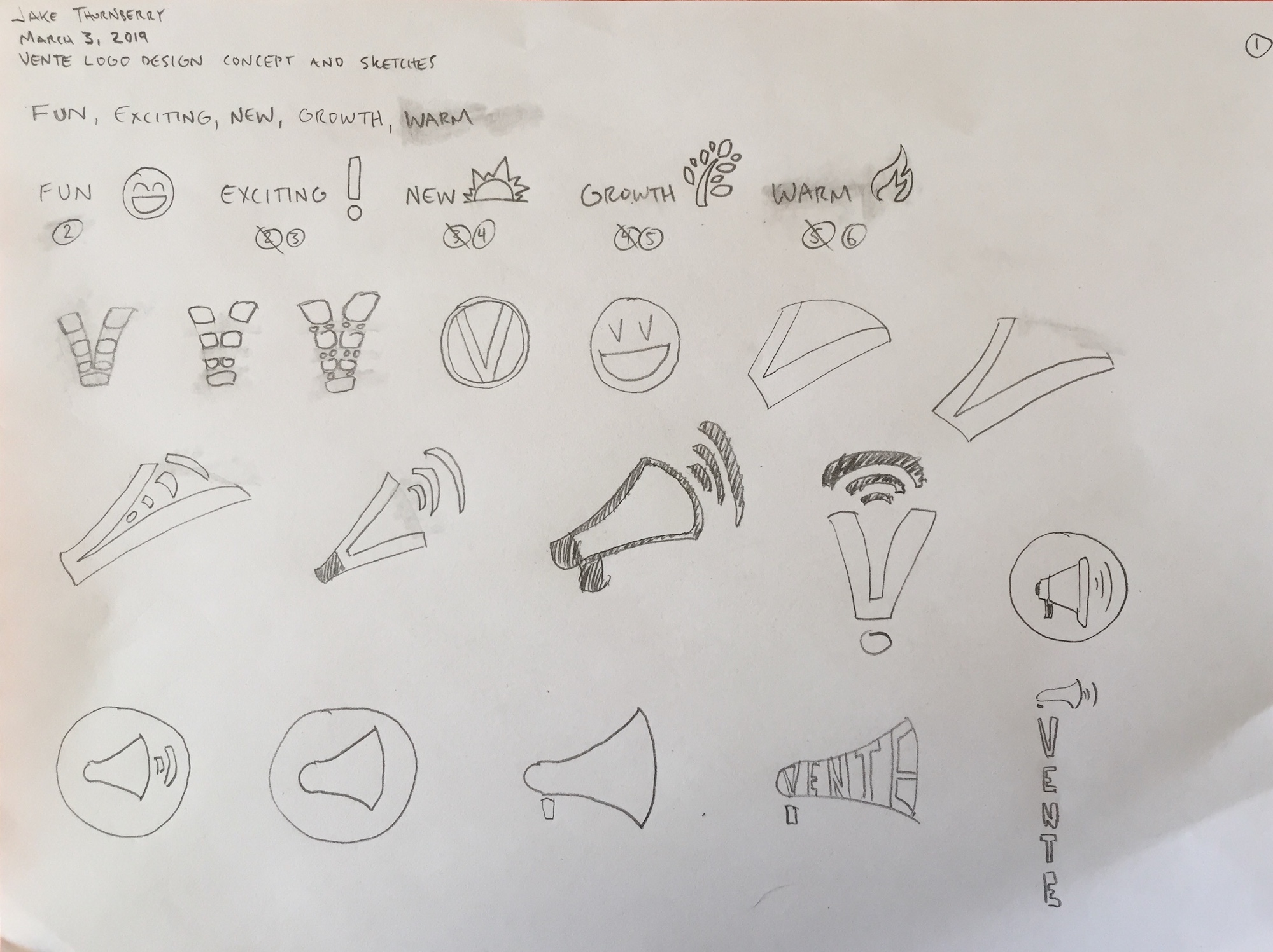
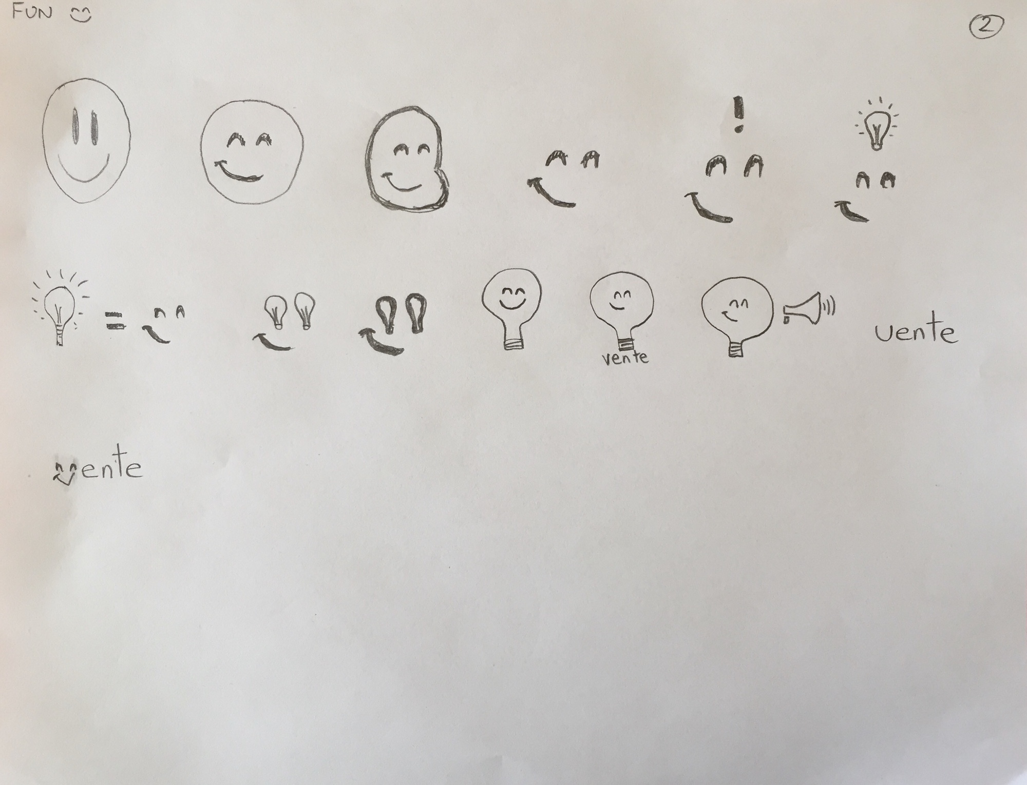
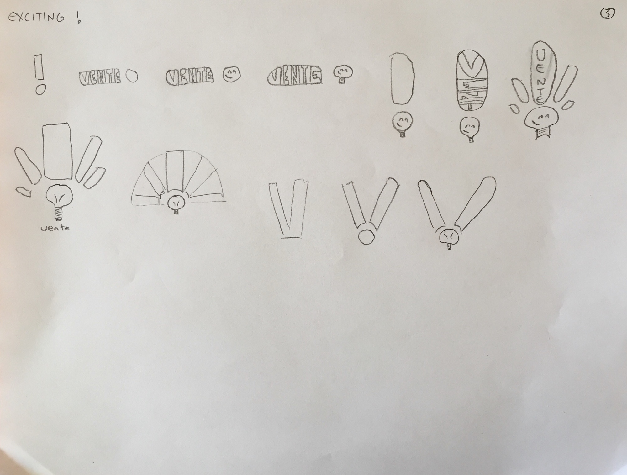
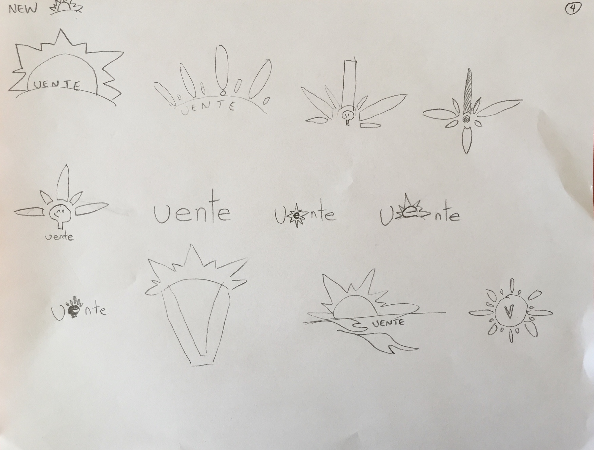
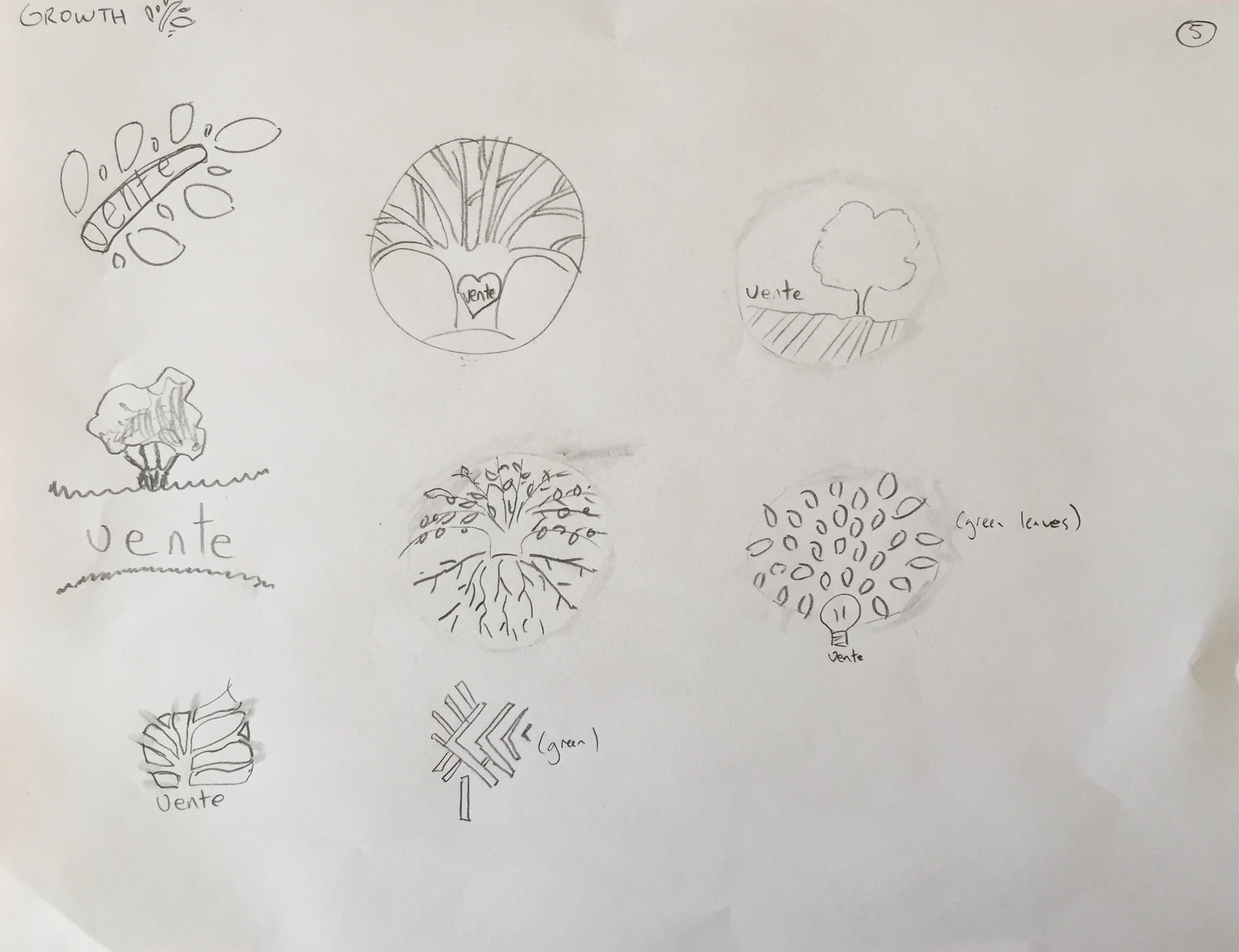
To begin exploring this, I asked myself “What are the values, voice, and personality that I want to represent Vente?” I then sketched out as many ideas as possible via stream-of-consciousness using the 6-8-5 method (set a timer for five minutes to brainstorm and sketch six to eight things) that riffed on the adjectives I’d identified.
The sketches helped me get some good design options by keeping me in the space of a divergent creative mindset—it’s one thing to think about brand and it's another thing to talk about it, but to bring those ideas out of the subjective ether and into reality by creating their visual manifestations really helped to sharpen some vague ideas I’d had about it.
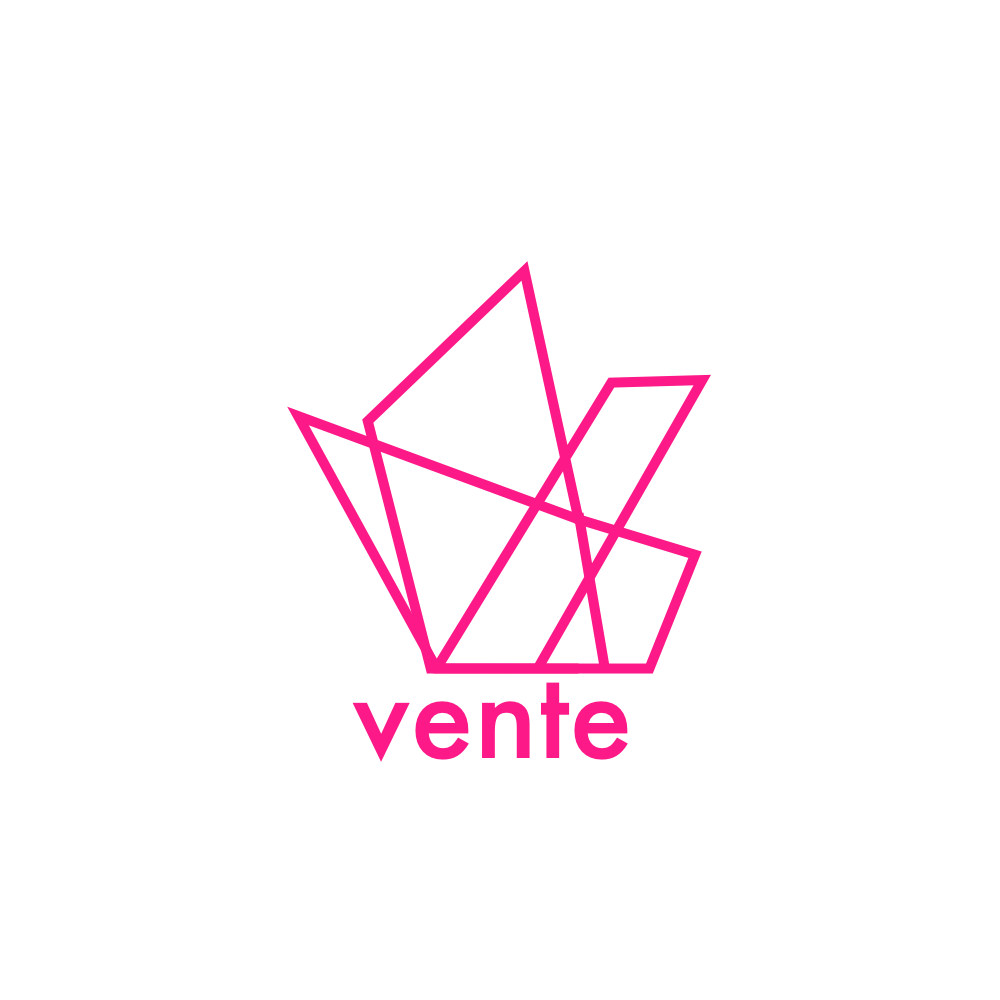
Logo Iterations
After receiving feedback on the initial round, I iterated on my initial sketches and, with the help of my creative director, narrowed down the strongest logo from each adjective. I then digitized those in Illustrator and began experimenting with pairing the marks and mascot with various type to judge the addition of text’s effectiveness in turning some of them into combination marks.
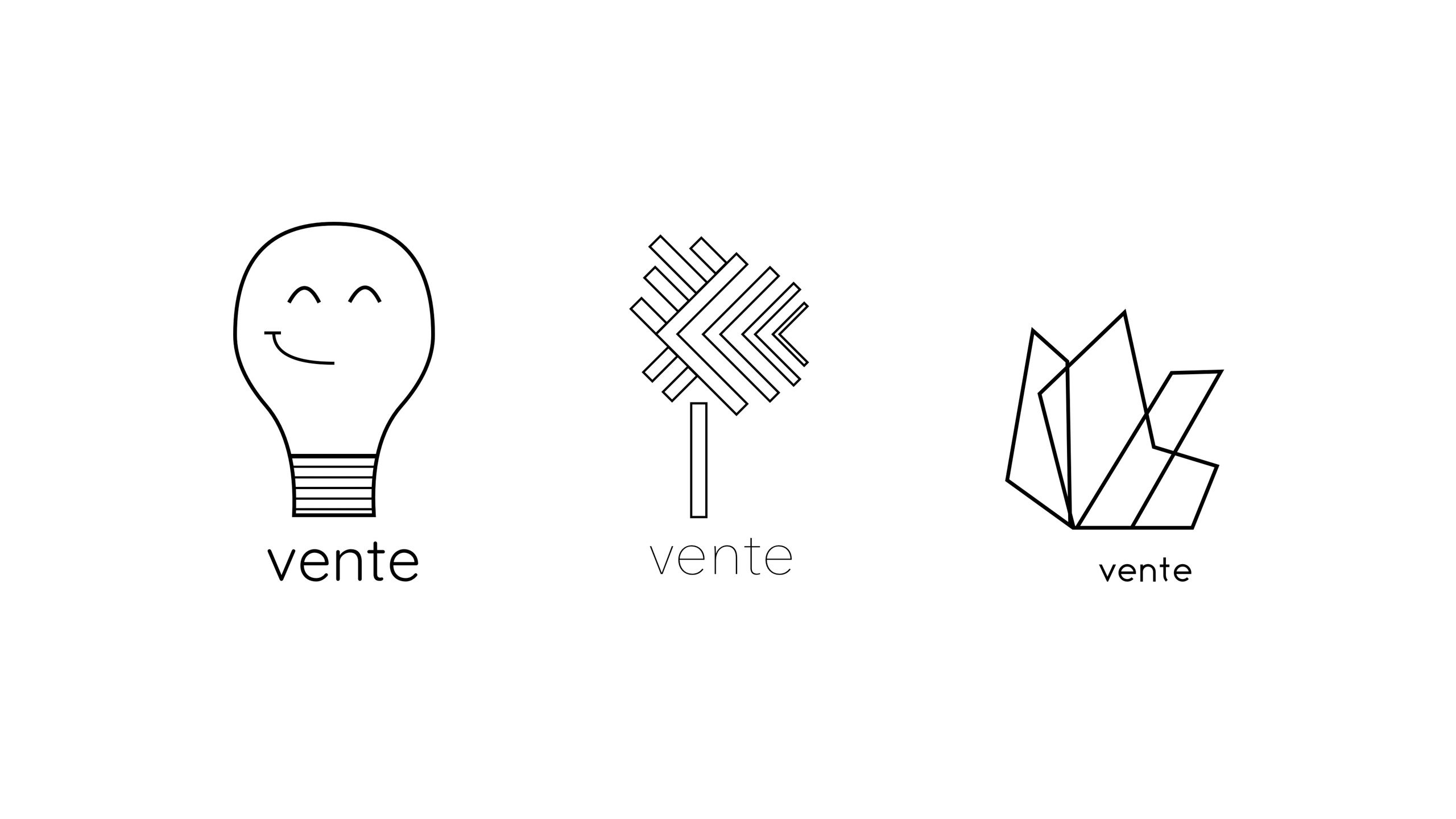
After receiving a second round of feedback, I completed another iteration of all three logos.


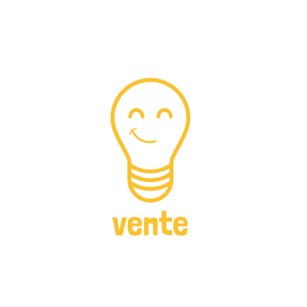
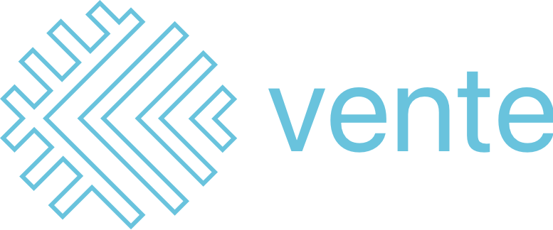
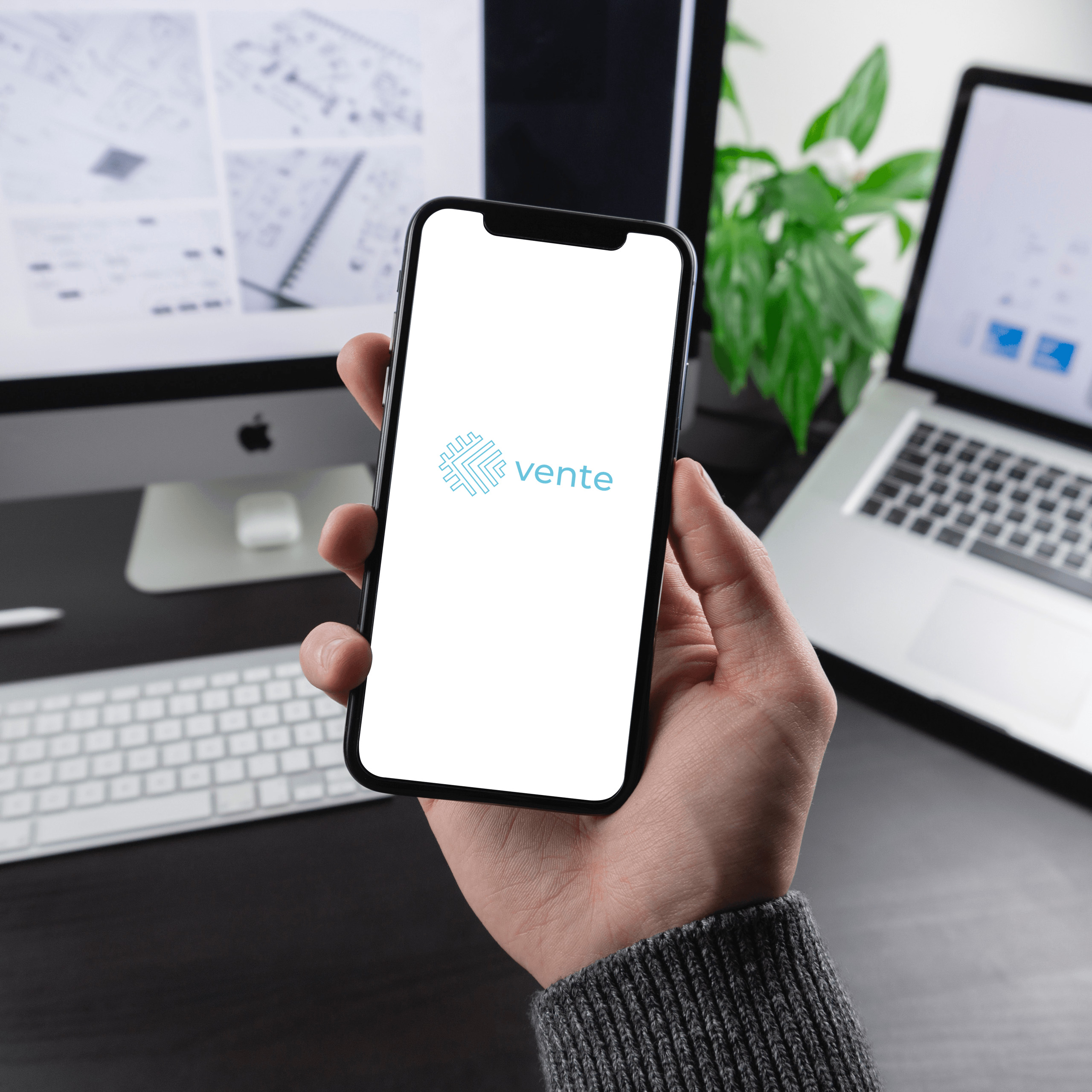
Final Logo
I then experimented more with various type and font weights. I then compiled all of my work into the:
- Concept for each logo design
- Black and white version of the logo
- Logo, on black
- Mark only
- Color versions of the logo
- What the logo looks like in context
Overall, I aimed to create three logos that are simple, versatile, appropriate, and timeless. They are all simple as I reduced all that I saw as unnecessary, versatile because they work nicely at different scales, appropriate as they all arrived from taking a hard look at what the brand represented, and timeless due to the fact that the design focus was on the brand itself, and not trying to imitate any current logo design archetypes, motifs, or trends. By focusing on the brand and not simply what’s trendy now, these logos at least stand a chance at resonating just as well in one year as they do in ten.
Design Directions
Moodboards
I created three divergent design directions based on the vision I had for Vente's brand and the moodboard concept I chose as the final design direction was "clean, crisp, and cool," as it aligned most closely with our users.
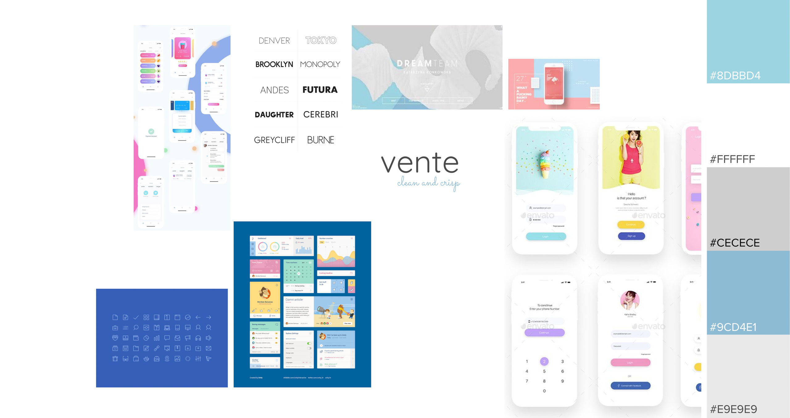
Moodboard
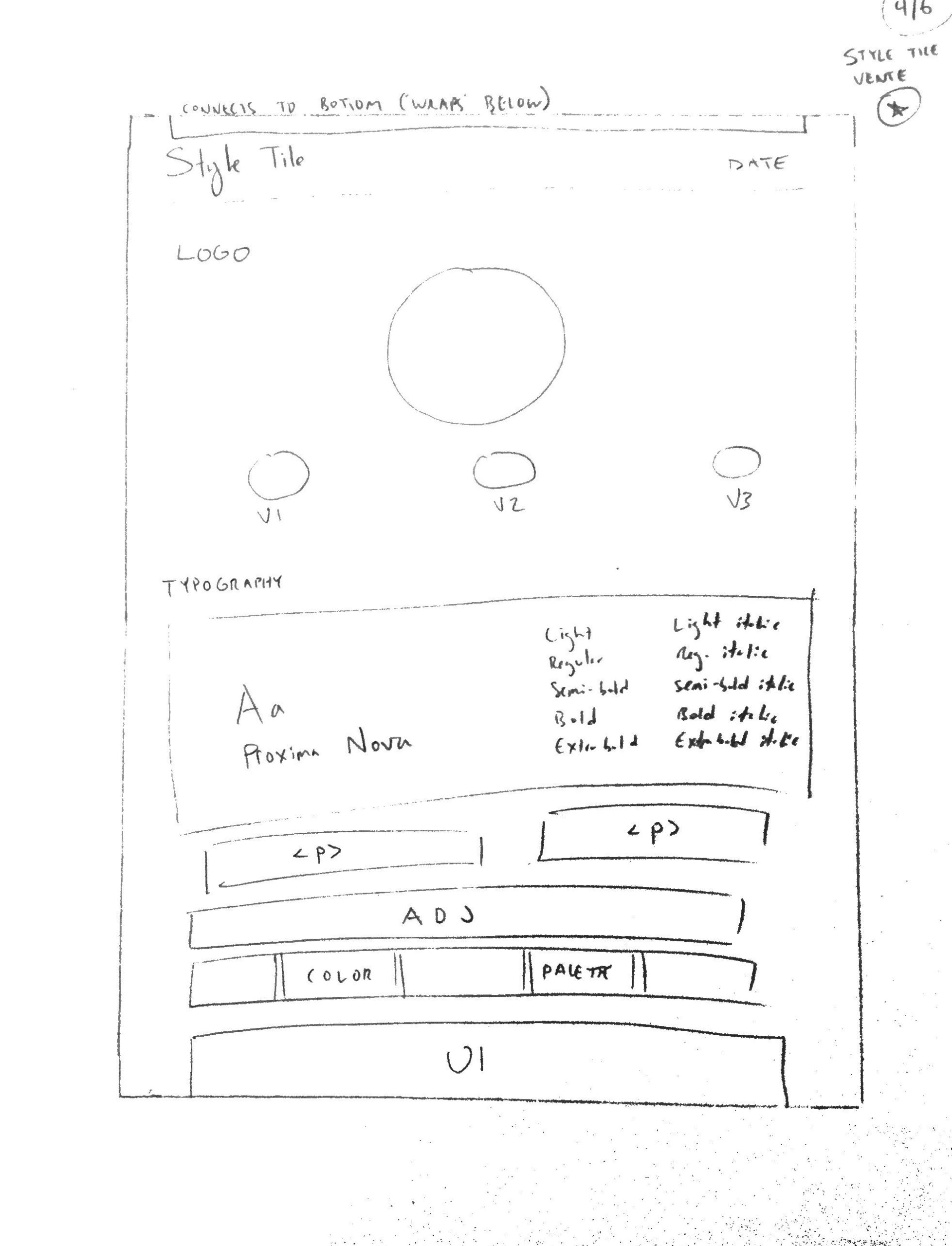
A paper sketch of a possible design for the style tile.
After one iteration, this was the final style tile.
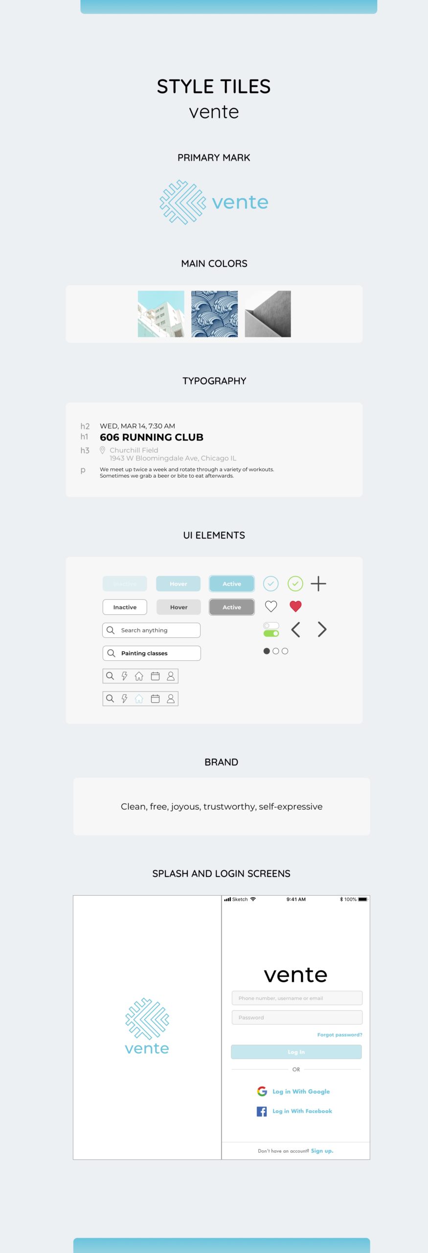
Style Tiles
The moodboards were a good jumping off point for the style tiles, as I’ve already started the creation process by having already done a bit of thinking about how all of the various elements should feel—then it was just a matter of making sure all of those lined up cohesively.
The most challenging aspect of was keeping the design’s style consistent and cohesive—getting so many different elements to all play nicely on the same team was definitely a learning experience.
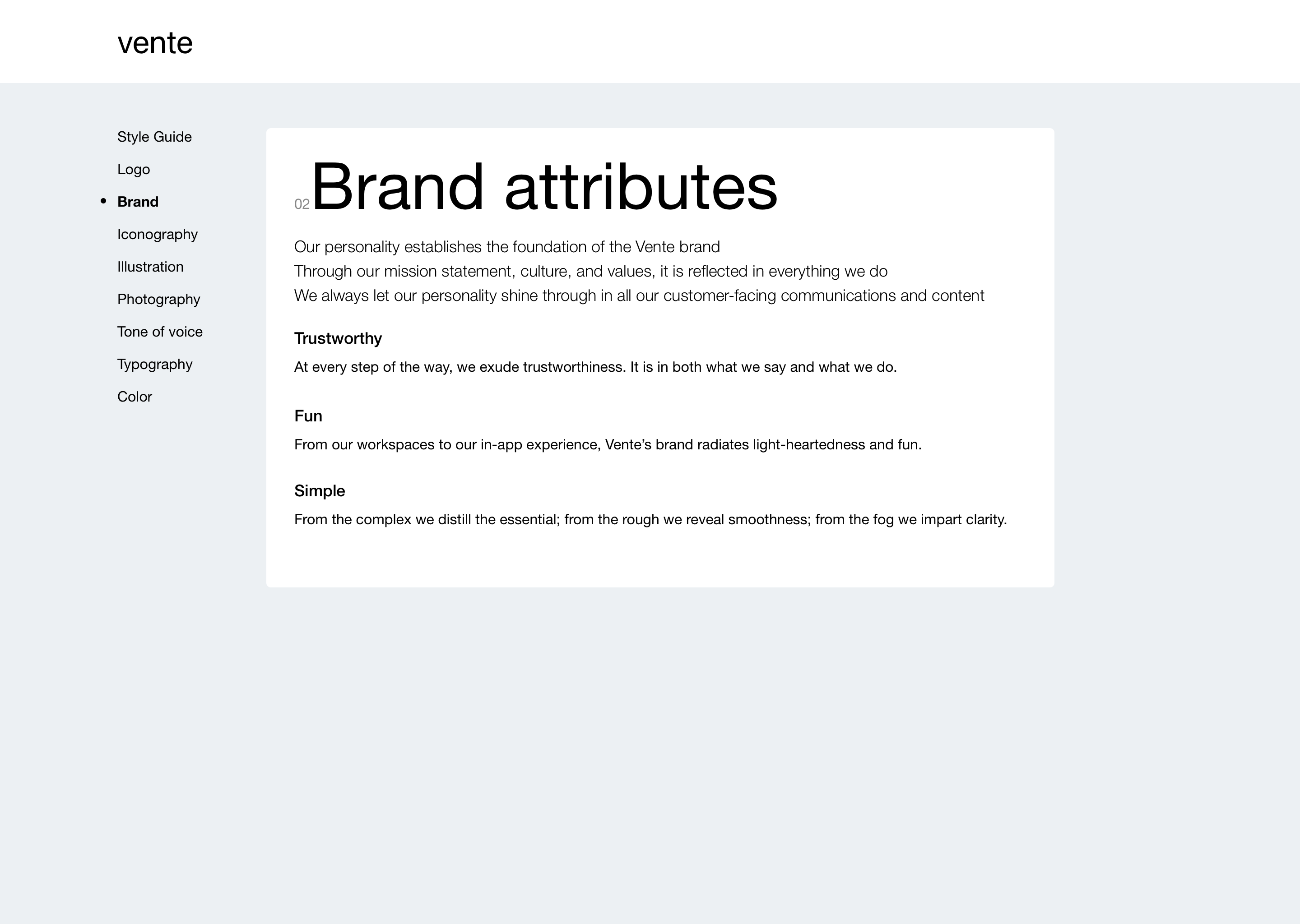
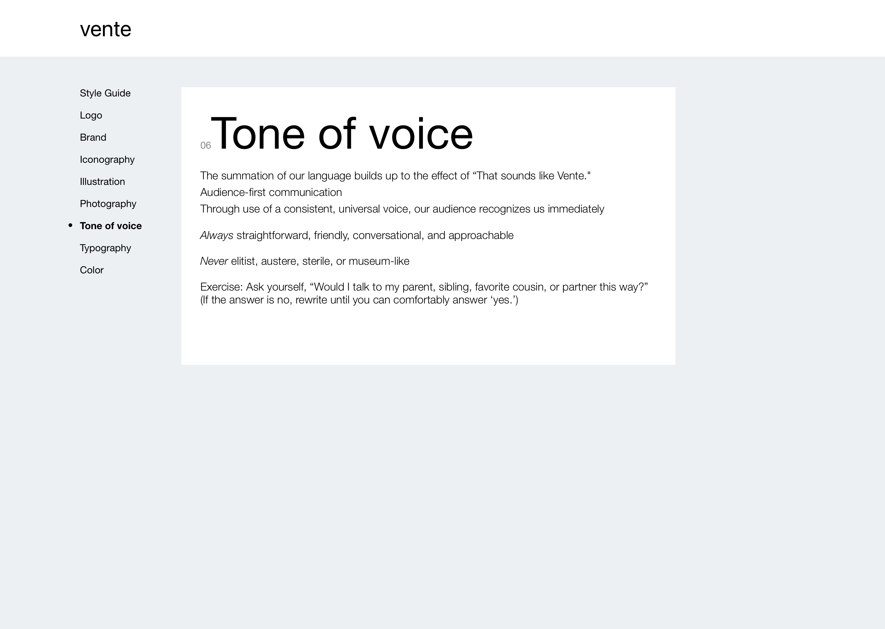
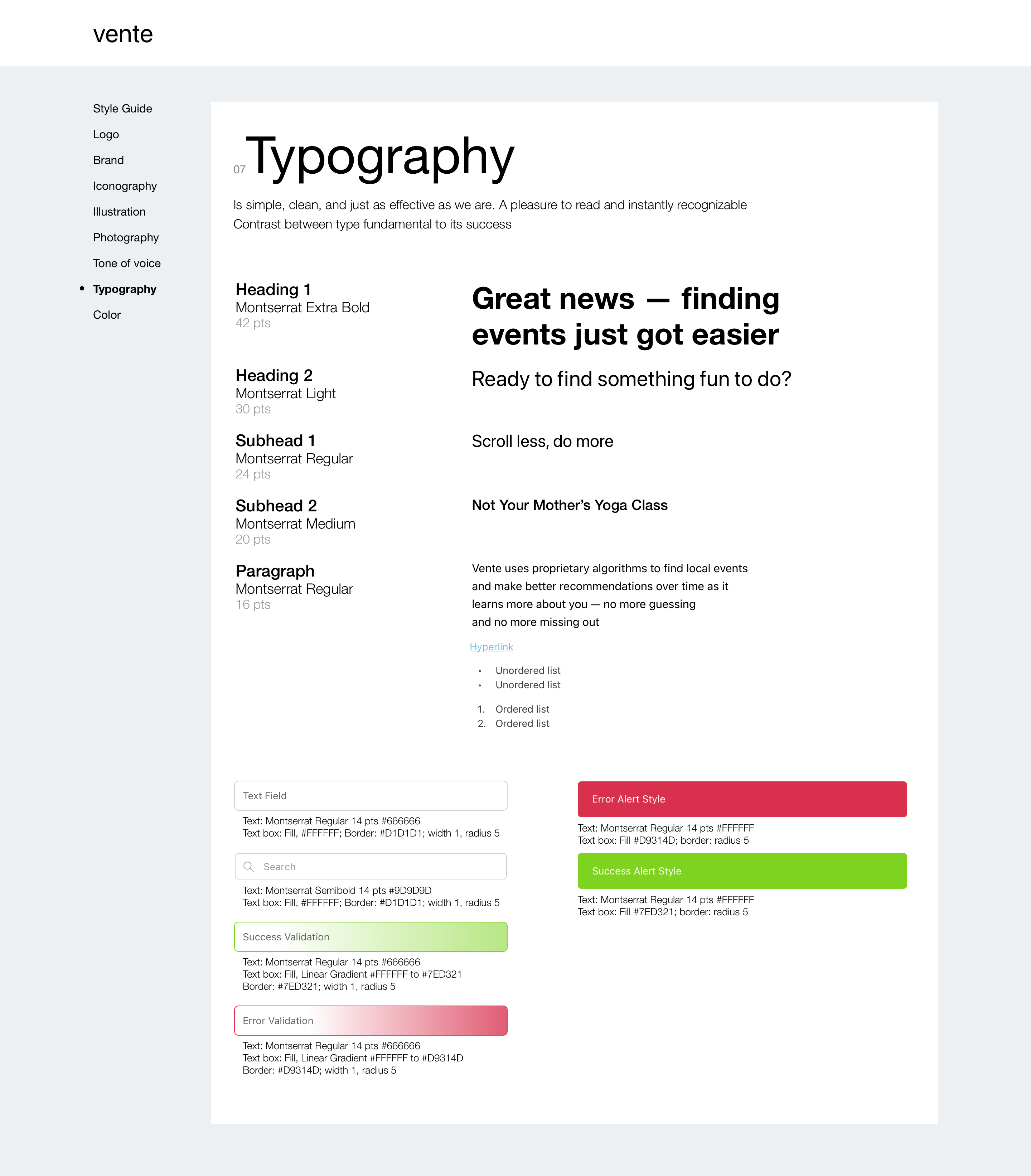
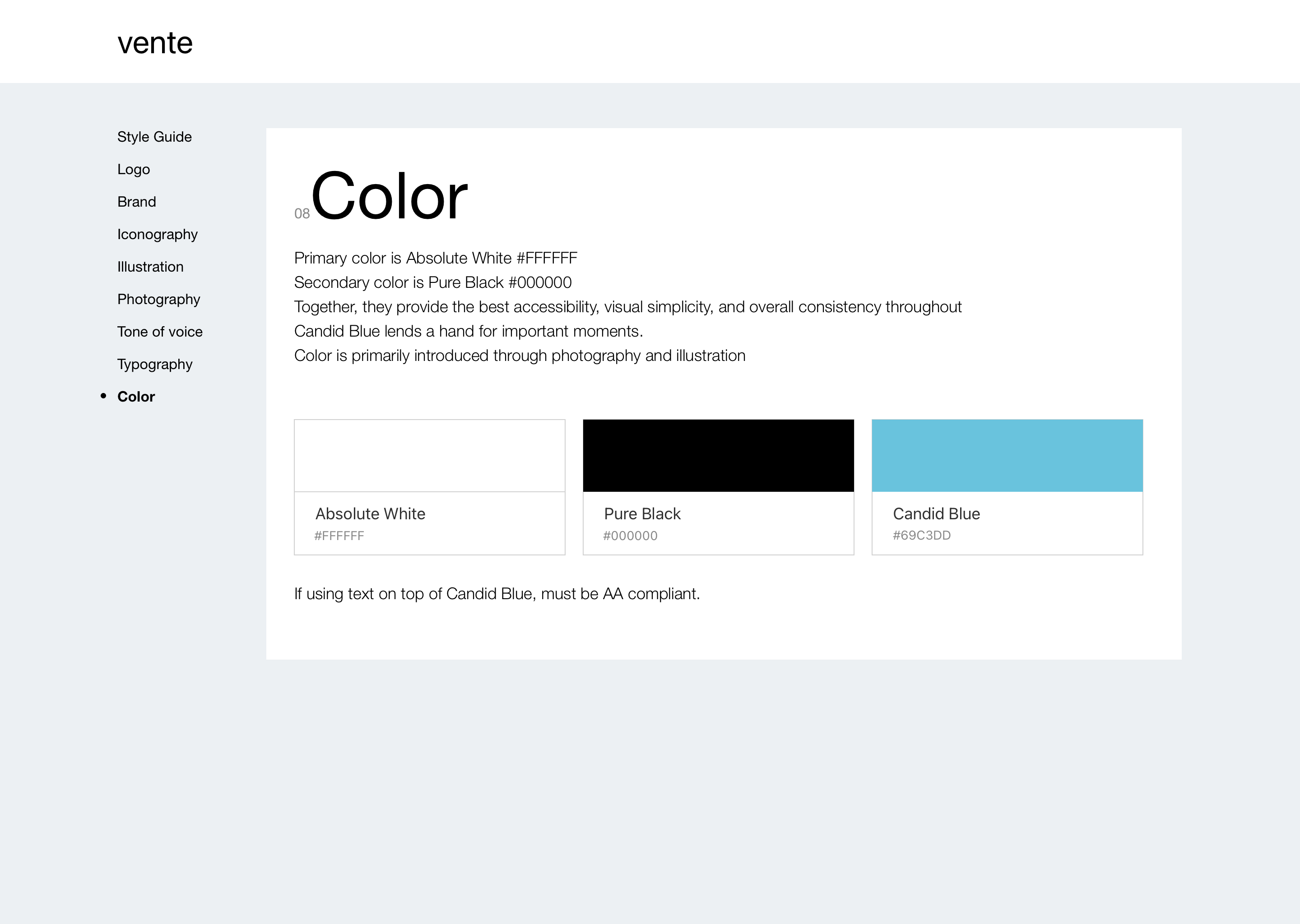
The Vente brand is trustworthy, joyous, clean, and crisp. To impart the feeling of trustworthiness and cleanliness, I used lots of white space and a light blue, as, per color theory, blue comes across as likable, trustworthy, and clean. Plus, none of the competitors in this market—aside from Facebook—were using it, so it'd be an easy way to help differentiate it. To give it a friendly, welcoming feel, I rounded all of the app's corners by increasing the radius and chose Montserrat, a geometric sans-serif typeface that was originally created to capture the beauty of 20th-century urban typography.
Most of the insights I gathered from getting feedback on this style tile were directed at how a proper style tile should include more UI components, which the first draft had lacked. The other insight that proved helpful in recalibrating how I view a style tile was that it’s really much more about seeing how the UI will line up with the mood layered on top of that—that may seem like such a minor shift in perspective, but it really made the idea of the style tile make a lot more sense in my mind.
The most challenging part about iterating on my work was not losing sight of the forest for the trees when it came to even the seemingly most minute visual design decisions. The tactic that helped most to recenter things was to bring it back to the persona.
The style tile the client chose connects effectively with Nate’s user persona as throughout the process I kept his profession and passions at the forefront of my mind while empathizing as much as possible by envisioning what a younger writer in a city would be drawn to both visually and stylistically.
Wireframe Evaluations
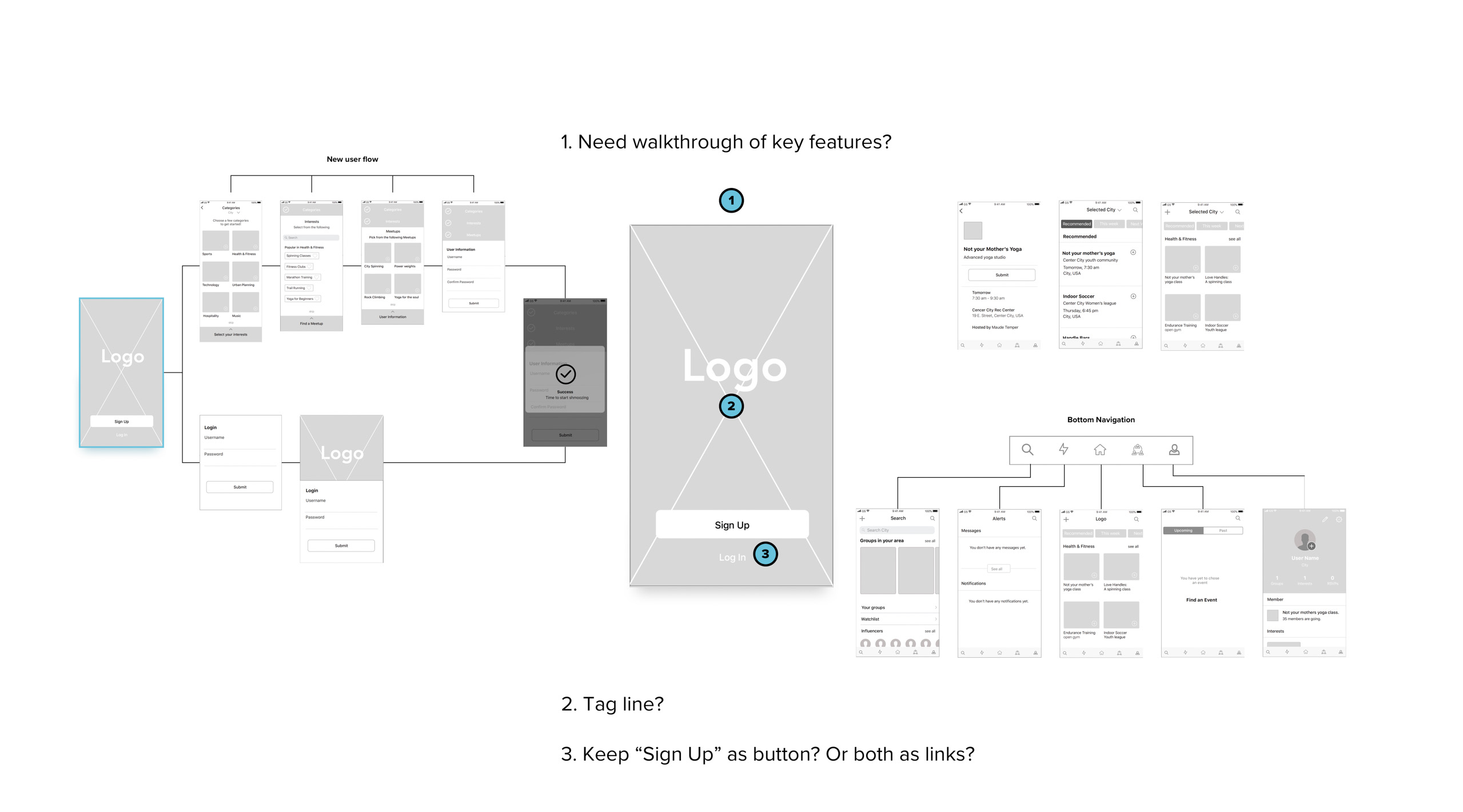
This was the first project I'd ever worked on where I'd received wireframes instead of designing them myself. In evaluating them, I got a feel for the intended functionality as well as the UI elements that would define the experience. I learned that as they had not been user-tested, I was given the green light to redesign them and add new views that could potentially expand the product and improve the experience.
While going through them, it really was like reading a book someone else had written or analyzing a painting someone else had painted, as opposed to revisiting my own familiar work—there were so many different mental fingerprints, decisions, and opinions. I learned that, as a designer, you may not always be getting a finished product for one reason or another and that, even if it was viewed as “finished” by the individual or team who handed it off to you, there’s always room for improvement. Somehow. Another thing I learned was how helpful it was to take off my designer cap and approach the flow as though experiencing it as a first-time user—that really opened my eyes to lots of small holes in the flow or things that weren’t immediately intuitive to me.
I thought there were a number of things that could be changed with the app and, in a perfect world, I would've had a quick chat with the UX Designer who'd handed them off to me to first see what their design rationale was for certain parts. But, that was not possible in this case.
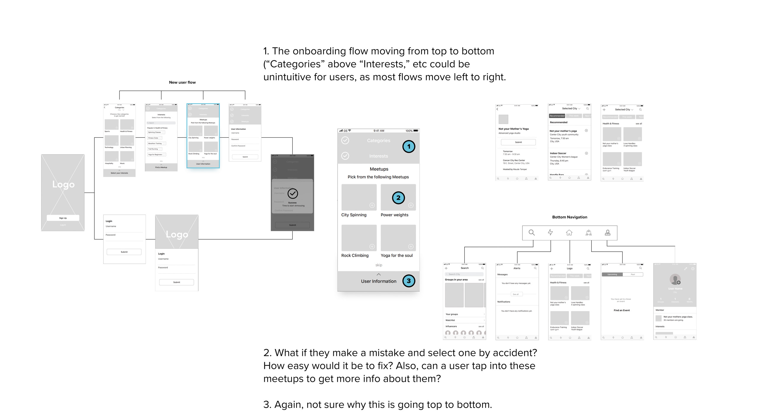
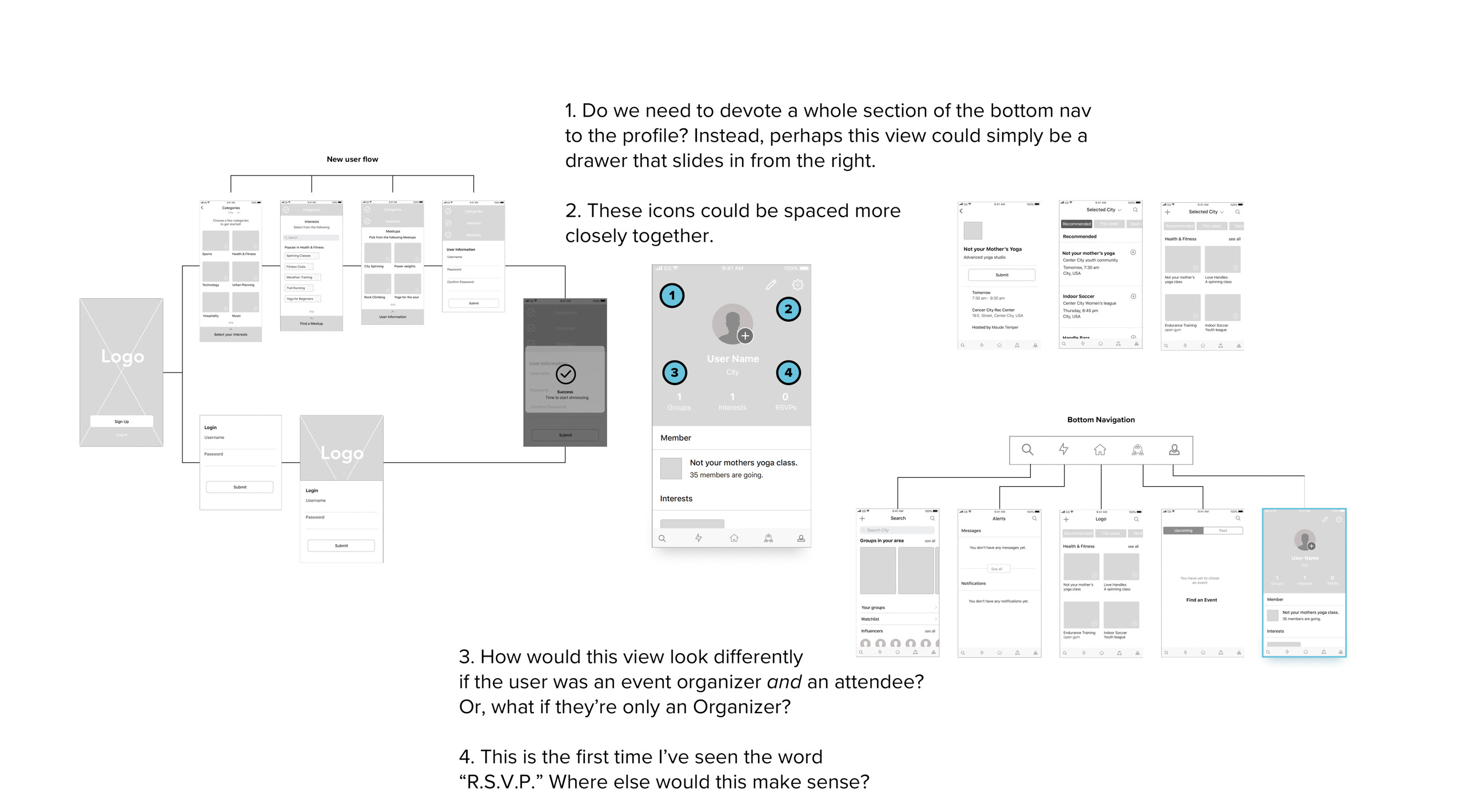
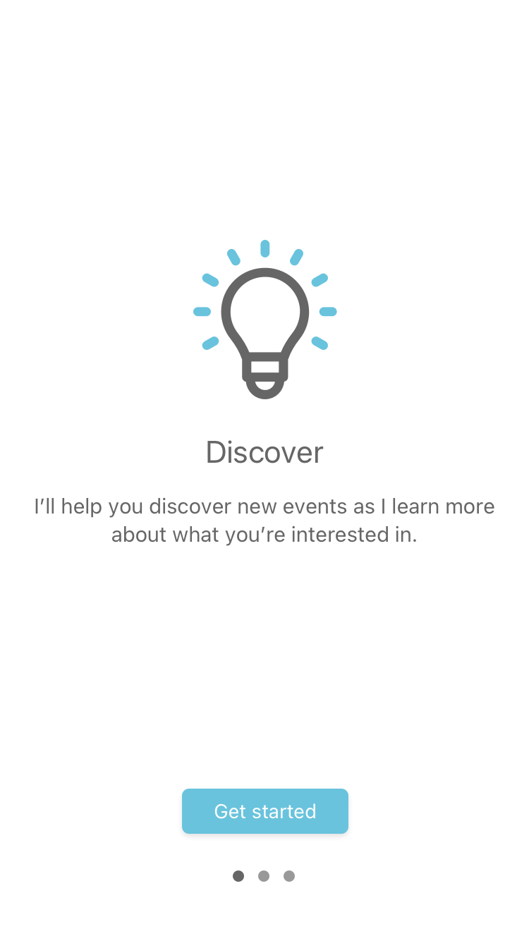
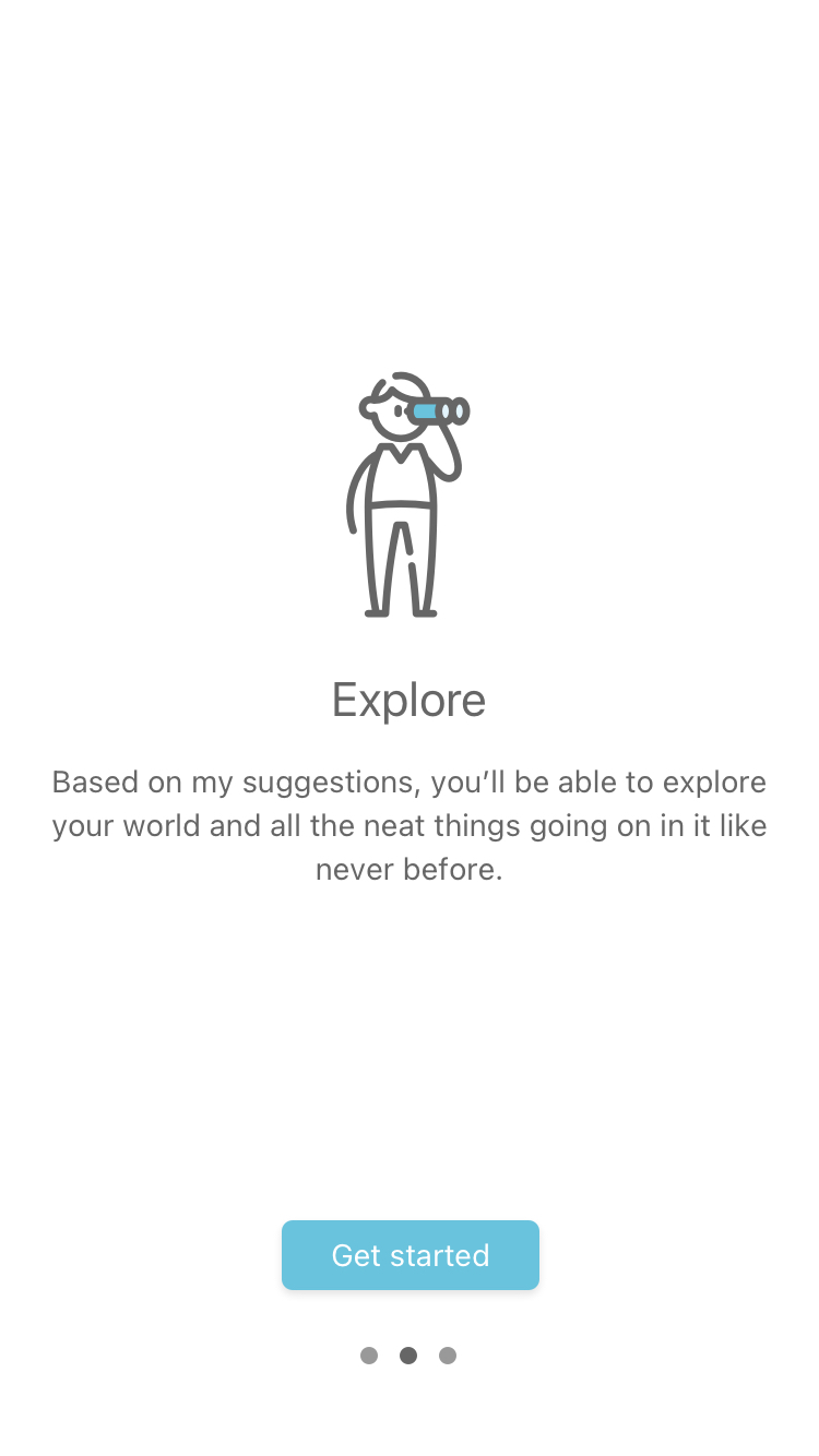
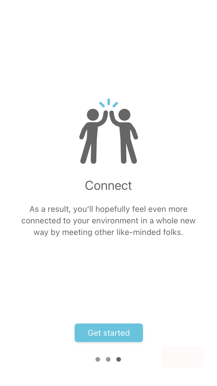
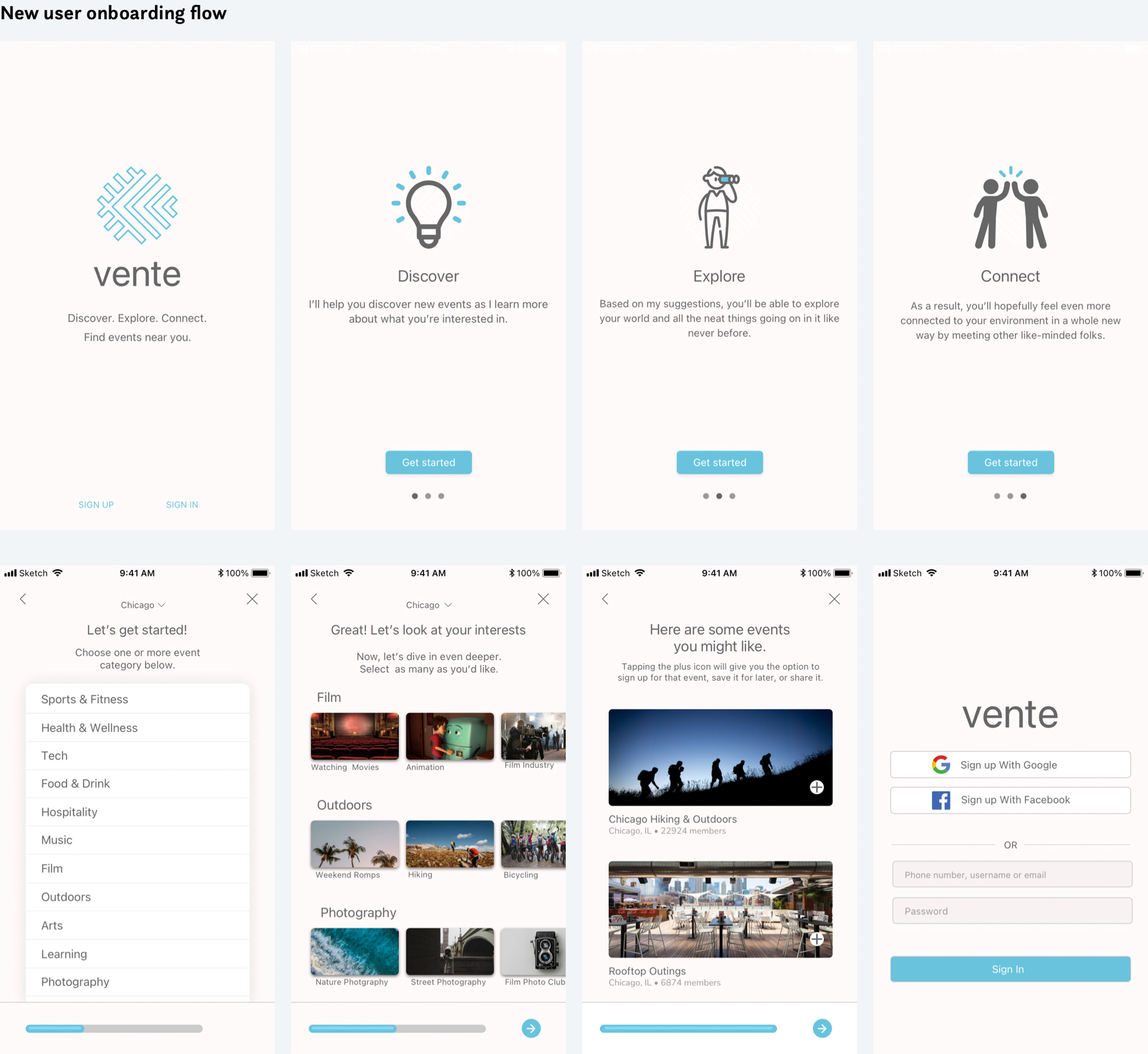
For starters, it was immediately clear that including a quick onboarding carousel to get the user acquainted with the purpose, features, and how the product would help them solve a problem was necessary. This would improve the application as they’d not only more fully understand how it works, but, more importantly, how it would help them accomplish something.
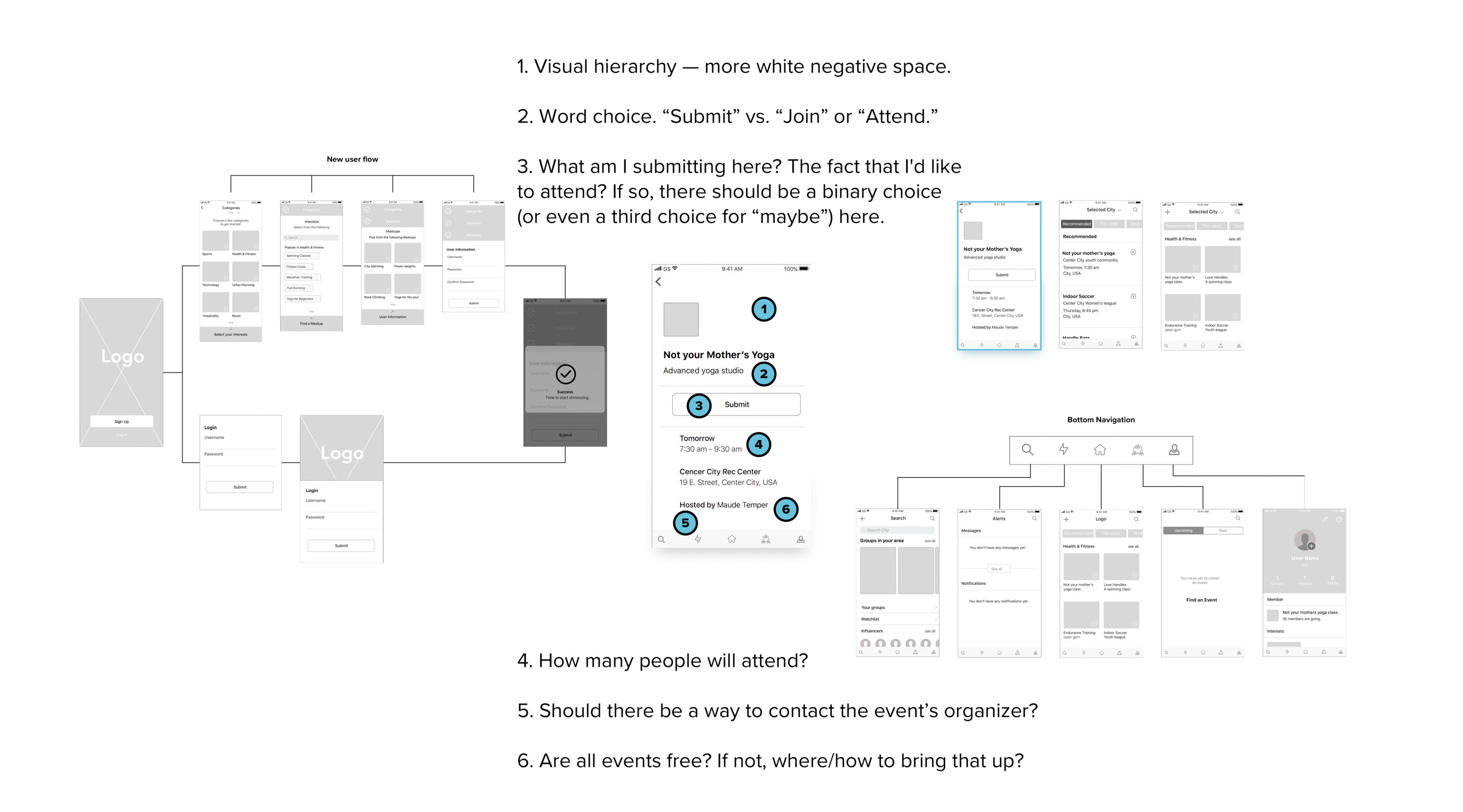
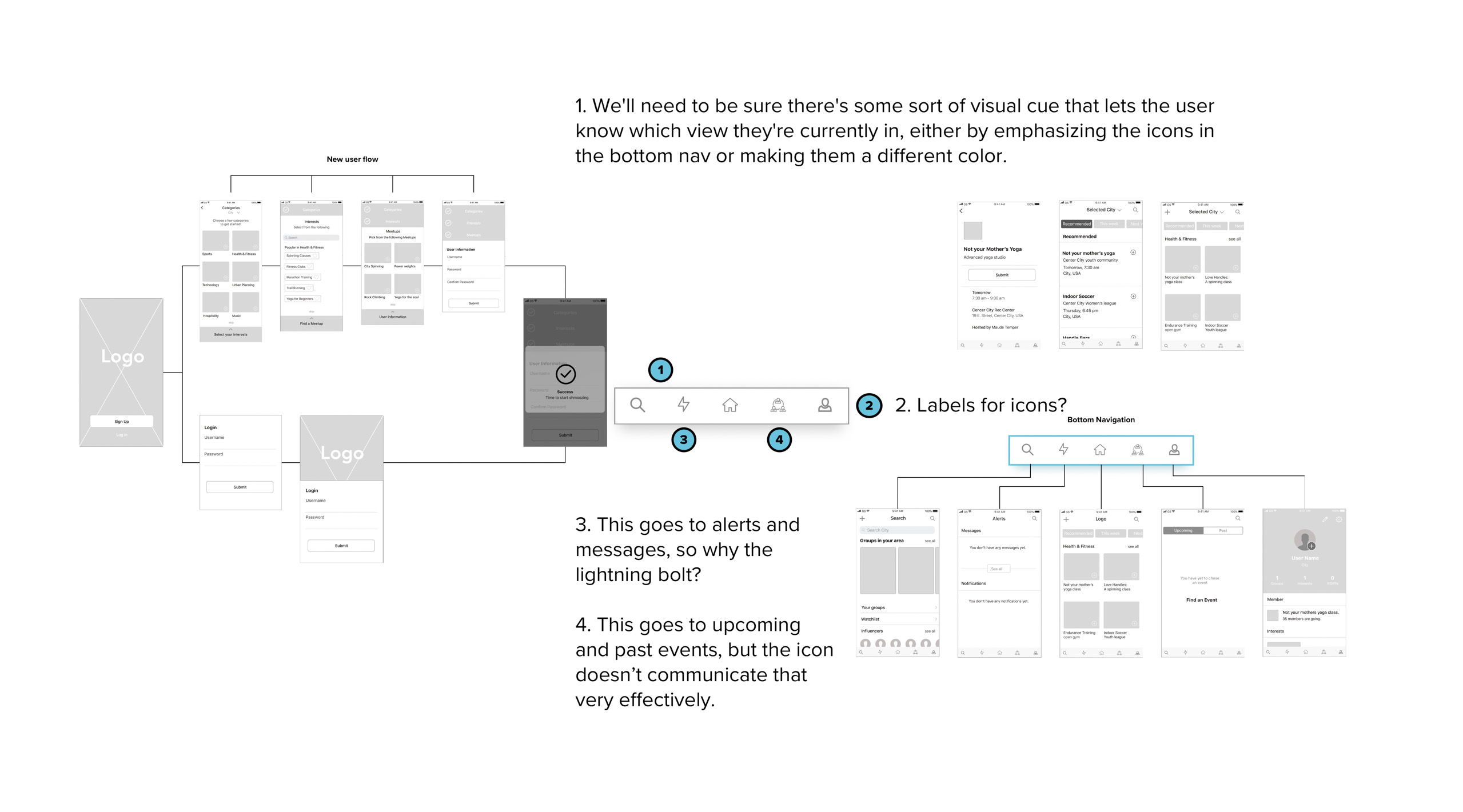
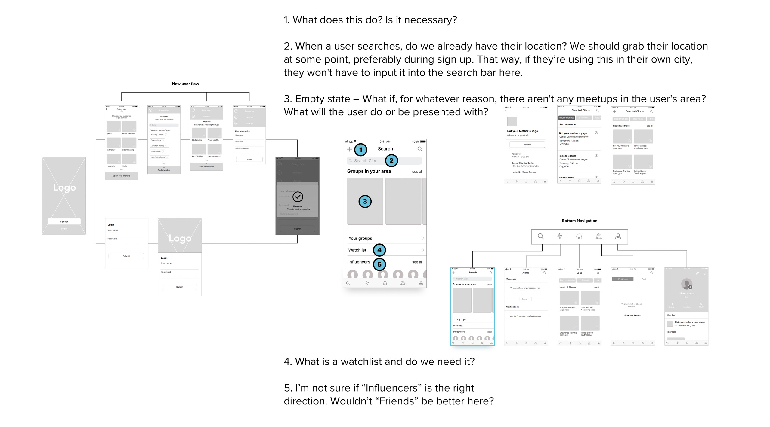
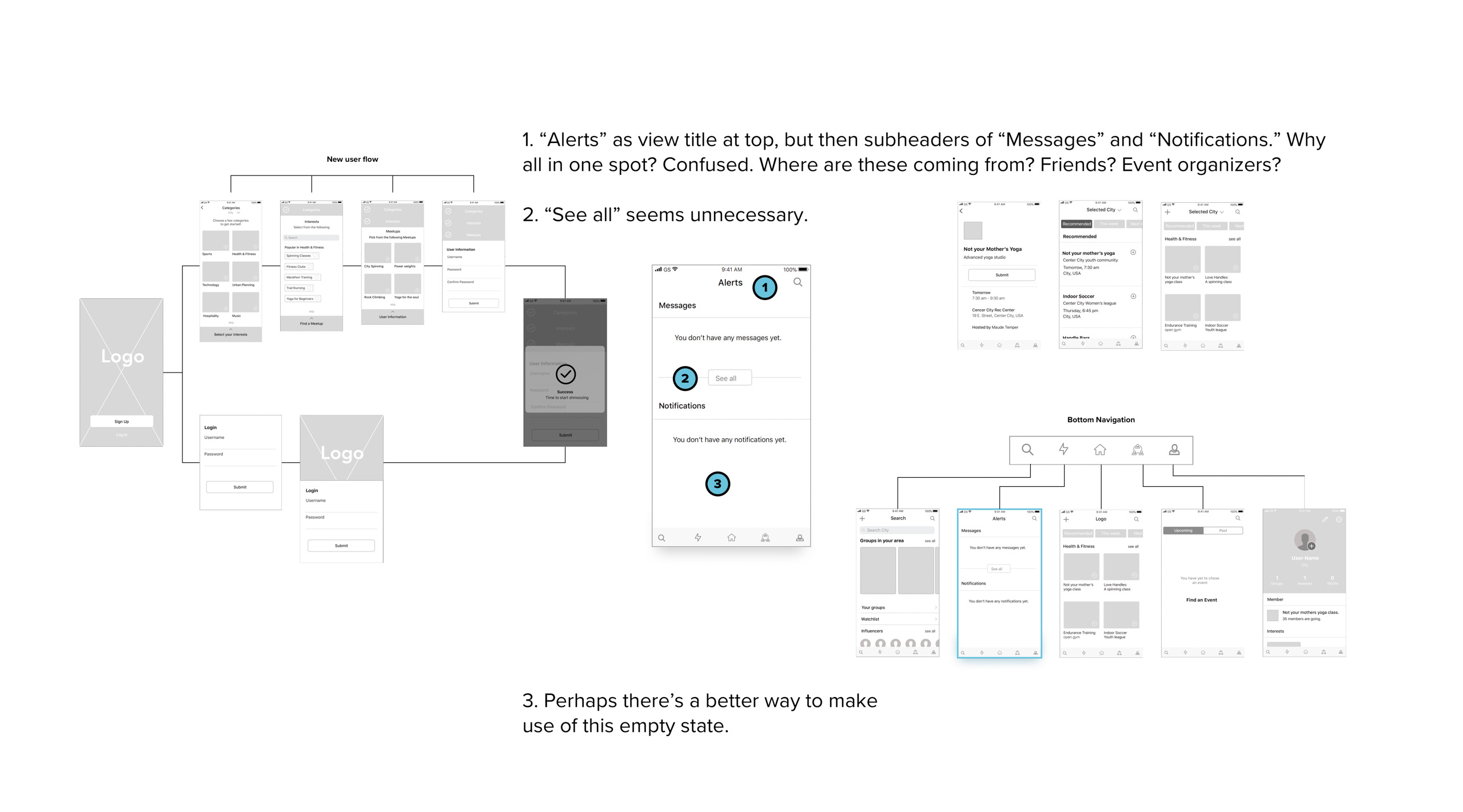
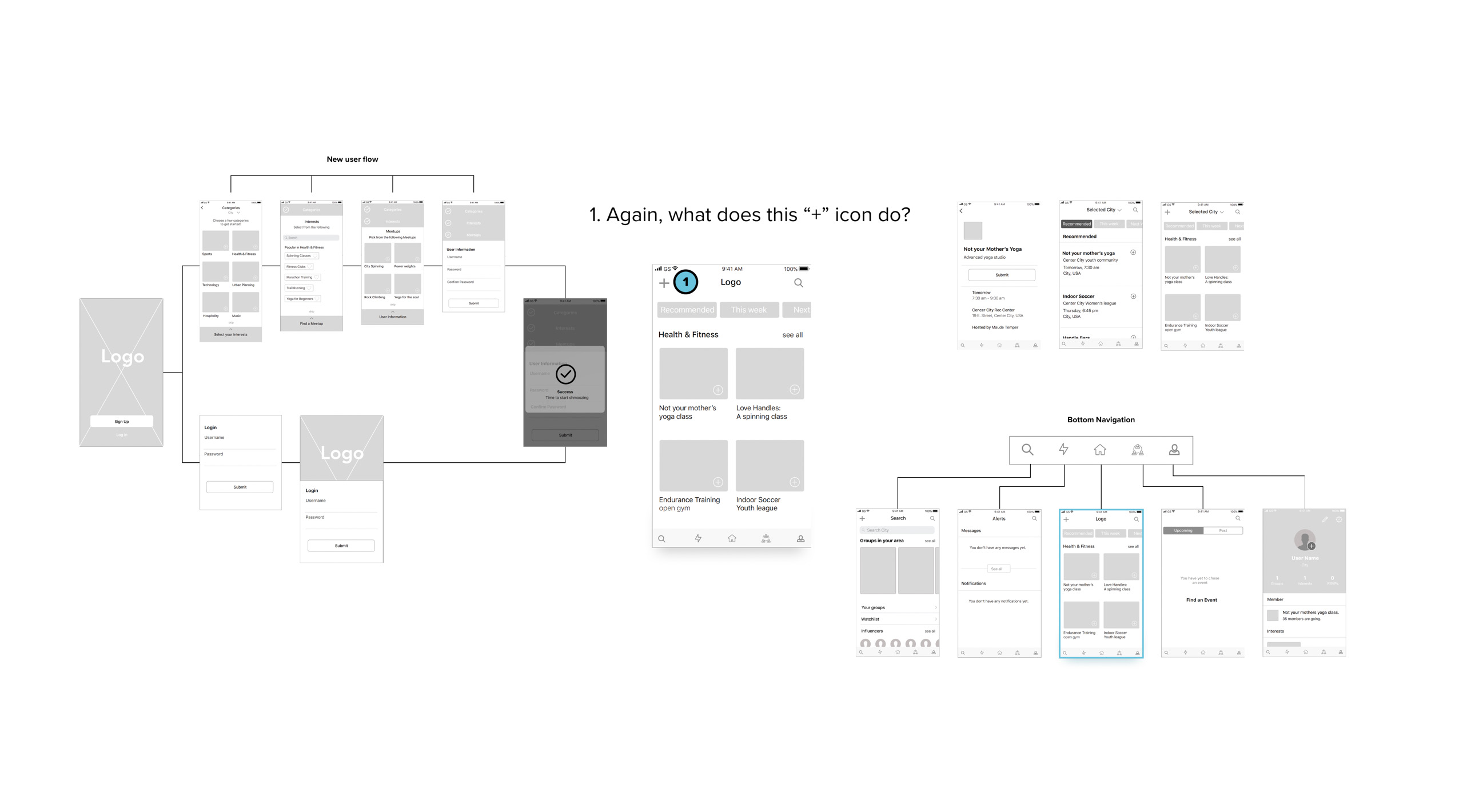
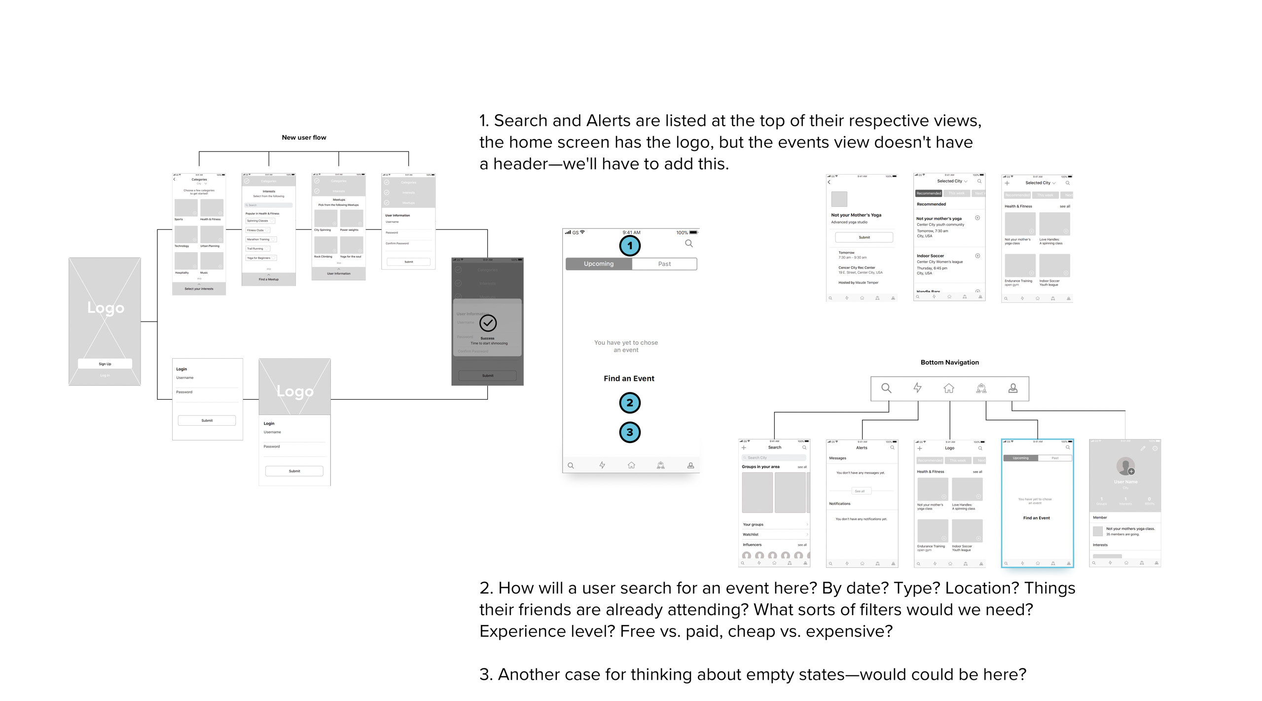
Another small but important tweak was ensuring that there’s a visual cue in the app’s bottom nav that clearly delineates the different nav views (Search, Alerts, Home, etc.) as there’s currently no signifier telling them exactly where they are in the experience.
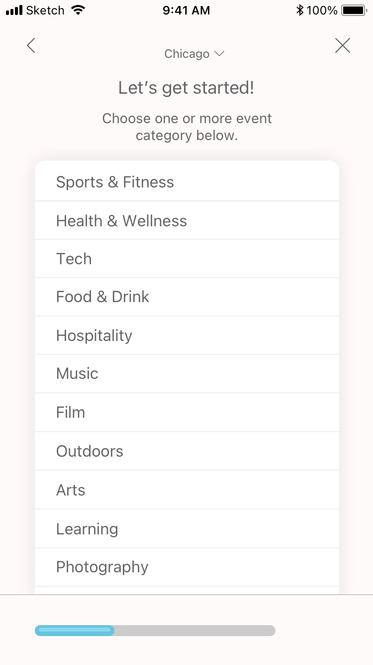
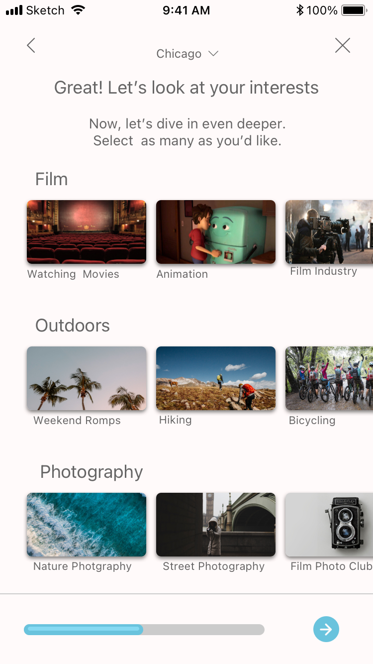
Lastly, I needed to spend some time thinking about the first steps of onboarding where we’d capture the user’s selections for categories, interests, and meetups, as the flow and just didn't make sense to me.
What follows is my initial analysis of the wireframes.
Wireframe evaluations
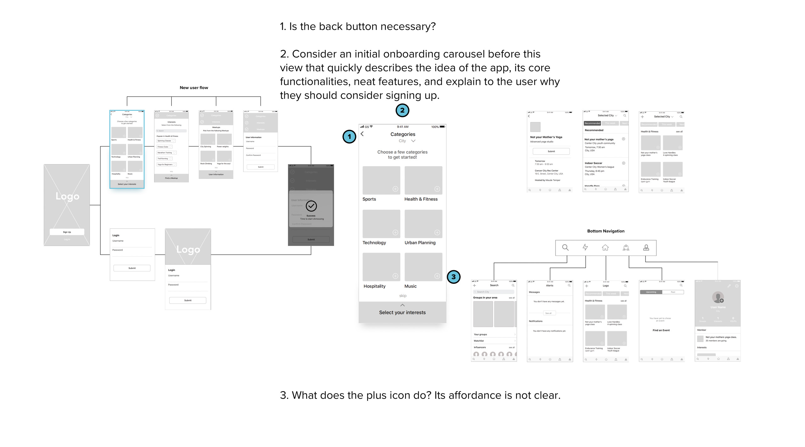
The Onboarding Process
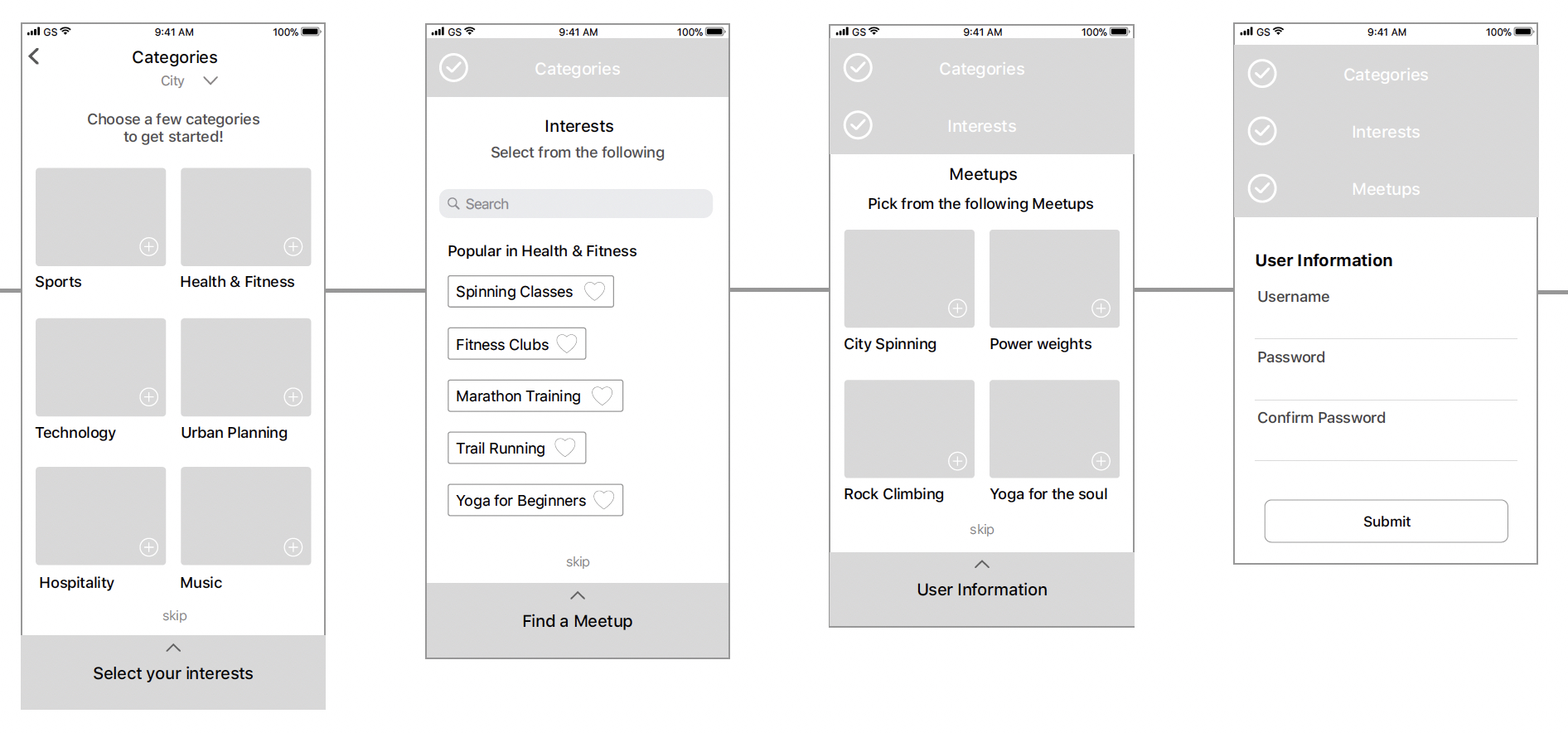
Original wireframes
Note that there isn't a "next" button for this onboarding process and they used an accordion instead—this is not a very common onboarding design pattern. Also, there wasn't any indicator of how many steps there were overall, which could result in would-be users abandoning the app before even trying it.


Redesigned onboarding views
For my proposed design solution, I replaced the accordion with a progress bar and added a "next" button. By adding the progress bar at the bottom—which is a far more common visual design pattern—users can better understand where they are in the sign-up process.
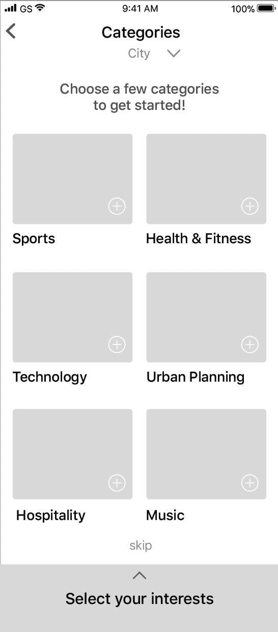
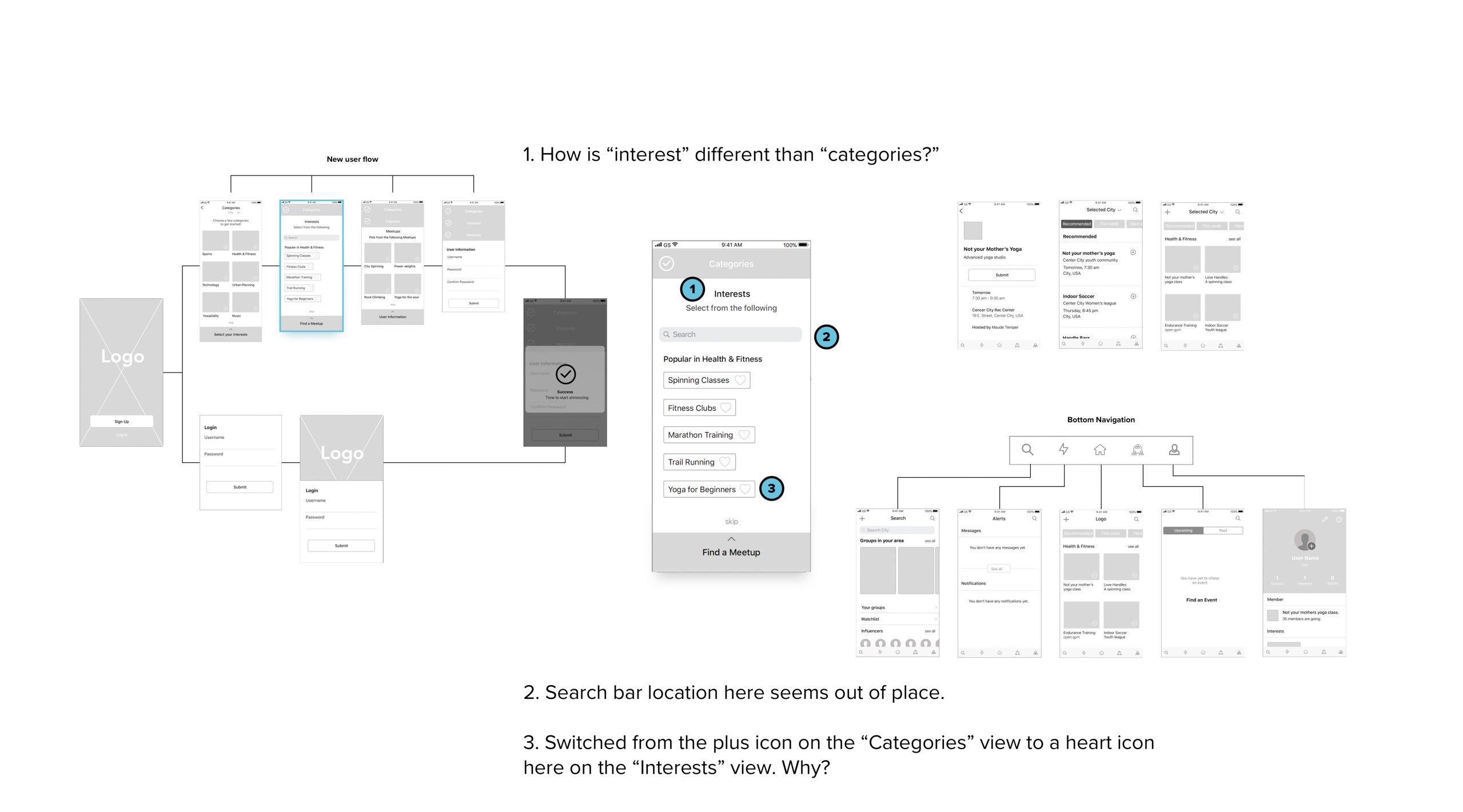
Original wireframe

Redesigned view
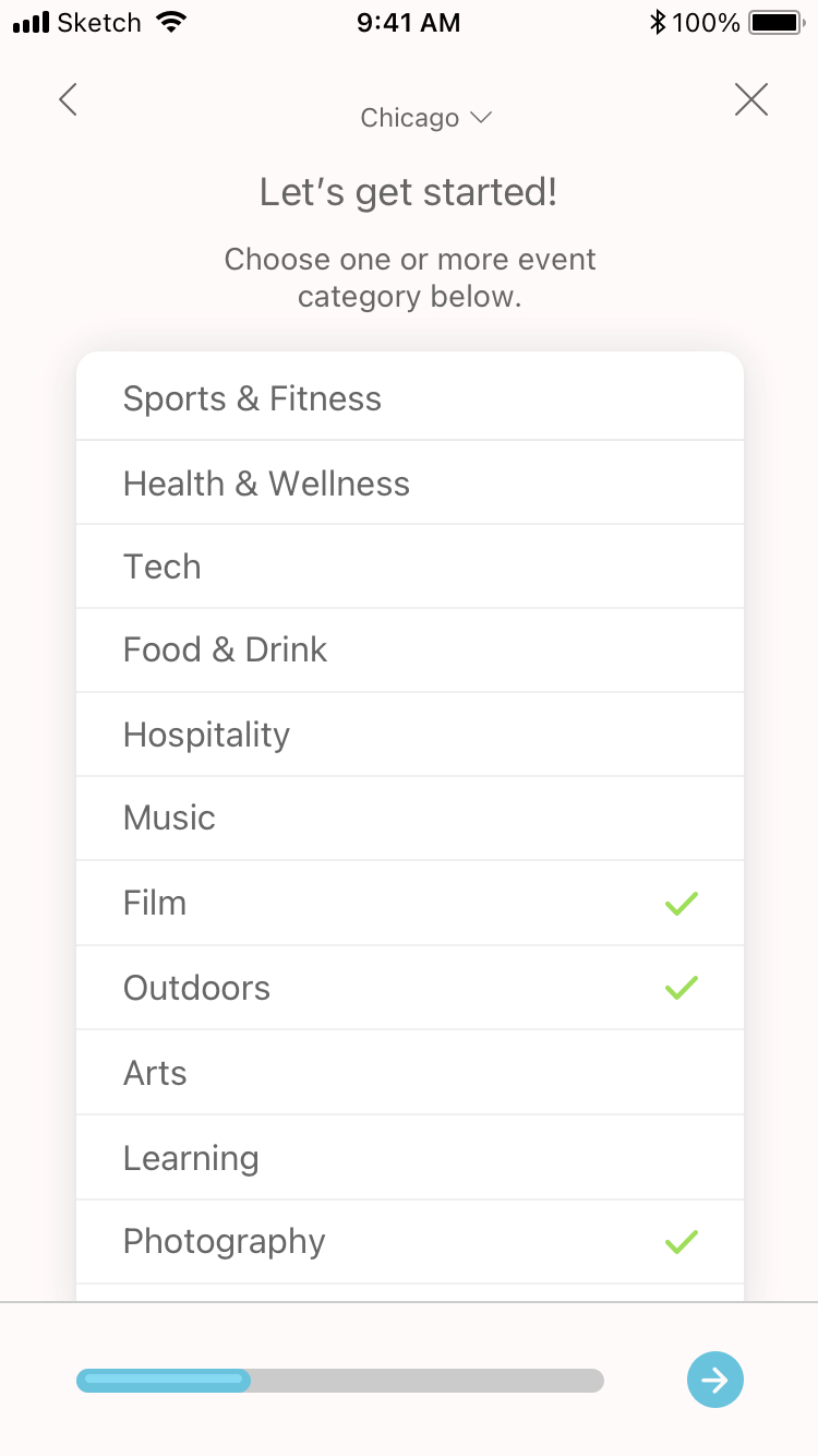
For the first view of the onboarding process, I swapped out the grid for a list, as a list utilizes space more efficiently while also providing far more options. Lists are better for efficient scanning and they perform better when there’s less screen space. As mentioned before, I also swapped the accordion for a progress bar and "next" button. Additionally, I slightly changed the content so that the user knows exactly how many categories they need to add to proceed (at least one).
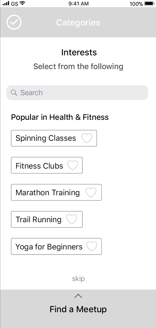
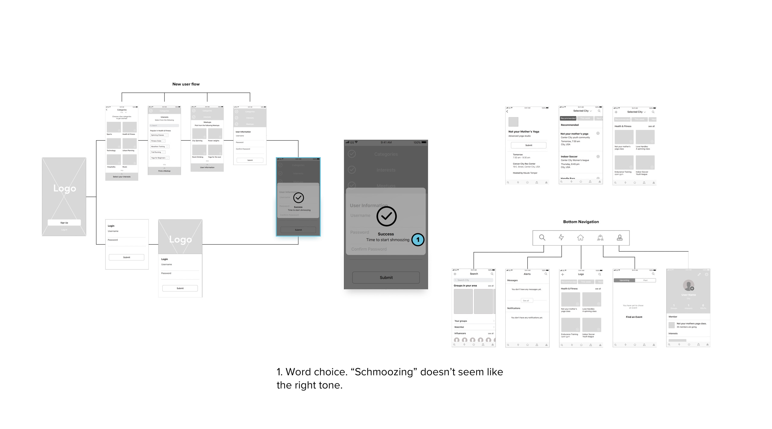
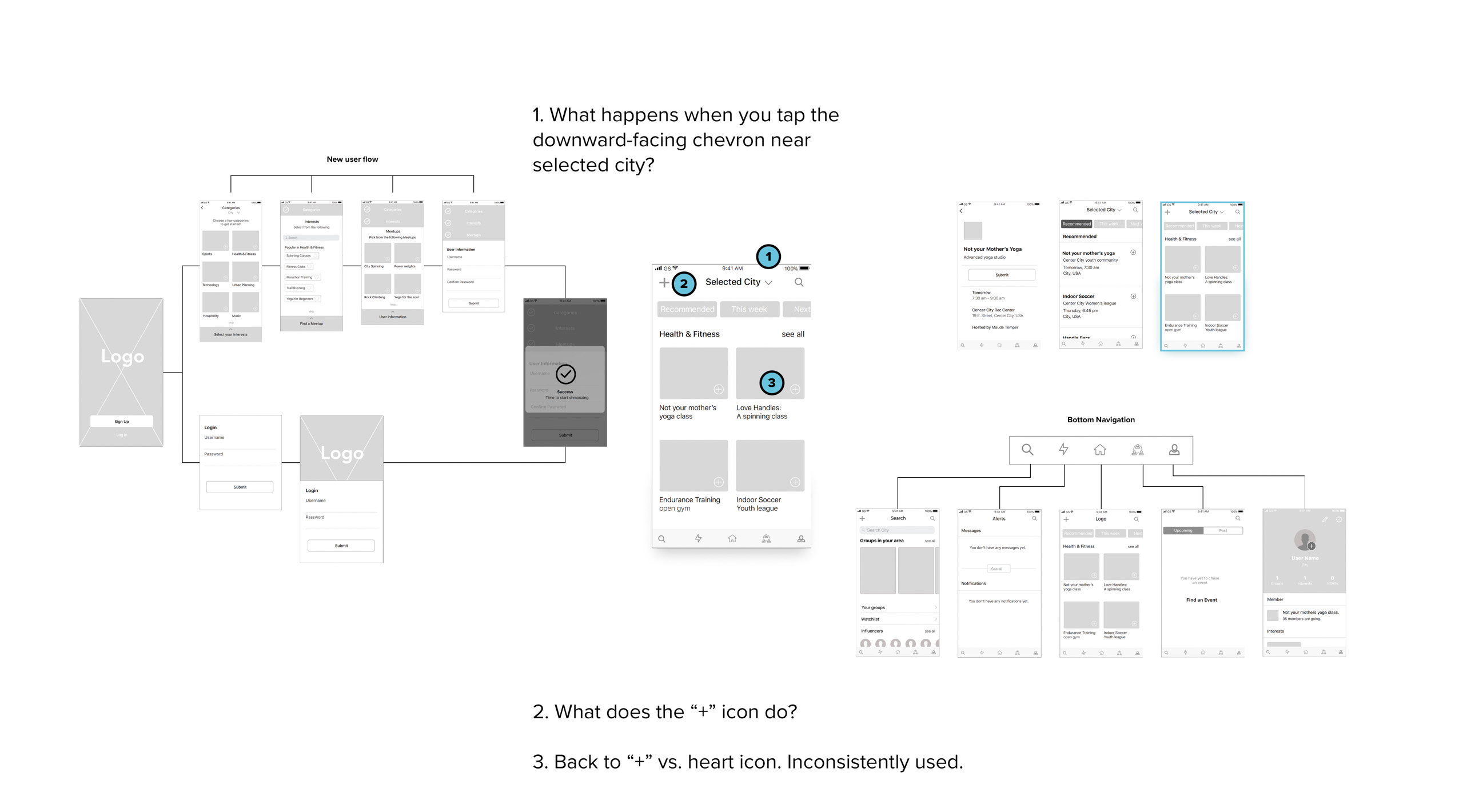
I added an 'X' in the event the user wished to skip the onboarding process and skip straight to siging up as well as a back button in case they made a mistake. I also removed the search bar on a hunch that, at this early in the game, the user might not even have any idea what sorts of events and meetups there are on Vente (I would've liked to have tested this to see if I was right). I swapped the list with heart icons for a swipeable grid with checkmarks so the iconography was more consistent (in the original wireframes, it switched between a '+' icon on the first viewand then a heart on this view).
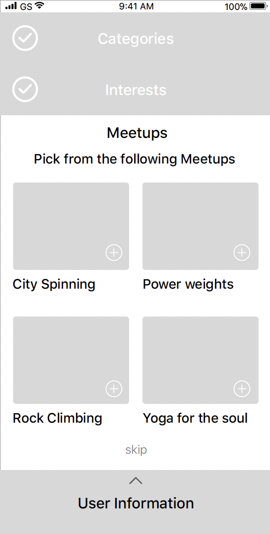

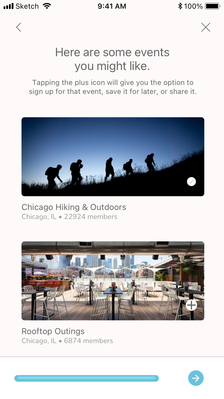
I modified the grid, as the former version was somewhat dense. In spreading out the image, the grid now has visual and textual elements, as well as large icons. This combination makes for good usability thanks to the size of each block. Everything is very easy to read and it’s visually more pleasing, too. I also amended the copy on this view based on some helpful feedback I'd received, as the user might not know where the selected events are being saved: "Is this going into my bookmarks?" "Will I be adding my name to the RSVP list?" "Is this just for the recommendation algorithim?" were all possibilities (among others).
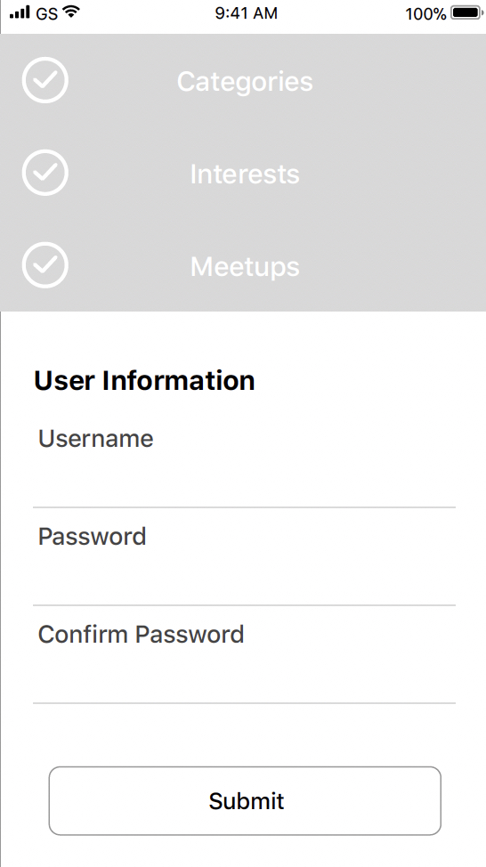
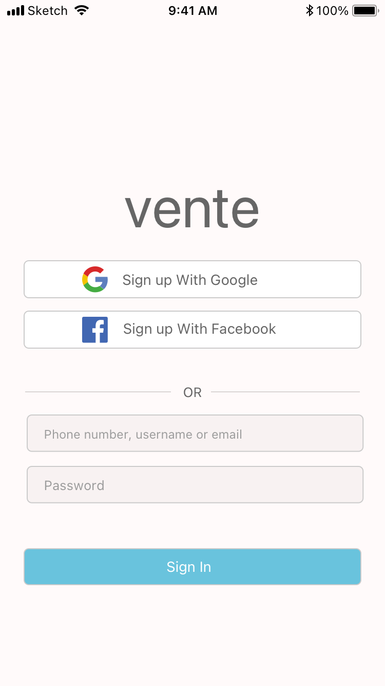
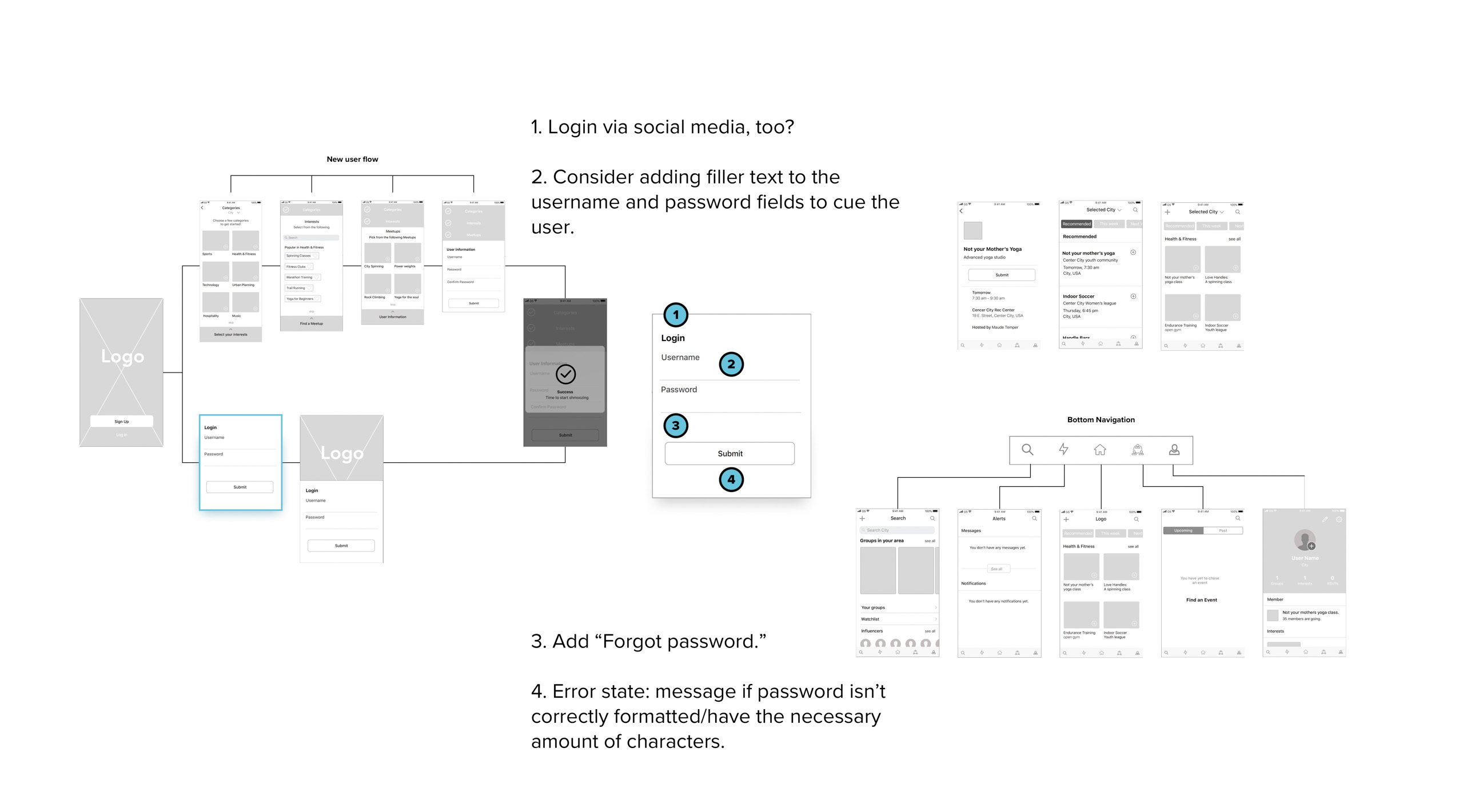
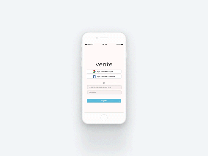
For the sign up view, I added the logo and gave users the option to sign up with either Google or Facebook, thinking that this might give them more freedom, they might be more willing to at least try the app, and it's just one less password to remember.
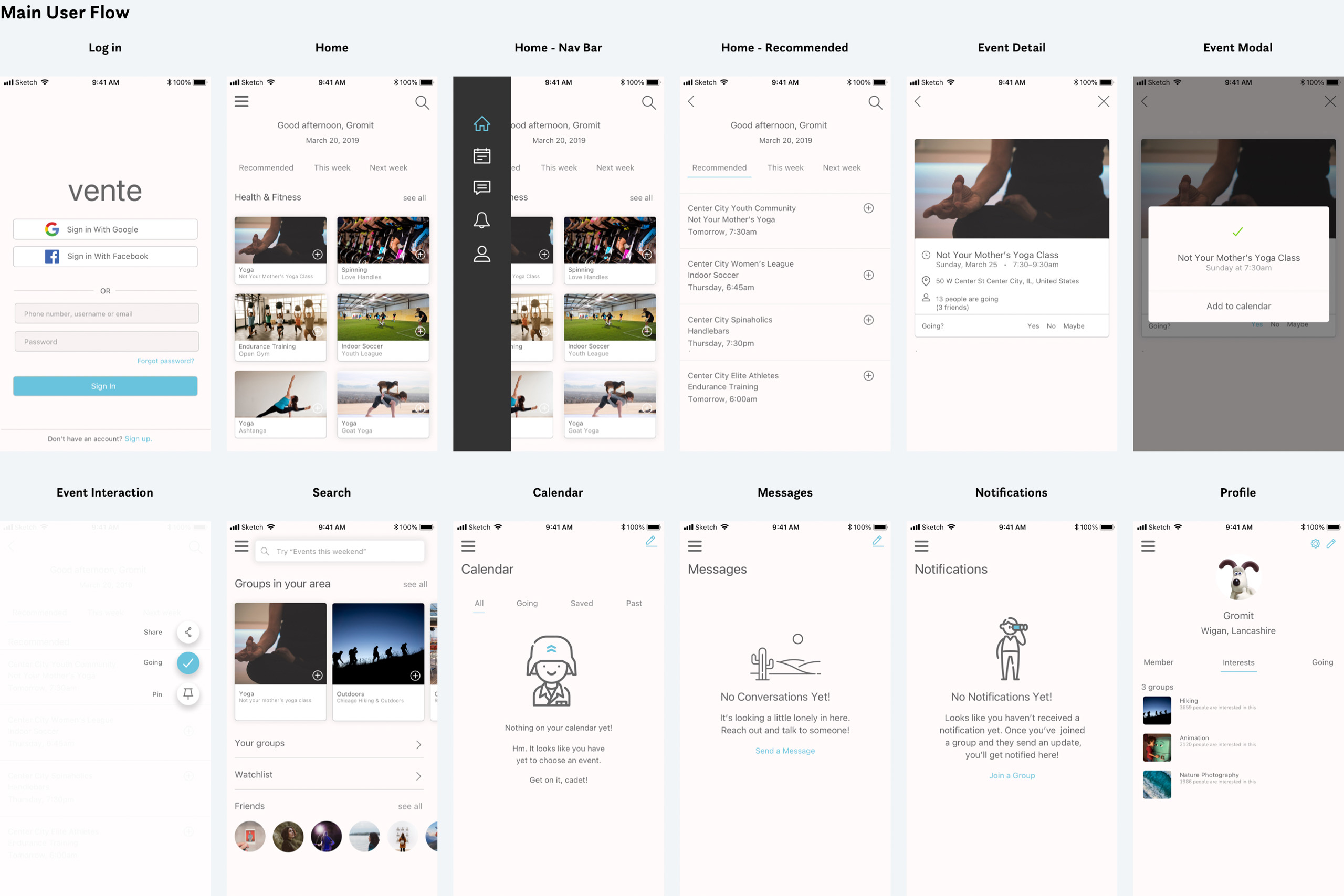
Original

Redesigned
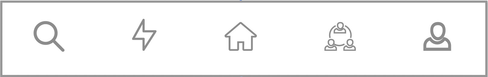
In the original tab bar, there were two glaring problems: not only were text labels missing beneath each icon, not all of the icons are intuitive or common. For example, what does the lightning icon mean? And what about the icon with three people in a circle?
As I was encouraged to think outside the box with this project and given carte blanche creative license, I also went out on a limb with a somewhat unconventional tab bar by both switching it from its usual location at the bottom and always in view to hiding it on the lefthand side of the screen and it would only be viewable when swiping from the left. My design rationale for this decision was that as mobile screens are already small and there would be a lot of content to display, I wanted to free up as much valuable screen real estate as possible.
Original
Redesigned
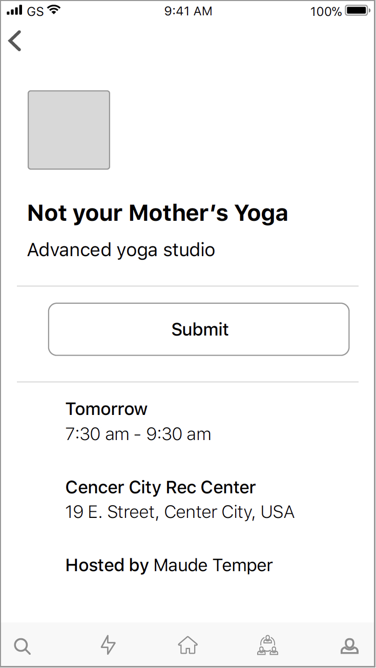
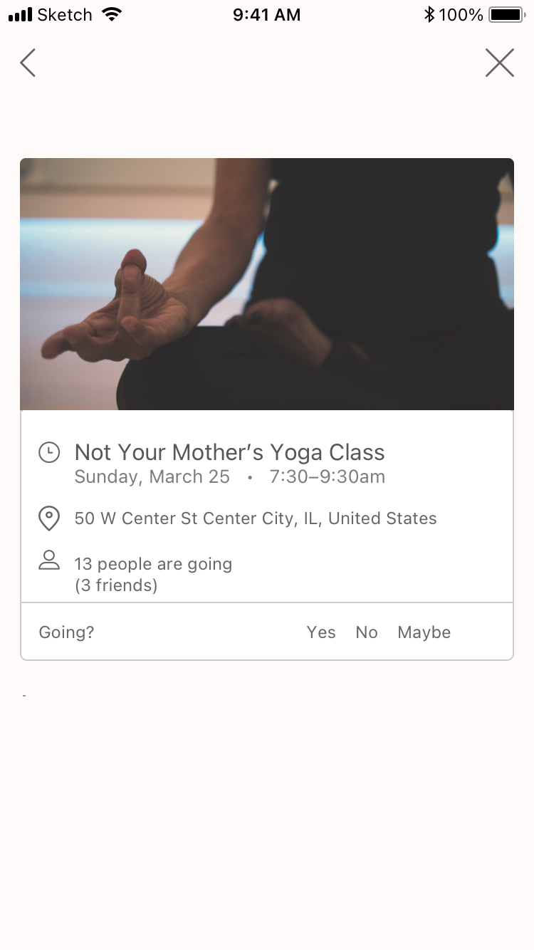
I had my work cut out for me with the event view. To start, I swapped the list view for a card and added an 'X' to escape the event view.
I then chose to display photos that are reflective of the experience and made the event more interactive by adding a swipe gesture (not pictured) that would allow functionality for signing up, sharing, and/or bookmarking.
The 'Submit' button's purpose was unclear to me—"What am I submitting?" I thought. So, I removed the button and added the ability for the user to say whether they wanted to go (or not), as well as if they were currently not sure.
I also added three icons to help the user more readily scan the event for the information they were looking for and added attendance information, including whether any of the user's friends were going.
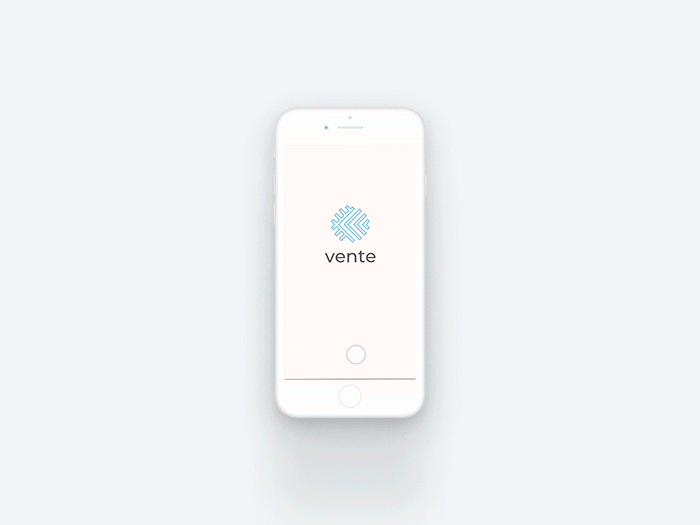
Splash screen
First tutorial
Second tutorial
Third tutorial
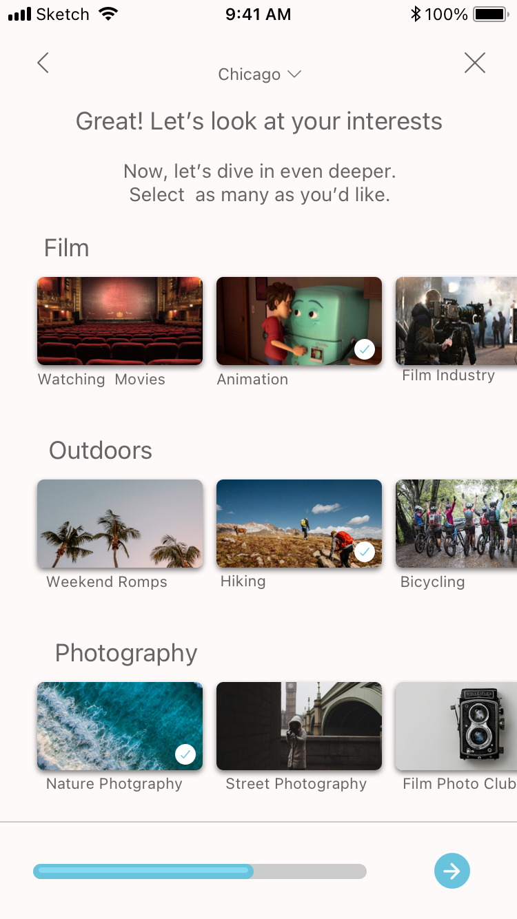
Selecting categories
Selecting interests

Recommended events based on responses

Sign up view
High-Fidelity Mockups
Onboarding flow
As the wireframes were going to require a fair amount of work to bring into high fidelity, I had to make a lot of tiny decisions about the aesthetic, functionality, and flow. However, having well thought-out style tiles really helped with the design process—I didn’t have to worry about getting the hue just right or going through hundreds of typefaces to find the perfect one.
In-app views
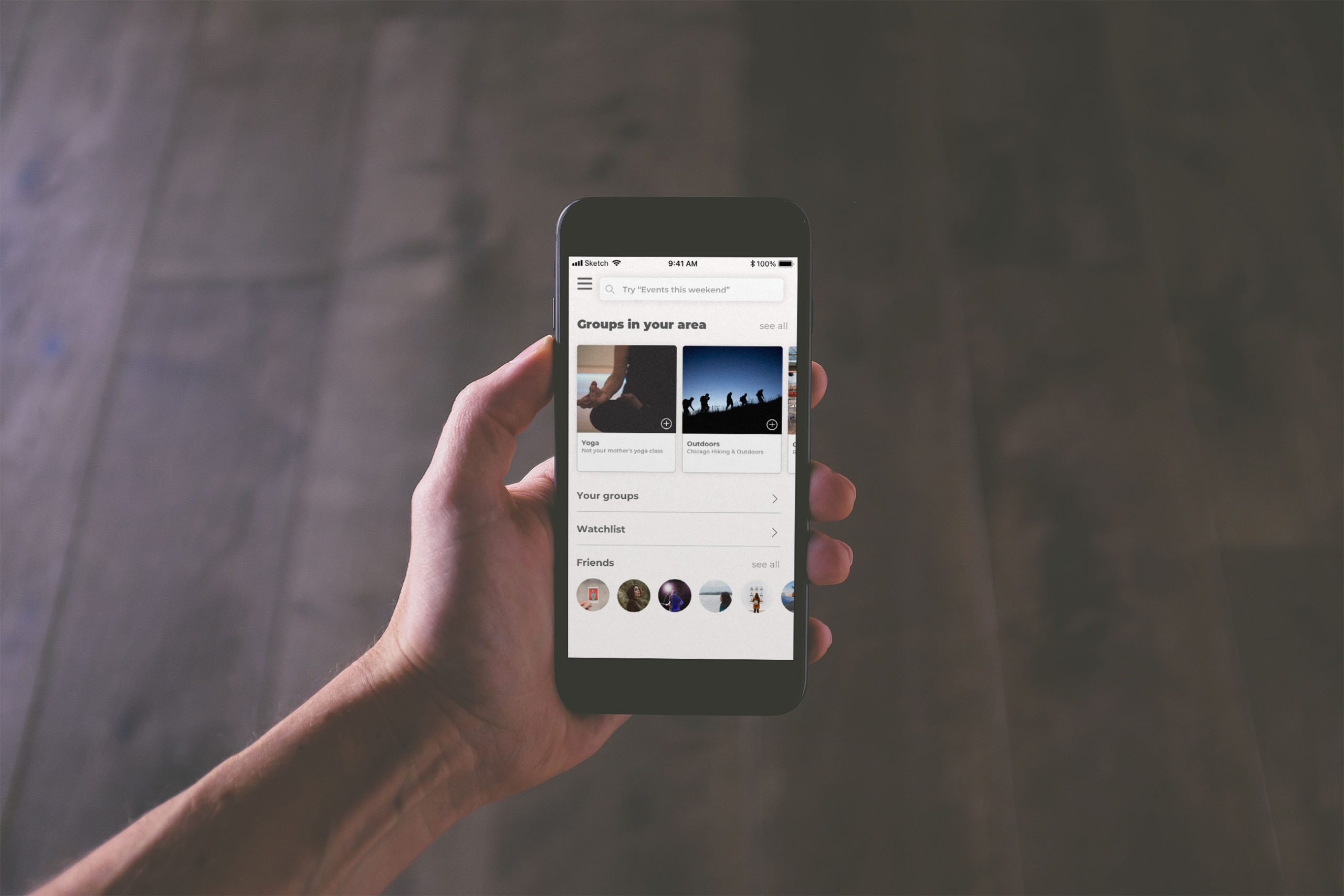
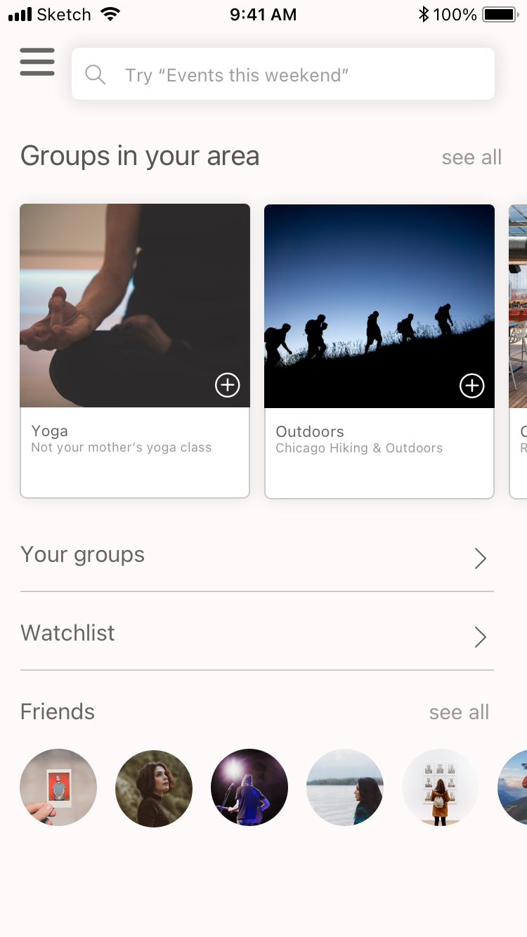
Vente recommends a list of events and activities based on the user's preferences in the Home view. Users can:
- RSVP for events
- Save events for later
- Share them with others
- Use the search function
- Message event hosts
- View their events on an in-app calendar
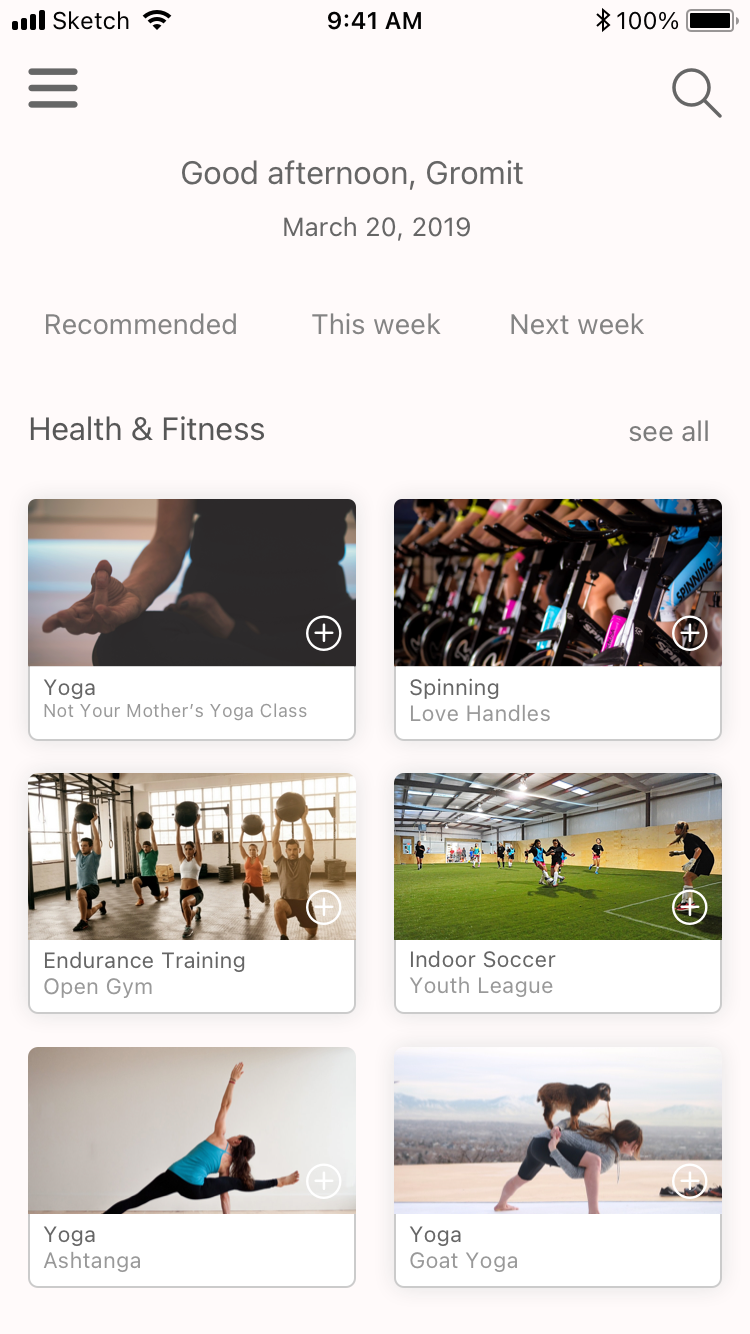
Home view
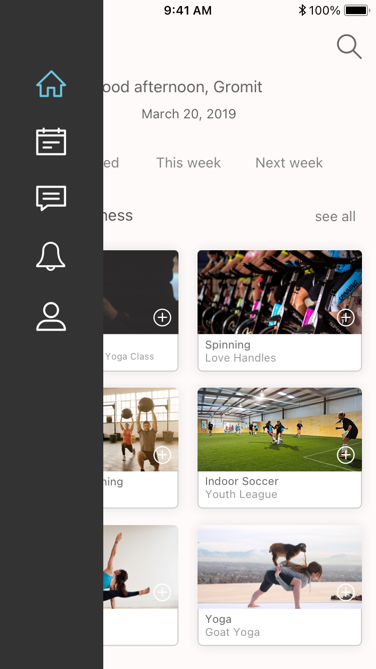
Home view - swipe right for tab bar
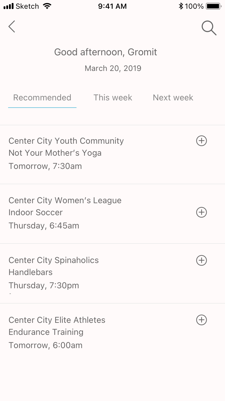
Recommended

Event view
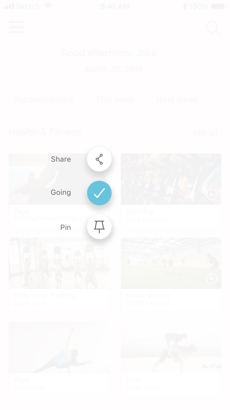
Add event - attending
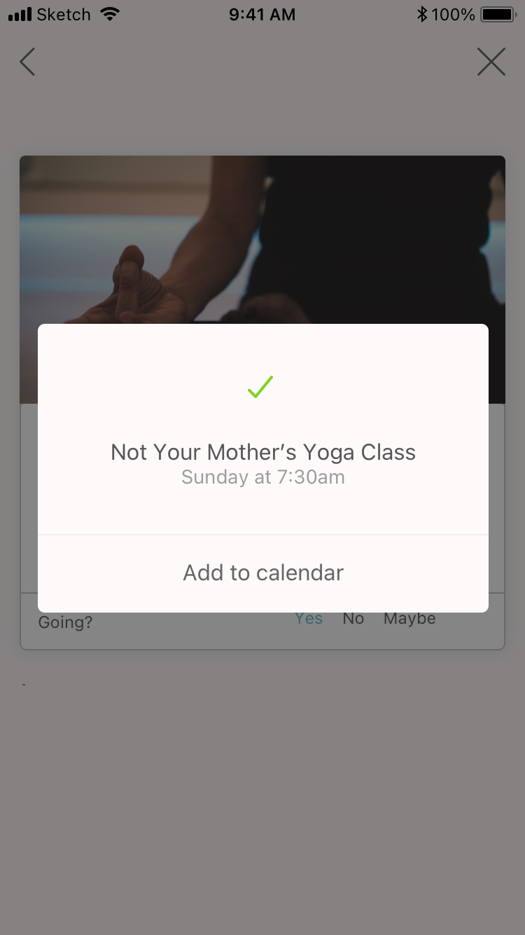
Attending confirmation modal
Search
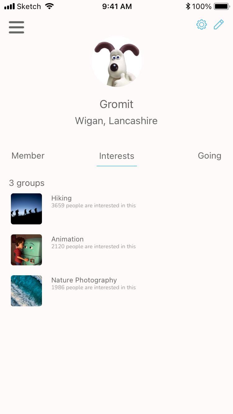
Profile shows groups the user is a member of, their list of interests, and events they're going to
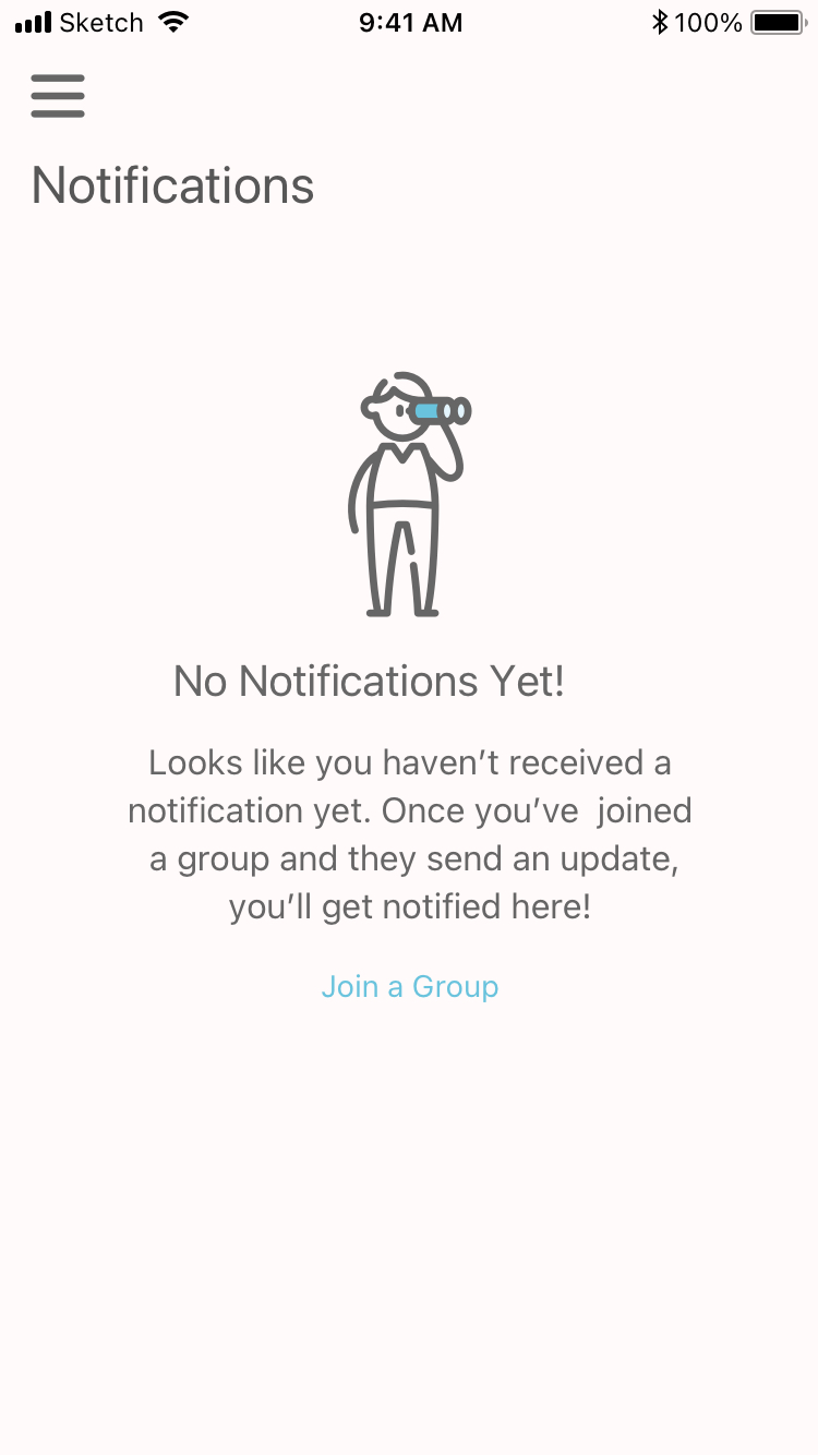
Notifications - empty state
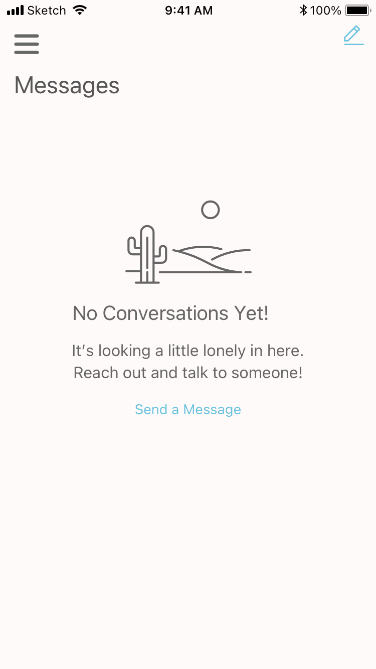
Messages – empty state
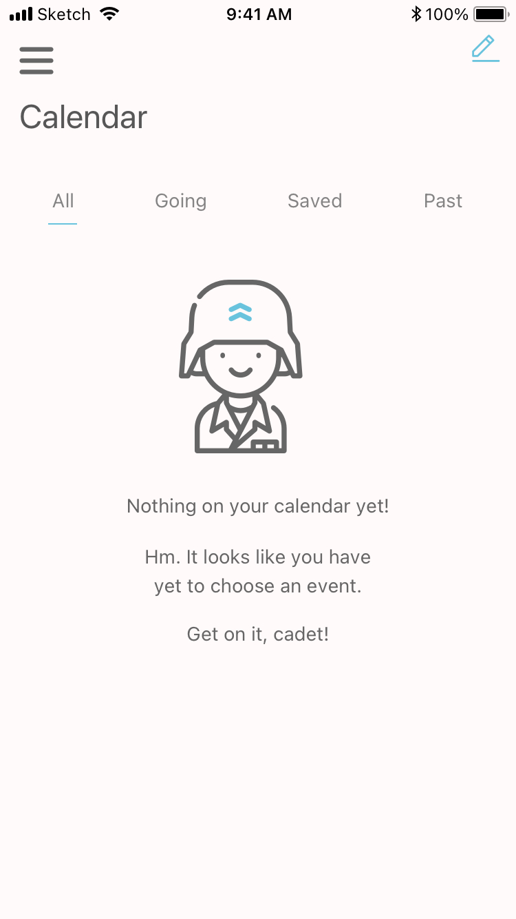
Calendar – empty state
High-fidelity Prototype
A new user's onboarding process.
The app's main user flow for (1) browsing for an event; (2) signing up for that event; (3) reviewing the recommended events; (4) signing up, sharing, and pinning that event; (5) using search; (6) exploring the other functions of the app: calendar, messages, notifications, and profile.
User Testing Takeaways
To see if the proposed design solution was on track, I conducted in-person testing of the first iteration of the Vente app with two users using InVision. Overall, the users found it easy to use, enjoyed the visual design, and commented that in one form or another they liked how it personalized recommendations. They were both able to accomplish the basic goal of the app: to search for and sign up for an event.
Users enjoyed:
- Being greeted by recommended events as well as future events.
- Recommended events: "I like that the app has already picked out a few things for me to do; that's really neat helpful."
- How much information was presented on the event card.
- That they can see events happening in their area.
- The aesthetics: layout, photos, colors ("Looks very modern" and "I find it all very calming.")
Users encountered problems or didn't like the following:
- The plus icons on top of images for attending an event looked "a little dated" or "weird."
- The latter part of the onboarding microinteraction "moed too quickly" for one of the users.
- The functionality wasn’t inherently clear and they were a little confused at times.
Style Guide
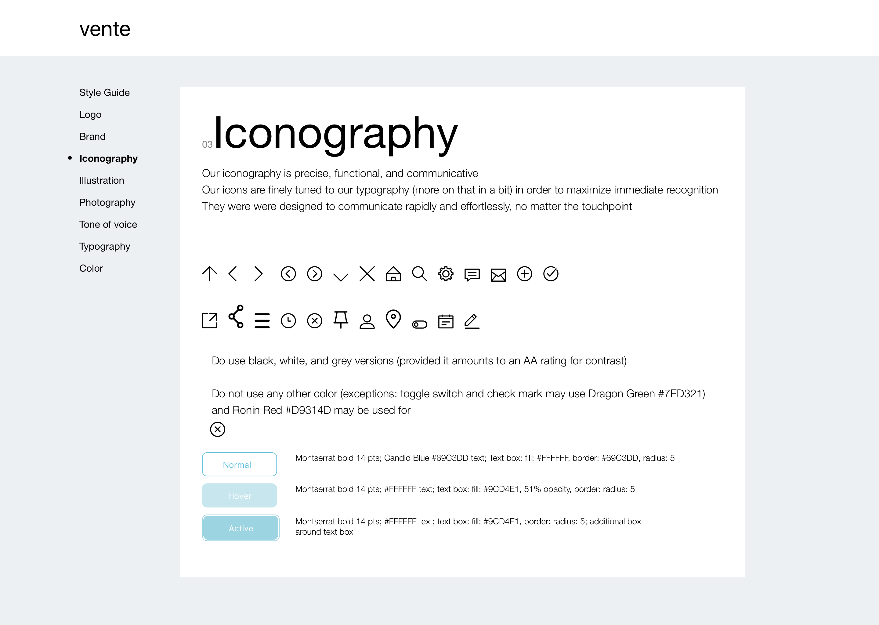
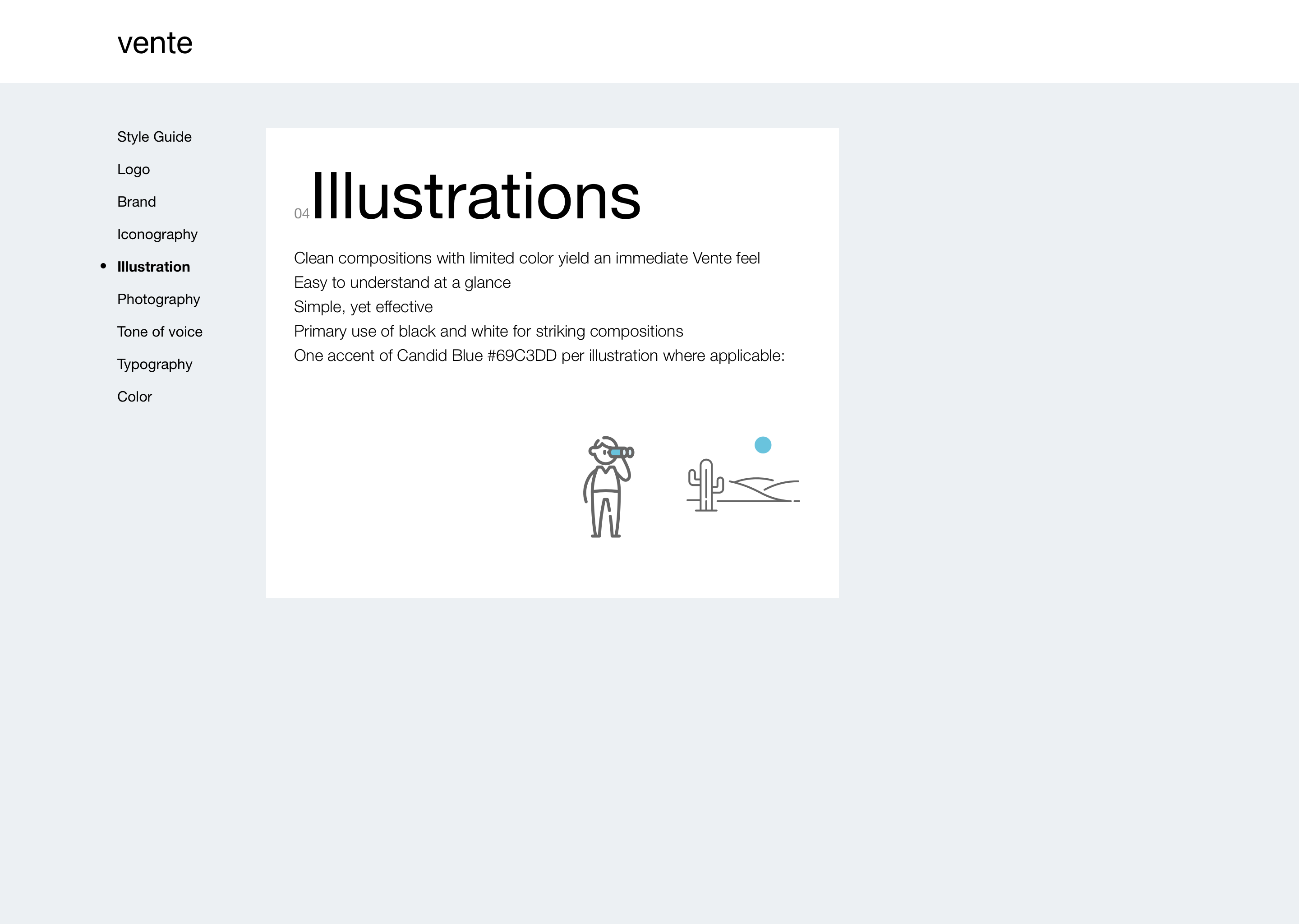
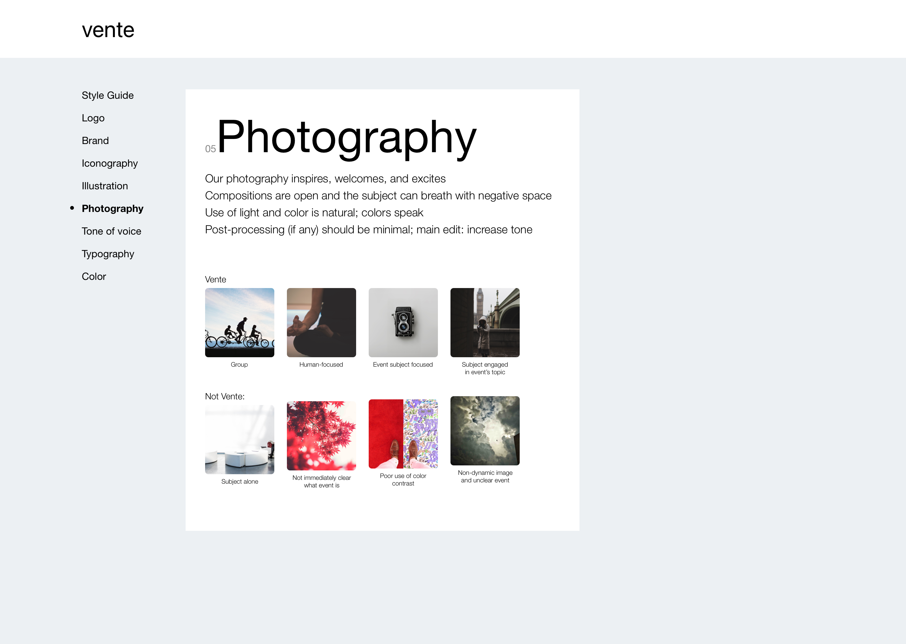
To help guide any future designers and developers, I compiled this for them to ensure they follow the style I'd proposed. It contains the rules and patterns of the UI, including how to use icons, logo, colors, typography, and images.
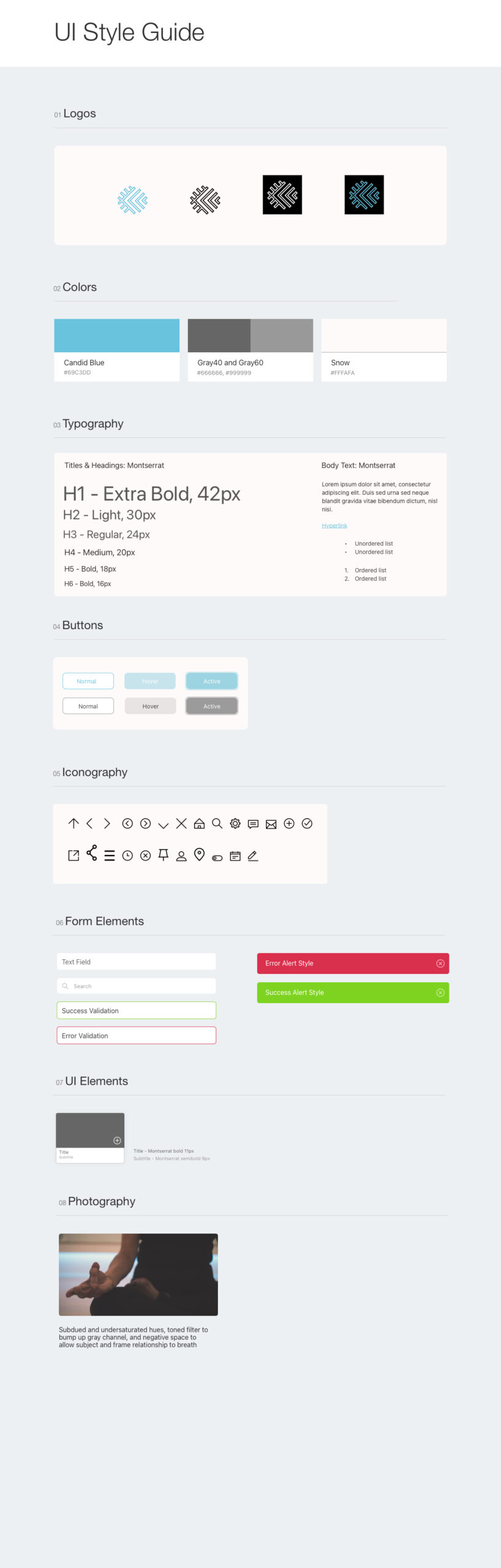
Style guide overview
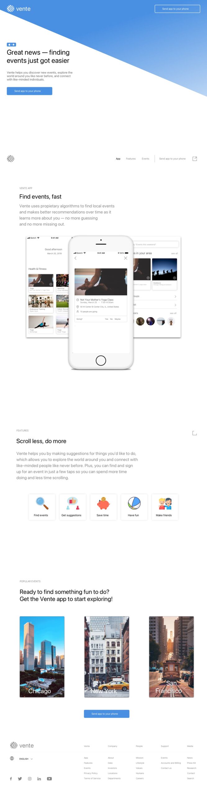
Marketing Site
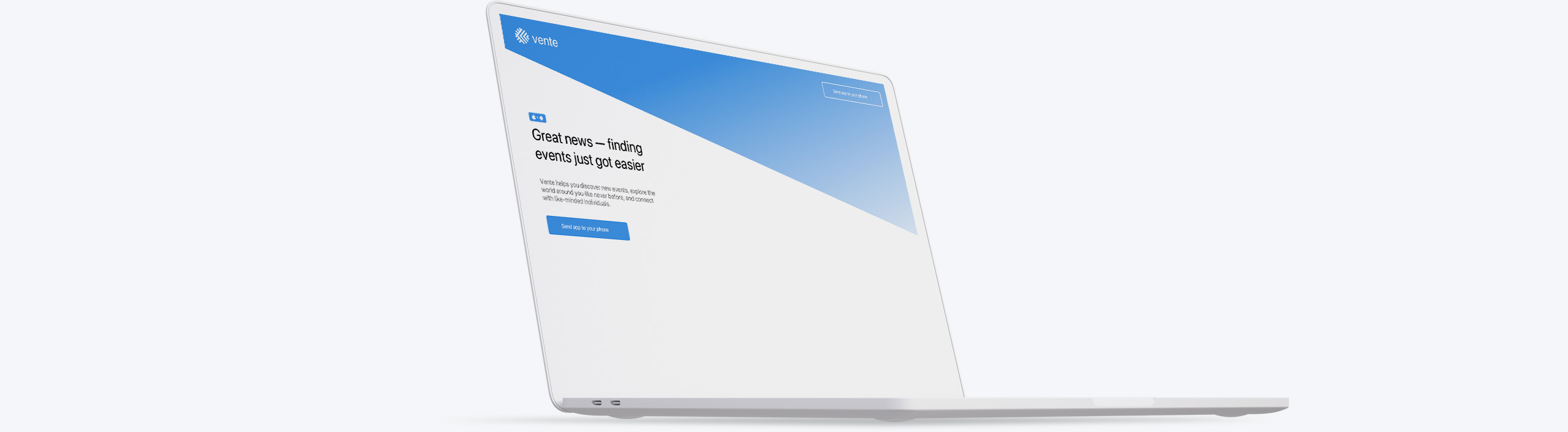
I then designed a responsive marketing website to promote the app while also helping potential users understand the scope of the app's features and benefits.
Well, what now?
Future considerations
If I had had more time, there are two things I’d like to explore with my final product: to do another round of user testing as the feedback I received was invaluable and I’d also like to build the prototype in another program that allows for more exploration of animations.
Reflections and Insights
I failed at many things during the last six weeks. Most of these failures were simply from me not executing at what I perceive to be my typical output performance. So to be kind to myself, it’s not so much that I failed completely—success and failure are not zero-sum and are, instead, a spectrum approaching each pole—but rather that I did not hit the—sometimes impossibly high—expectations I set for myself. Battling my perfectionism has been a long-term work in progress, but this program has helped me enormously see how ultimately damaging that way of thinking is and it's okay to let it go. Sometimes I was simply forced to let it go due to extremely tight deadlines and, with the repetition, it's become a bit like muscle memory—the old feeling would start to come back, but I just shake my head, laugh, and let it go, saying "Sorry bud, we've gotta move on" softly to myself. It's felt amazing.
My design process has changed from the beginning of this phase to the end in that I am much more confident with my ability to provide critique of my fellow designer’s work. In the beginning of the program I struggled with this a bit—I just couldn’t come up with much of anything of use so quickly on the fly as I am the sort of communicator who typically needs time to review, collect my thoughts, and synthesize them—so to exercise this muscle, I reached out to two fellow designers who also had expressed interest in honing this skill. I set up a weekly meeting with them so we could practice giving and receiving feedback—as with all skills, the best “hack” at getting better at something is simply doing it; showing up and doing the work. That always pays off. I still have a long way to go with this, as I still don’t feel I’m good enough at the more incisive but helpful aspect of crit, but I’m steadily becoming more comfortable with it.
Another way in which my design process has changed is that not only do I feel more confident as a designer thanks to taking some deep dives on learning about UI Design, I also feel more comfortable at it at the 30,000-foot view of how it relates to UX and how it segues into/dovetails with Front End devs.
A third way my design process has grown is that I see the immense value of getting feedback so I can iterate early and often; I got a little better at just “getting it out” vs. “getting it right,” but I still have work to do on this front. However, it’s amazing how much feedback and successive iterations really propel you, the product, and your process forward.
Some goals I have for the rest of the program are: remaining at least one day ahead of deliverable dates so I have plenty of time to get feedback and iterate; providing more meaningful critique for my fellow teammates and designers; utilizing my time with my next Creative Director by being more prepared for our weekly check in's than this phase; writing at least one paragraph a day about what I worked on that day so by the time I have to write up a case summary for the project, it's basically already written itself.
Other Projects