Haystack Conferences
It's like Kayak. For conferences.
Project: Haystack Conferences
Role: UI designer
Tools: Sketch, InVision
Duration: Three week-long sprints
What I did
Competitive analysis
Branding
Logo
Style tiles
Web design
High-fidelity mockups
InVision prototype
Desirability testing
UI kit
Style guide
Future considerations
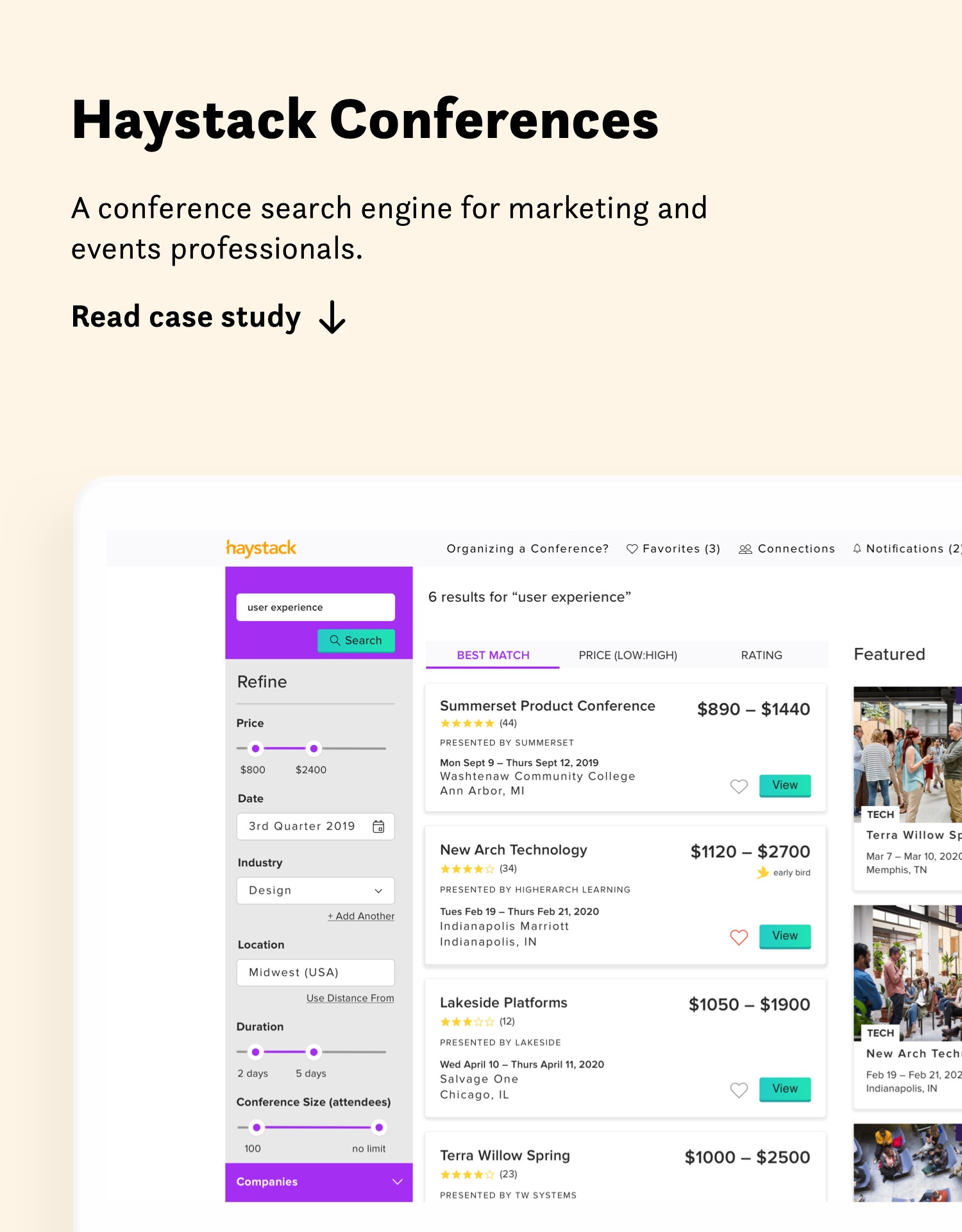
A web platform for marketing and events professionals to discover conferences that match up with their marketing, exhibitor, or sponsorship needs, Haystack's bread and butter is conferences in market research and consumer insights located in the US and Canada. They're aiming to expand this to include the world of larger international conferences with 150-plus attendees.
THE BRIEF
I helped Haystack flesh out their original vision of creating an elegant, intuitive, and highly-usable interface that would provide comprehensive, carefully curated conferences based on the best-fit criteria of its users.
I worked on a "team" (that is, very loosely) with two other designers from Designation and we received very light guidance from two design directors from Designation.
CONSTRAINTS
Our team had just three week-long sprints from kickoff to shipping the final deliverables. However, the client was very design savy and excited to explore as many options as possible, so there was very little in the way of constraints, creative, business, or otherwise.
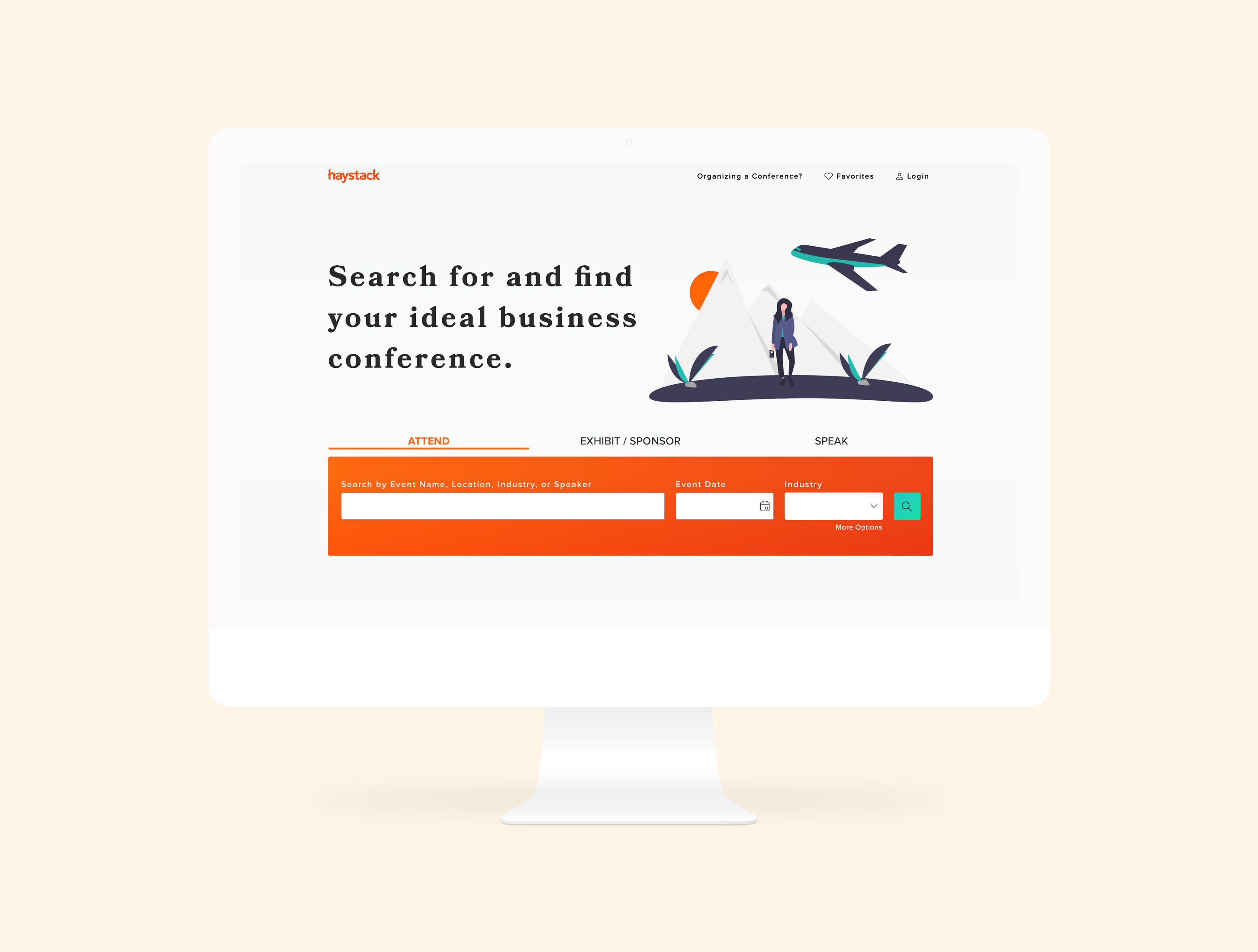
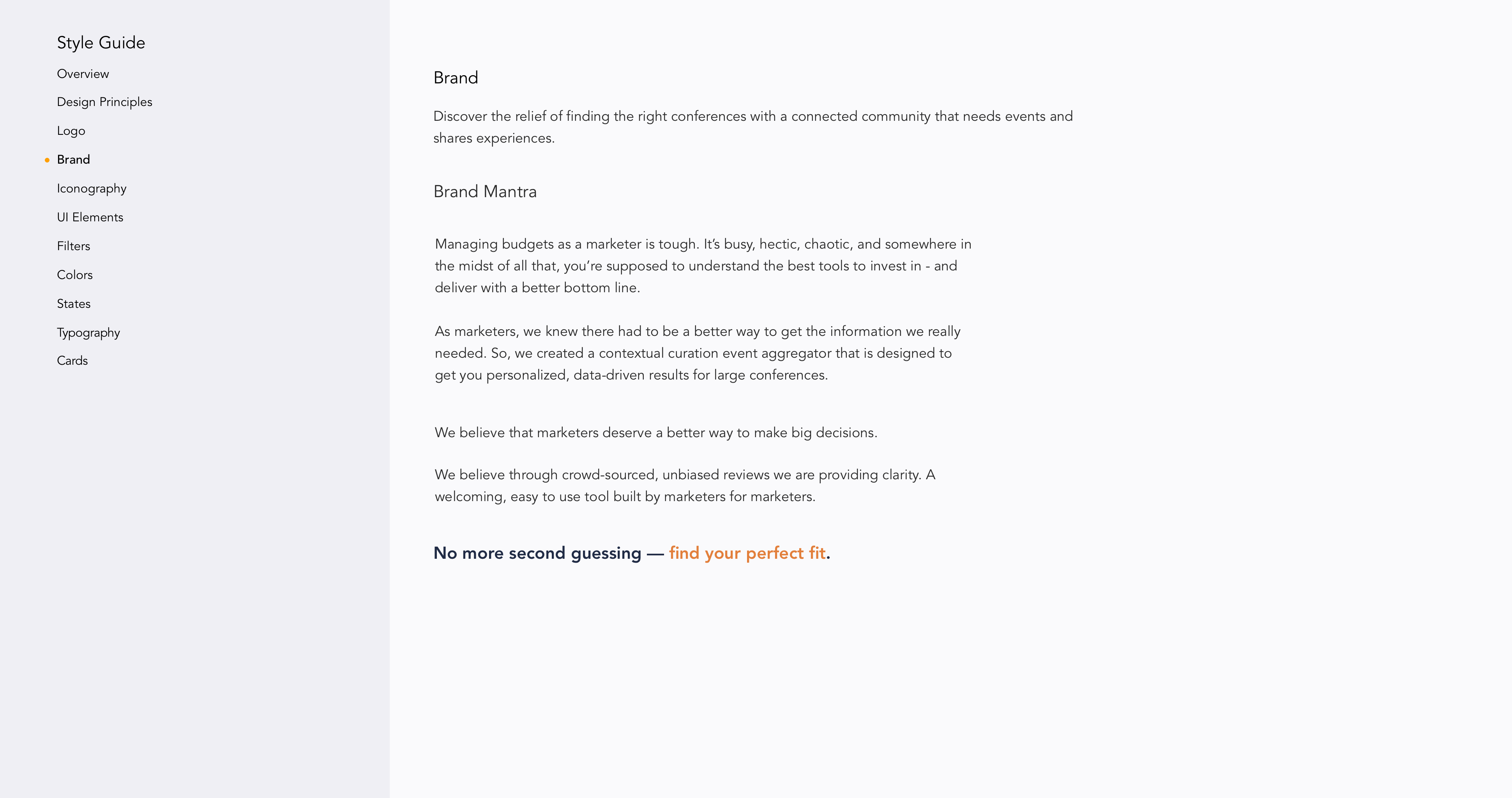
Introducing Haystack Conferences
When it comes to conferences, marketing and events professionals have a slew of decisions to make regarding budget, exhibition, sponsorship, marketing, planning, and attendance. The same could be said for conference organizers.
Melissa Andrews, global marketer and entrepreneur, was frustrated with the current—and limited—number of options out there. Some products were too broad, while others were too narrow. The search results were not particularly helpful and felt more like an index. There's been great advancement with marketing tech, but progress with face-to-face interactions has lagged behind. But she knew that marketing's favorite place to spend was on in-person events; not only are they terrific for generating leads and fostering brand awareness, but they're also the last bastion for social connections and tactile exchanges, as everything else is digital these days.
She had an idea: What if there was a conference discovery and planning product that allowed everyone involved in this process a single, go-to resource for identifying in-person conferences that best meet their marketing and exhibitor and sponsorship needs?
Andrews began working on business planning and, with the help of her UX Design Consultant, Gregory McClendon, began developing proto-personas and user journey documentation. After Andrews and McClendon built initial concept wireframes and ran them through one round of qualitative user interviews and tests, they decided it was time to visit Designation.
Process
Google Ventures design sprints
The Approach
Our team considered our kickoff meeting to be an opportunity to learn from Melissa and Gregory. We wanted to:
Hear the business’s origin story and history.
Understand the current brand landscape.
Elucidate design direction
Confirm alignment on final deliverables.
What success looked like for them at them at project close in order to ensure we were all completely aligned from the beginning.
We learned that, at a high level, our project’s scope was to define and build Haystack’s brand and define a visual design system for its primary user flow, core information architecture, and content strategy. More specifically, they described Haystack as fun, clean, modern, easy, robust, and trusted; the last adjective was essential as they’d learned from users that many only pick conferences that a close friend or professional acquaintance has vetted.
“Many of the users we interviewed wanted something that felt like a trusted friend.”

Melissa Andrews
Founder, Haystack Conferences
Our client was interested in a combination of brightly-colored and strongly-contrasting illustrations that balanced professional yet creative feelings and conference-themed images. They expressed a preference for a serif, sans-serif type pairing, provided that the sans-serif utilized predominantly geometric shapes in order to evoke a friendly yet approachable feeling. They were clear that our design system should employ atomic design for ease of future iterations and scalability.
“Keep things fun, somewhat whimsical, and employ a vibrant and bold use of color while also keeping it fairly clean with lots of whitespace.”

Gregory McClendon
UX consultant
UX WIREFRAMES
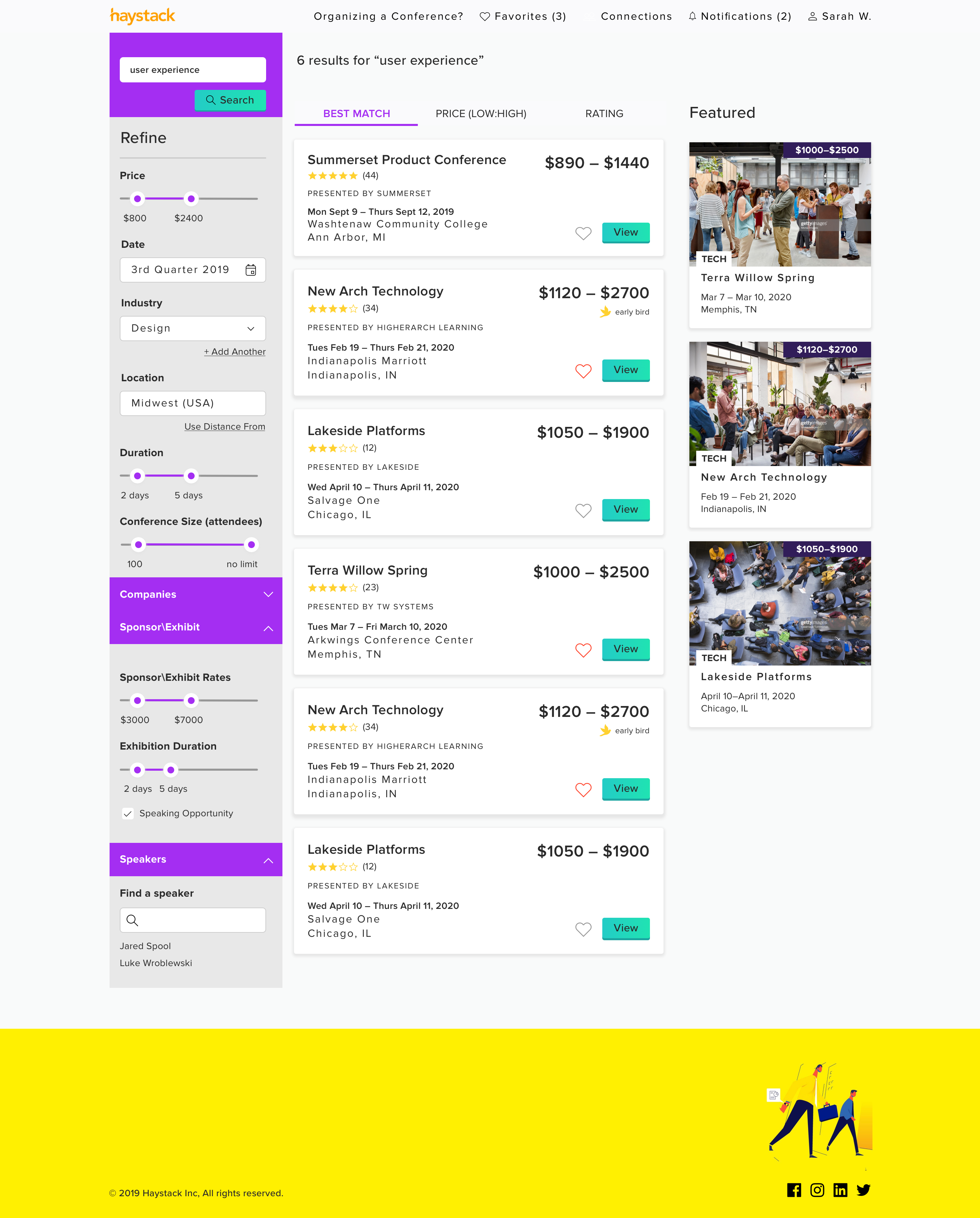
The proposed design of the application included user interface screens of an initial landing page, search, and an individual conference details page. We concentrated primarily on these three views, but also created additional design solutions for onboarding, bookmarking, the user profile page, notifications, and the user’s social connections within the app in order to create a more fully-fledged experience.
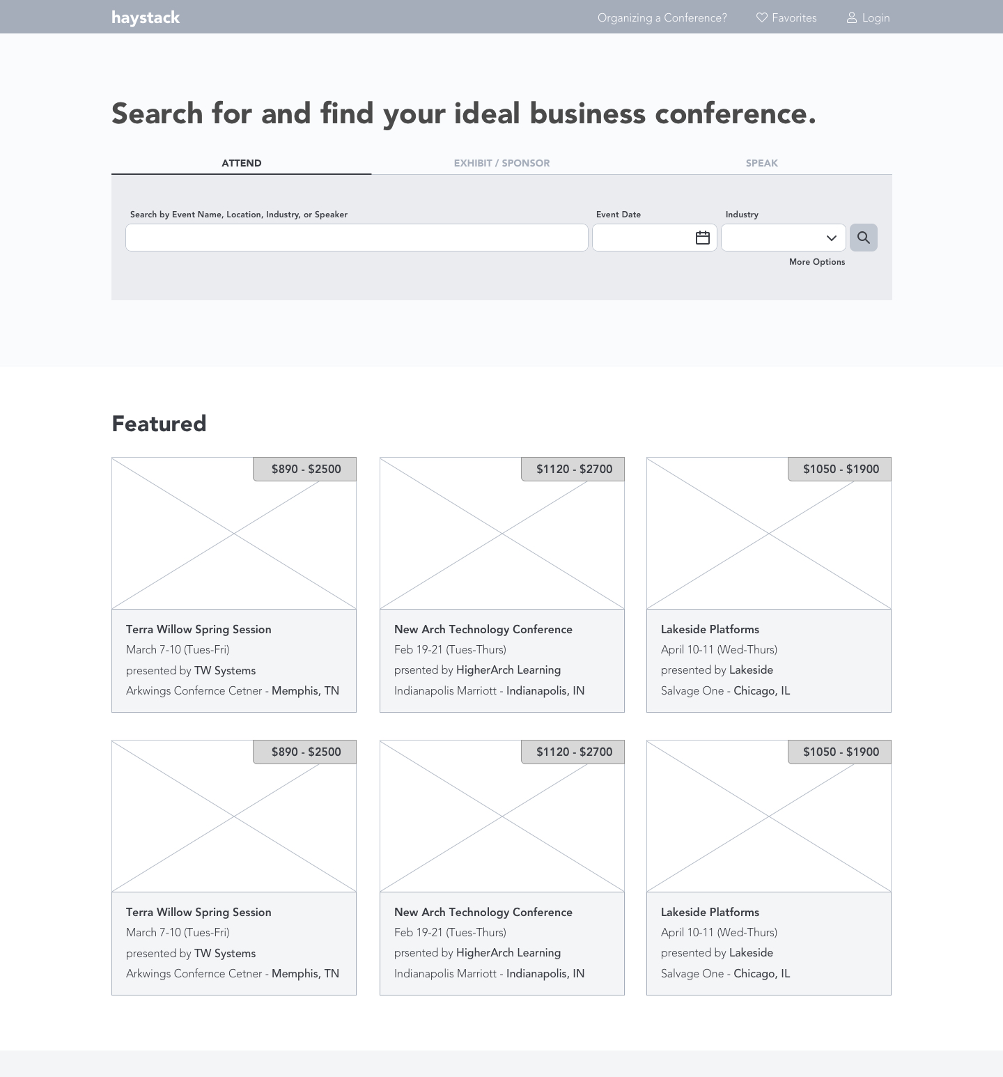
The home view.
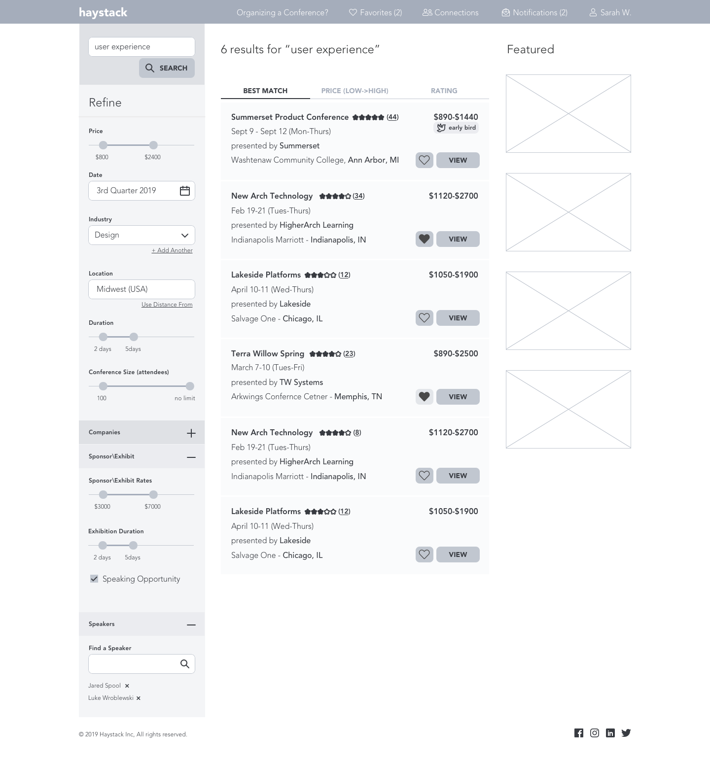
Search results
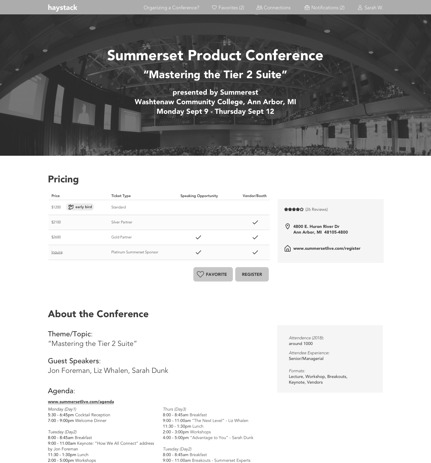
Conference details view.
RESEARCH
After reviewing the UX deliverables, which included the creative brief, wireframes, and three proto-personas, we learned that marketing and events professionals as well as conference organizers were in dire need of a one-stop shop to make decisions about conference exhibition/sponsorship, marketing, and attendance. They needed a tool that:
- Alleviated the burden of a manual and cobbled search.
- Was robust yet easy to use.
- Users could trust.
To learn about market trends in this space, discover opportunities for product differentiation, and gather inspiration, our team conducted a visual competitive analysis of direct competitors and out-of-category inspiration. Haystack's direct competitors included 10times, AllConferences, ConfEvent, DataFox, and EventBrowse. Our out-of-category inspiration came from the likes of Evernote, Airbnb, and Slack.
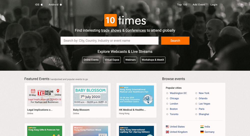
10times
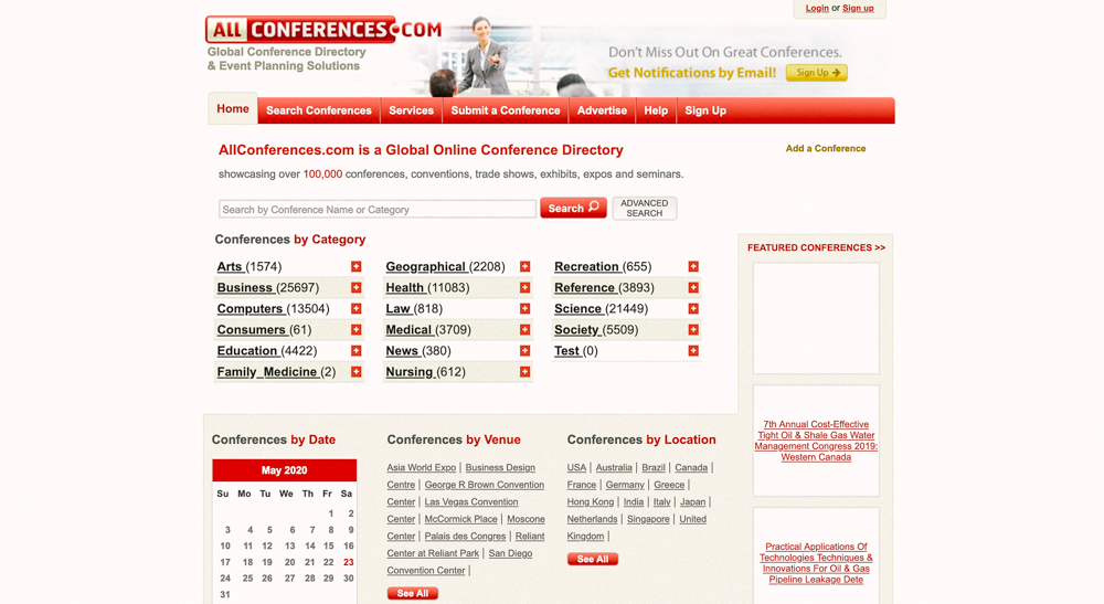
AllConferences
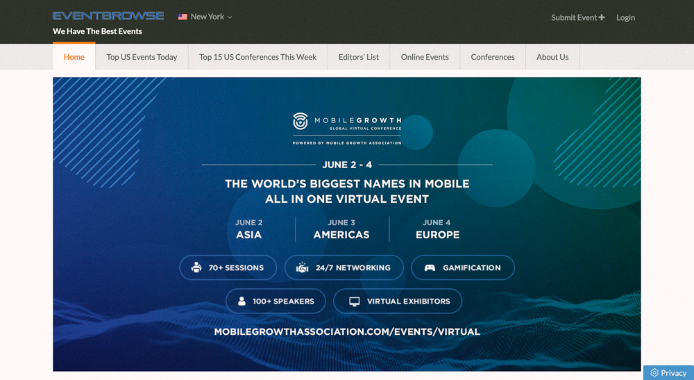
EventBrowse
From this, we gained these key takeaways:
Sixty percent of the competitors utilized dated, clunky, and poorly-designed websites that exhibited little to no thought given to neither the UX nor UI.
The market was currently divided 50/50 between warm and cool palettes.
Whitespace was being used well by only 40 percent of the competitors.
All of the competition exclusively used sans-serif typography.
After synthesizing these results, we came to the following objectives about our design direction:
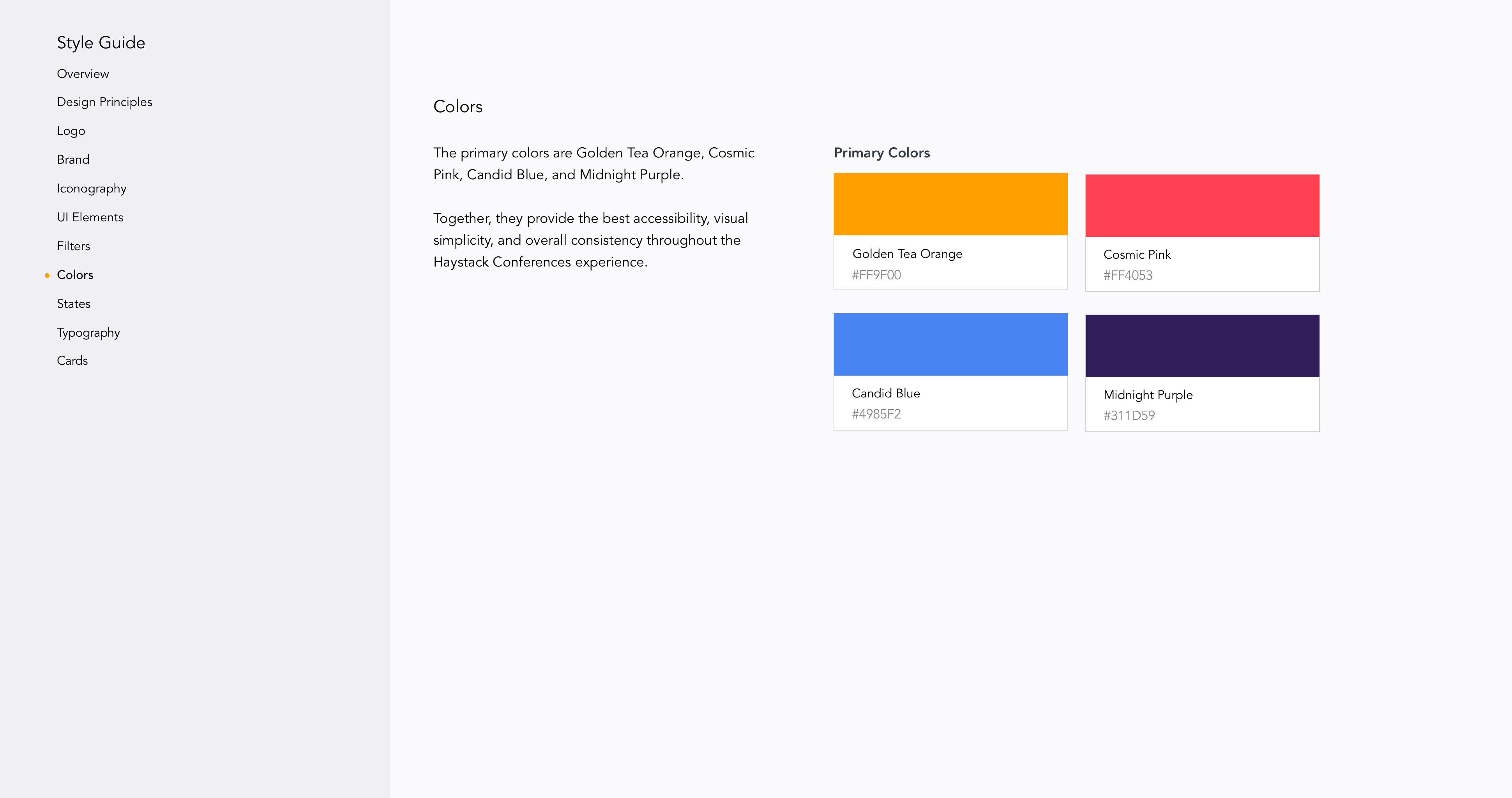
We would utilize warm, bold, and friendly colors. This would convey a positive association in the user’s mind by associating Haystack with friendly and inviting feelings.
Using generous amounts of white space would reduce clutter, differente Haystack from its competitors, and ensure it looked sleek and modern.
We wanted to explore a serif display and sans-serif typography text pairing. Using a serif for hero-level headings would align Haystack with current emerging design trends while invoking a sense of uniqueness and enhancing readability and accessibility. The sans-serif for body text would enhance readability and accessibility of the text-heavy screens. Together, this pairing would lend a sophisticated yet friendly look and feel to the design.
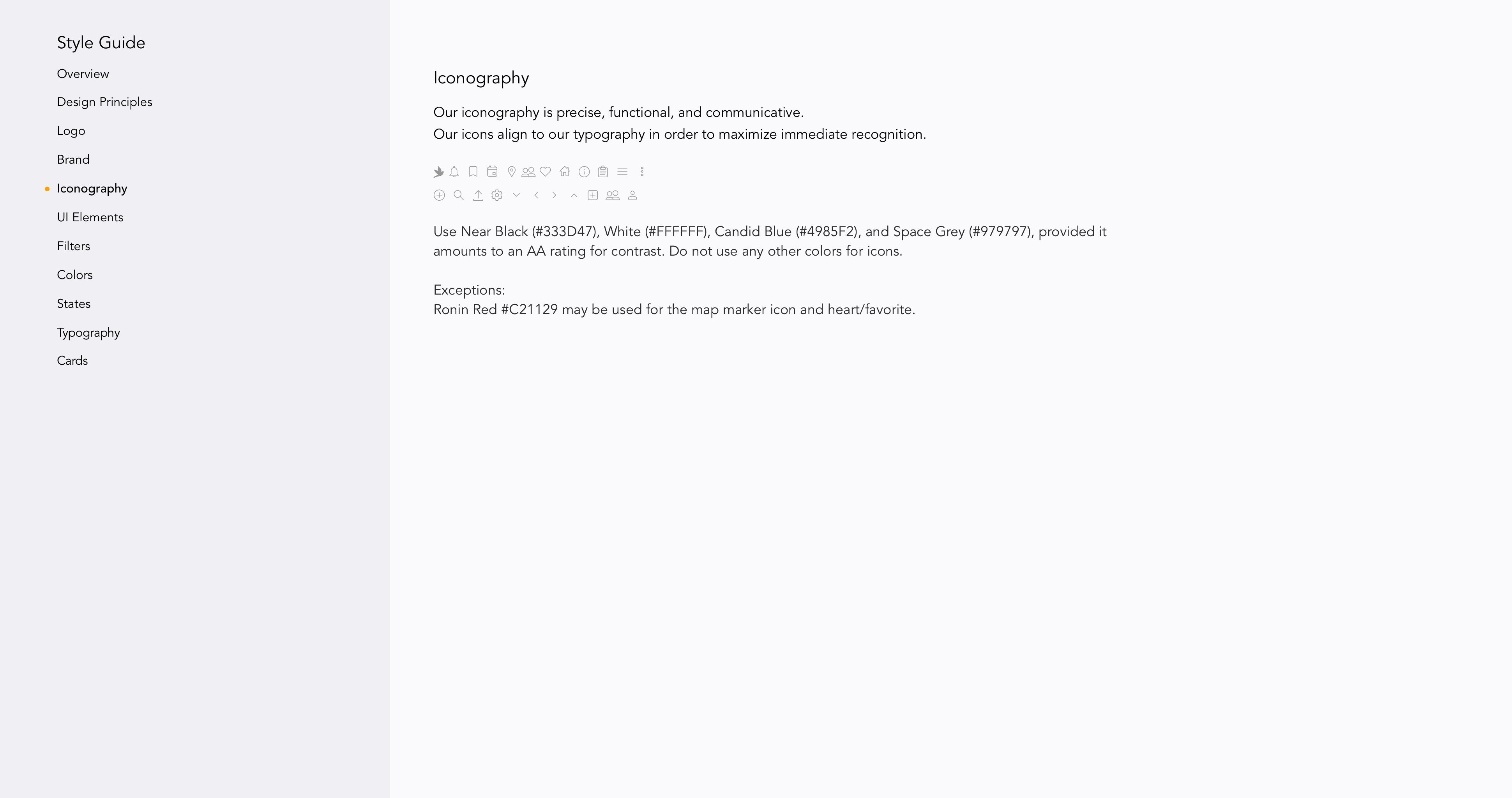
Finally, we would leverage illustrations to provide a visual reference, help users better understand content, and impart a friendly and, to Gregory’s point, whimsical tone to the aesthetic.

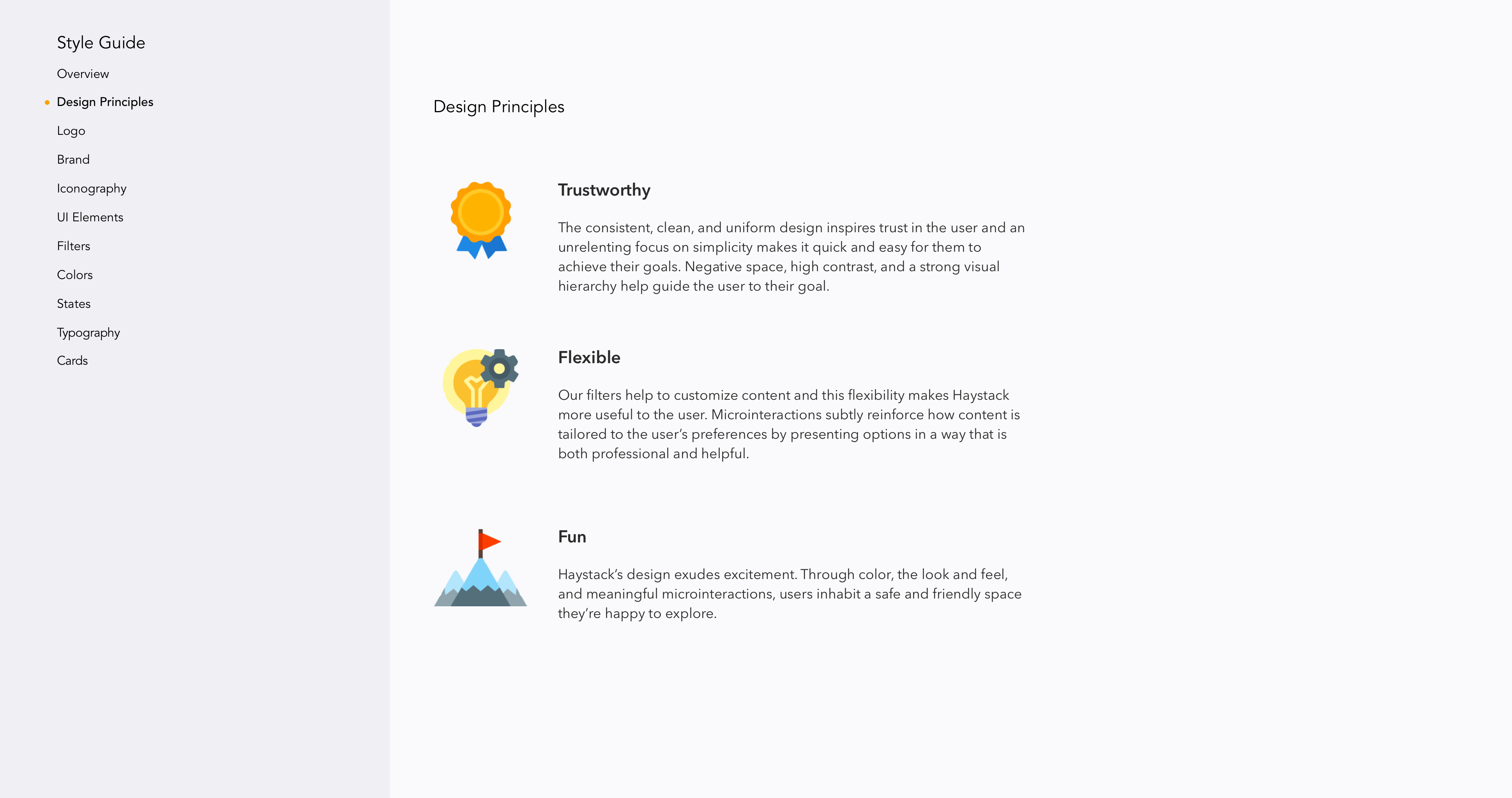
The consistent, clean, and uniform design inspires trust in the user and an unrelenting focus on simplicity makes it quick and easy for the to achieve their goals. Negative space, high contrast, and a strong visual hierarchy help guide the user to their goal.
STYLE EXPLORATIONS: INITIAL DESIGN DIRECTIONS
We came together as a team to discuss what we’d learned so far and how that would inform our next step of solidifying our design direction: drafting our design principles. These guidelines reflected the knowledge and experience we’d accumulated thus far from both our kick-off meeting and research.

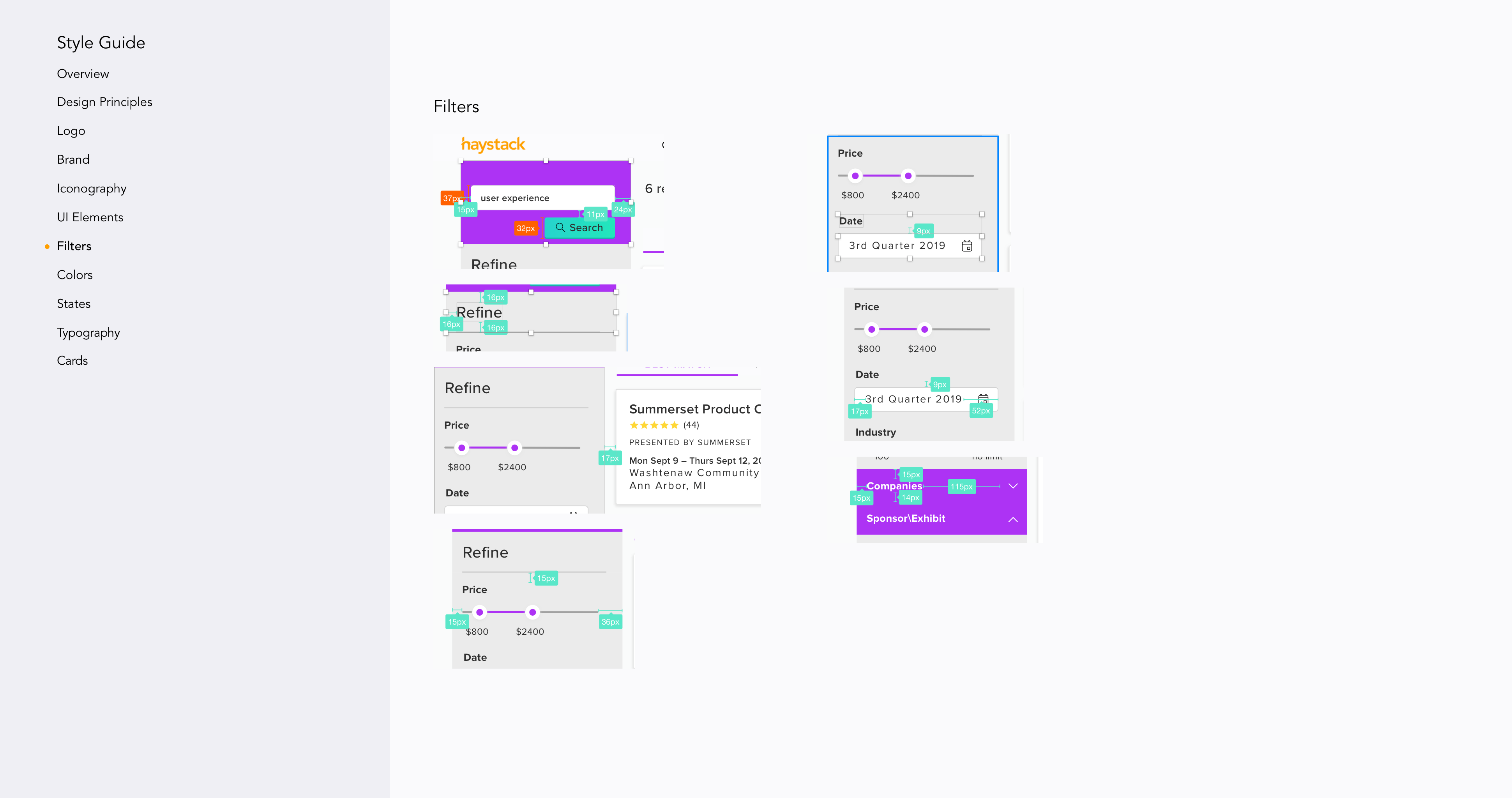
Our filters help to customize content and this flexibility makes Haystack more useful to the user. Microinteractions subtly reinforce how content is tailored to the user's preferences by presenting options in a way that is both professional and helpful.

Haystack's design exudes excitement. Through color, the look and feel, and meaningful microinteractions, users inhabit a safe and friendly space they're more than happy to explore.
With the design principles defined, and taking into account what we’d learned from the kickoff meeting about the user and business needs, I began creating three divergent potential design direction concepts.
Using our design principles as a framework, I then translated these three moods, folded in some potential UI elements, and created three distinct style tiles. These three concepts served as a tool for exploring the intersection of the client’s and the user’s visual preferences. I intentionally designed three divergent styles for two reasons: firstly, to explore possible styles that would hopefully resonate with different facets of our user’s lives and, secondly, in order to give our client a wider variety of design directions to choose from.
The Vibrant and Bold style tile.
"This feels modern without being overly techy-y" — User
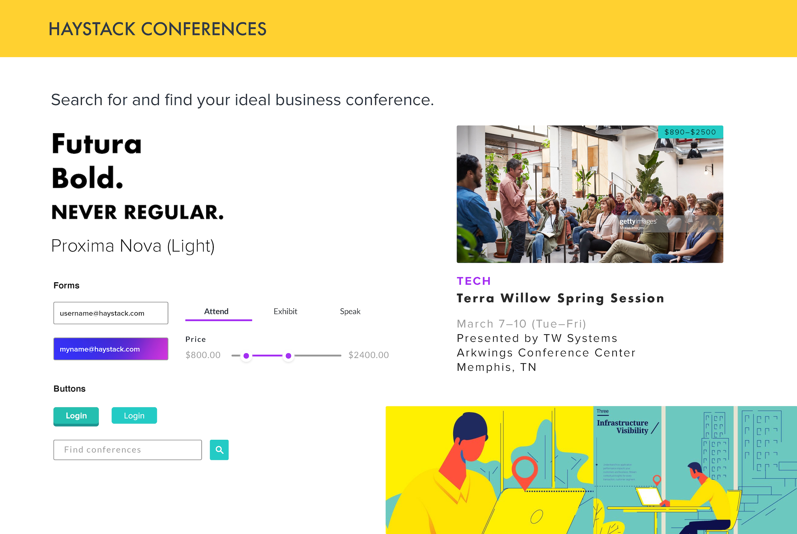
The first direction sought to capture a sense of boldness, energy, and excitement through the utilization of a vibrant hay yellow, a striking purple gradient, and an ocean green. I intentionally leveraged this particular yellow in an attempt to capture the excitement that one might experience when attending a conference.
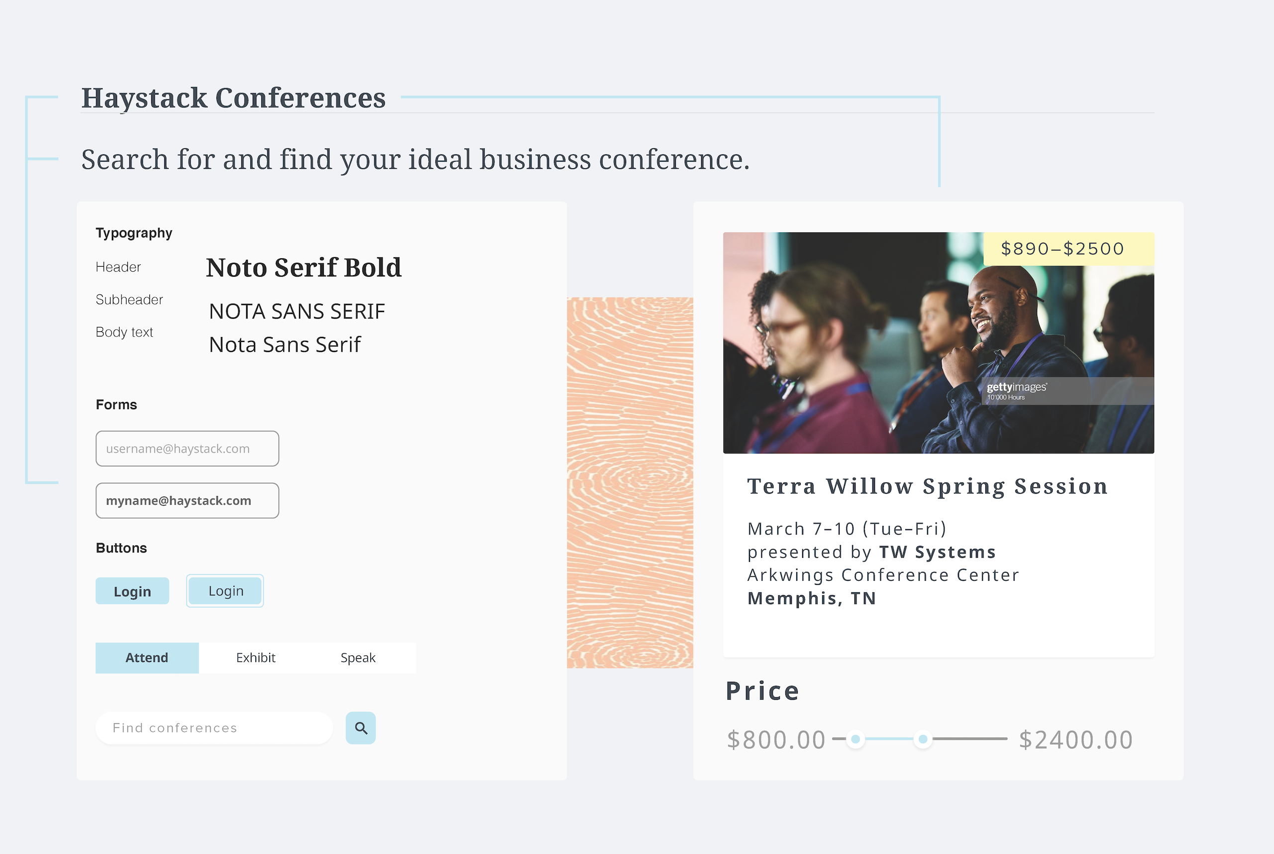
Clean and Calm.
The second direction was an exploration of a clean, minimal, and somewhat feminine aesthetic. Based on the fact that a slight majority of users were female and Melissa had voiced an interest in it, I was curious to explore a feminine color palette, but not too feminine.
To achieve this, I settled on subdued hues of a desert-orange coral and aquamarine blue, soft edges, and abstract patterns that could augment the visuals without drawing too much attention to themselves. Meanwhile, images’ contrast were bumped up ever so slightly to offer a healthy juxtaposition with the relative softness of the rest of the design.
Based on the information we’d received during client kickoff, I wanted to find a humanist typeface similar to Open Sans—where beautiful design meets versatility—in the form of a serif, sans-serif pairing. I was also thinking a little ahead at this point, as I was beginning to envision Haystack’s UI with a flat design treatment, for which this type would only strengthen. For these reasons, I chose Noto Serif and Noto Sans Serif.
Modern and Professional.
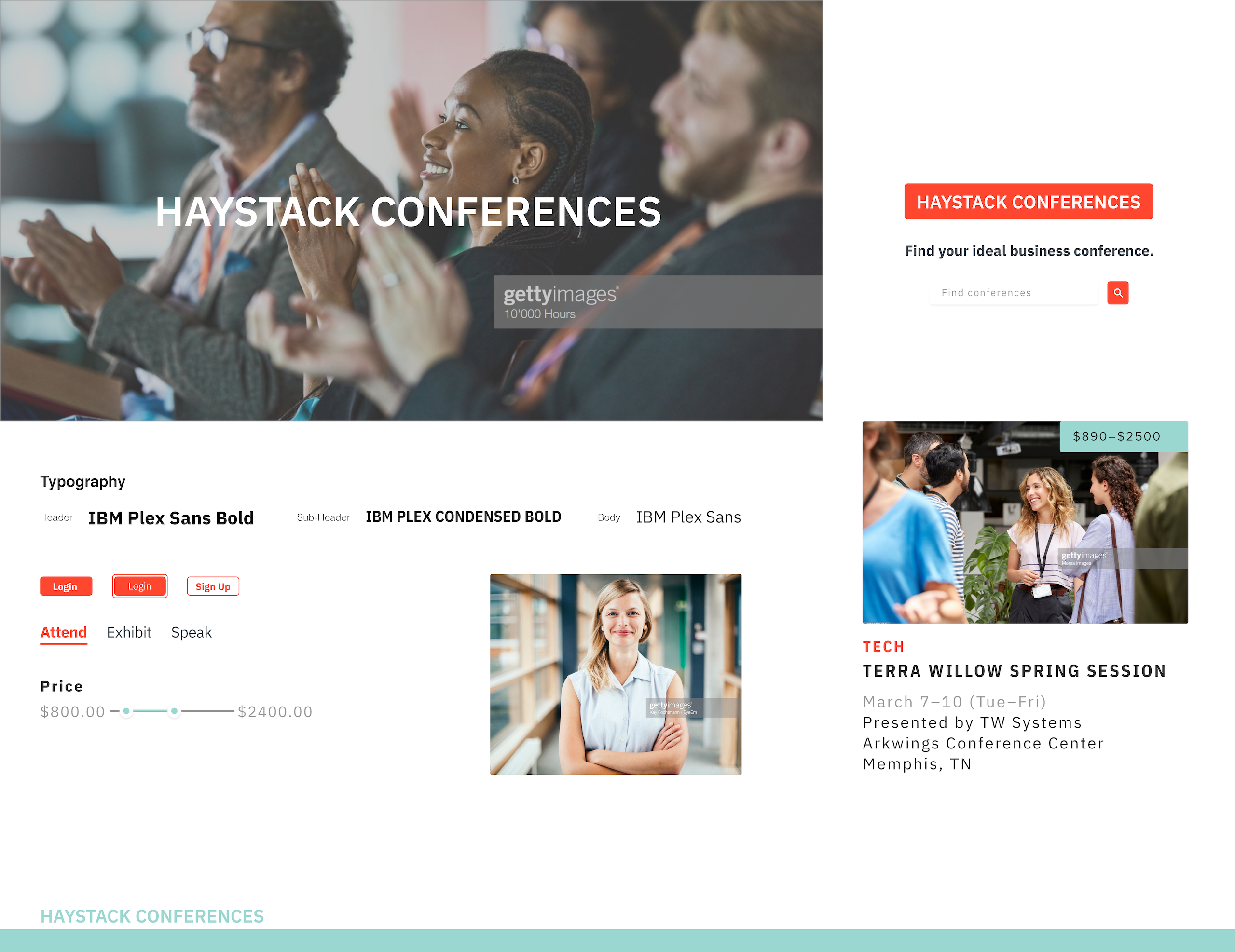
The third and final direction sought to pitch it straight down the middle—to blend the boldness and vibrancy of the first style with the moderate femininity of the second. A warmer, more vibrant (and less visually shocking) deep reddish coral pairs with a seafoam green to dovetail a sense of energy and excitement with calm, smoothness, and quiet strength.
Corners are somewhat softer than the first, but not as much as the second. The typeface, IBM Plex Sans, is a nod to American gothics, but is more legible and I chose it for its more formal qualities, versatility, and how it balances the organic with the engineered; it’s modern, but it still has soul.
INITIAL DESIGN DIRECTION FEEDBACK
Our team conducted the first round of desirability testing by putting all of our style tiles in front of three users. Testing revealed that users clearly preferred the first style tile due to its energy, sense of excitement, and urgency while the other two didn't resonate enough with them. They described experiencing feelings of calm, warmth, and feeling invited, but one wasn't exciting enough while the other didn't feel specific enough.
After synthesizing the results of the tests, we arrived at three key takeaways:
- Creating a sense of excitement was paramount.
- Users gravitated towards designs that felt optimistic, light, and friendly yet also somewhat professional.
- The aesthetic shouldn’t demand too much attention and must exhibit a certain sense of impartiality. It should take a backseat and act as a canvas in order for the individual conferences to take center stage and shine.
At the end of our first design sprint we met with Melissa and Gregory, where we shared the results of our visual research, explained our design principles, and ensured we were aligned with our potential design directions. They were very excited about the process, receptive of what we had to say, and very enthusiastic about and supportive of our designs.
They felt that, from a design perspective, all of them were well executed, but Gregory felt strongly that the first style of "Vibrant and Bold" would be the strongest design direction for further exploration. As this tested the most positively with users, I moved forward with that direction.
HIGH-FIDELITY MOCKUPS
With the direction forward carved out for me, a nod from the client, and a set of high-fidelity wireframes in hand that had been tested by Gregory, I began the next step of creating high-fidelity mockups in Sketch. We had been given explicit instructions that, as the key screens of the wireframes had been thoroughly tested (e.g., landing, searching, and an individual conference’s screen), we would have to stick to them closely; the ancillary screens (e.g., profile, favorites, social connections, etc.) were only lightly tested, so we had more creative license to explore possible directions with these and make potential design improvement recommendations accordingly.
As Haystack was still exploring their branding, for the first round of desirability testing I shifted my focus to helping them land on something color-wise that they knew would resonate with their users.
I incorporated many of the elements from the “Vibrant and Bold” style and revisited our Design Principles to re-center my direction. On the one hand, a bold hay yellow, ocean green and purple palette, combined with semi-curvy border radii and illustrations, were used to impart a sense of excitement, being inviting, and friendliness in the user. On the other hand, ample white space and a geometric-yet-modern sans-serif typeface would impart a sense of professionalism and trustworthiness.
The first version of the search results page, before (wireframe) and after (high-fidelity mockup). Drag arrows to view the proposed changes.
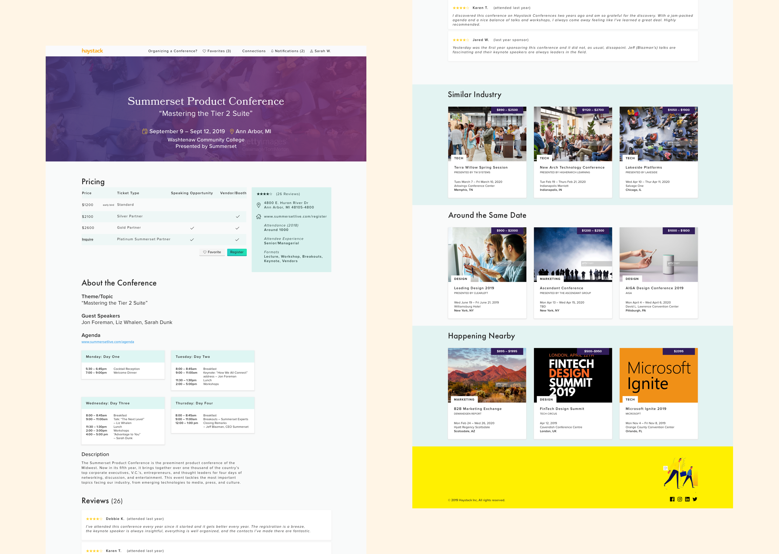
The first version of the high-fidelity mockup of the conference page.
For the second round of desirability testing, our goal was to measure how closely our mockups achieved the desired emotional responses and how well they aligned with Haystack’s still-nascent brand. We tested five users, all of whom worked at medium- to large-sized companies. Some had a very limited knowledge or prior exposure to the product while others had relatively extensive exposure to it as they had participated in UX interviews.
FEEDBACK
Overall, users came to the conclusion that, although they liked certain aspects of each individual designer’s direction a little more (or sometimes less), overall each possible design worked and we felt confident that we were headed in the right direction. Users reported that my mockups felt inviting, like “bright and summertime,” clean, and intuitive. A majority of users voiced that they “really liked the font” (Proxima Nova). However, users were, at this point, conflicted about color—some felt everything was working well and it was consistent, while others felt it was too much. I also learned from our users that some of them felt the photos I’d selected contained compositions that were a little too busy for them.
Coming to the end of our second week-long design sprint, we met with Melissa and Gregory to catch them up on all the good things we’d been up to that week, run our potential designs by them, share what users had to say, and have a conversation about how everything was proceeding.
The meeting was productive and both Melissa and Gregory were complimentary of (and excited about) what we’d built. I received very useful and actionable feedback from Gregory that the design direction could be pushed further by showing intent, incorporating the purple gradient more so it didn’t feel like the odd person in the room, and demonstrating how illustration might work.
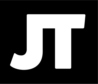
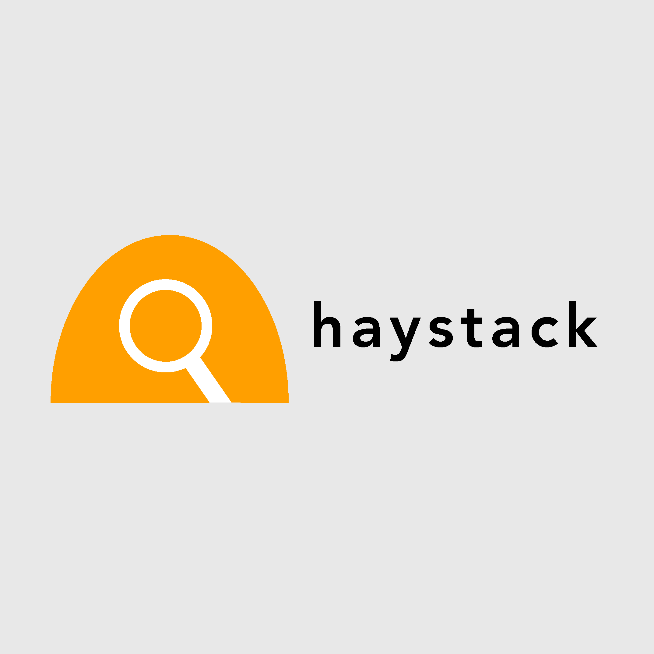
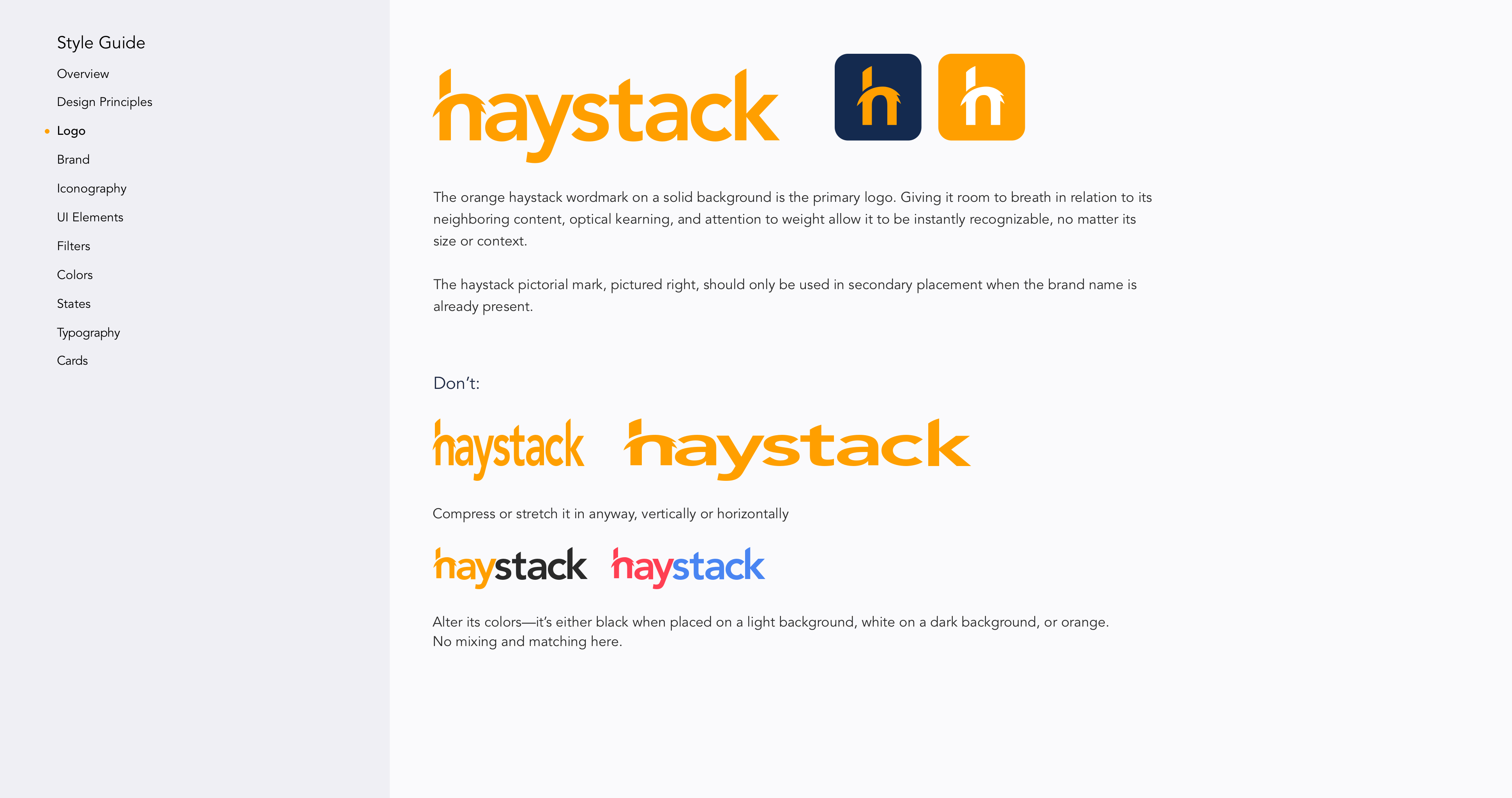
Secondarily, they weren’t thrilled with the logo they’d received from an external branding team. They wanted more of an iconic logo, as the current version (a haystack) was too literal.
Based on the client’s, teammates, and Creative Director’s feedback, I iterated on my designs and experimented with a few potential directions for their logo.
Overall, users came to the conclusion that, although they liked certain aspects of each individual designer’s direction a little more (or sometimes less), overall each possible design worked and we felt confident that we were headed in the right direction. Users reported that my mockups felt inviting, like “bright and summertime,” clean, and intuitive. A majority of users voiced that they “really liked the font” (Proxima Nova). However, users were, at this point, conflicted about color— some felt everything was working well and it was consistent, while others felt it was too much. I also learned from our users that some of them felt the photos I’d selected contained compositions that were a little too busy for them.
In today's day and age, it's amazing all the things we can do solely in the digital sphere. However, when I need to quickly brainstorm and ideate, there's nothing like the freedom of putting pen to paper to visually explore ideas.
Three versions of potential logos. I'm especially drawn to the middle logo as it nicely dovetails both the silhouette of a haystack and a visual double entendre of both the proverbial needle in the haystack and a magnifying glass, which perfectly encapsulates what Haystack Conferences is trying to help the user accomplish. A bit on the nose, perhaps.
DESIRABILITY TESTING
After our team had a thorough discussion about the pros and cons of desirability versus usability testing, we came to the consensus that it would make more sense to do one more round of desirability testing for three reasons:
- So much of the user’s experience is related to the search and filter functionality.
- We’d made a number of changes to our respective interface designs.
- The original scope pertained more to branding and discovering what our users felt and thought about colors and type, we decided it would be more useful than a usability test. Plus, we weren’t sure how to prototype filter functionality for a usability test, given the short timeframe.
FEEDBACK
The results of our final round of desirability testing were mixed. On the one hand, users pushed back on designs that they felt were too corporate-y or overly feminine (a little femininity is okay) while, on the other hand, they were drawn to designs that felt somewhat professional.
Their aesthetic preferences were somewhat all over the map and most of their feedback was more focused on the functionality and how easy it would be for them to achieve their goals. For example, a great deal of the feedback offered pertained to more to the UX design: “Everything was intuitive;” “Filters made sense;” “Most—if not all—of the information that I need is here.” Overall, they were visually drawn to designs that evoke professionalism with content that is well laid-out. The yellow I'd utilized did not test very well, so, for the next iteration, I explored a warmer burnt-orange instead.
The Result
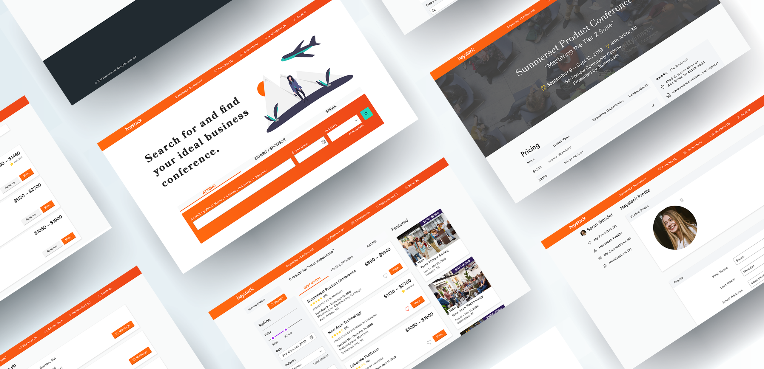
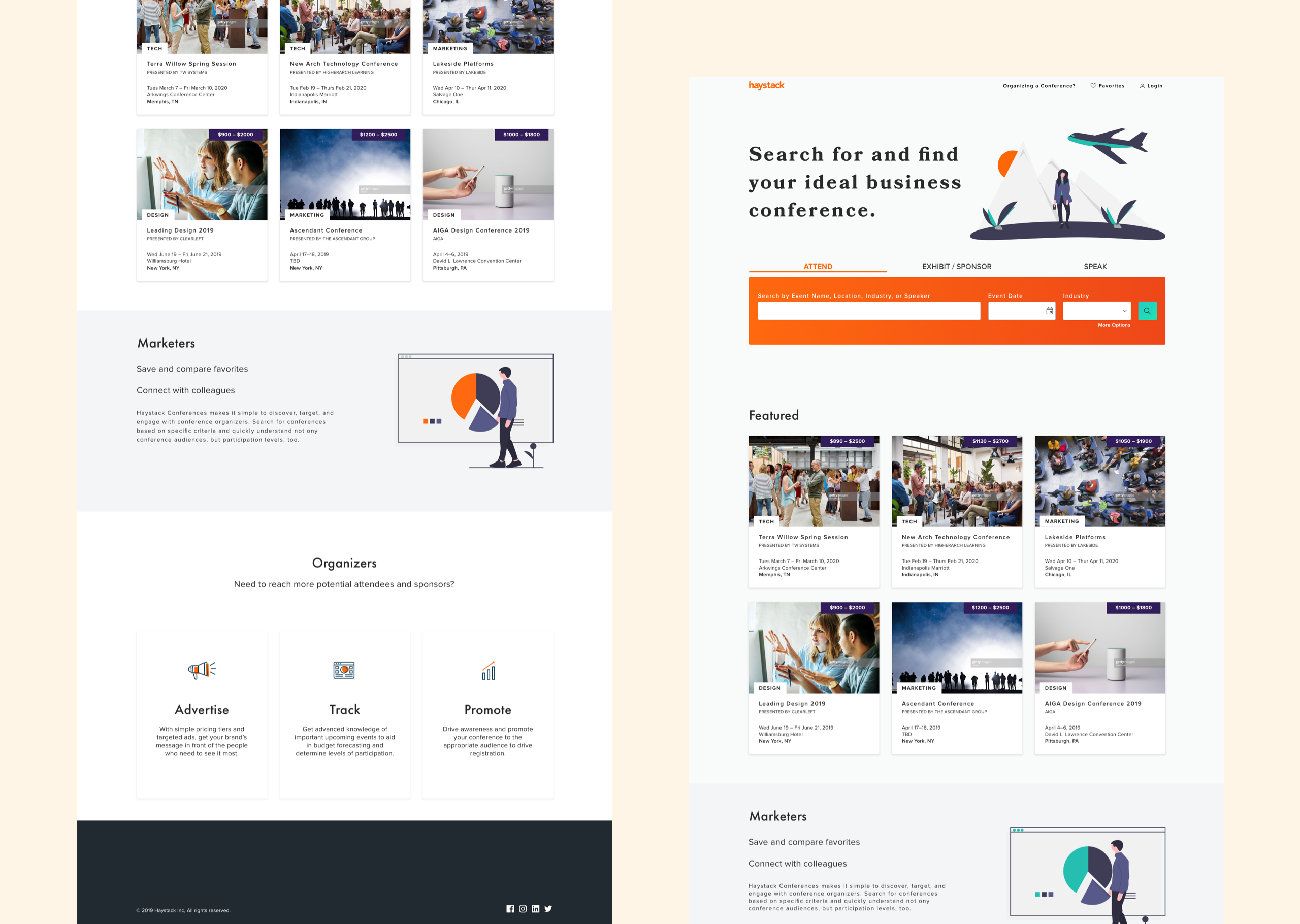
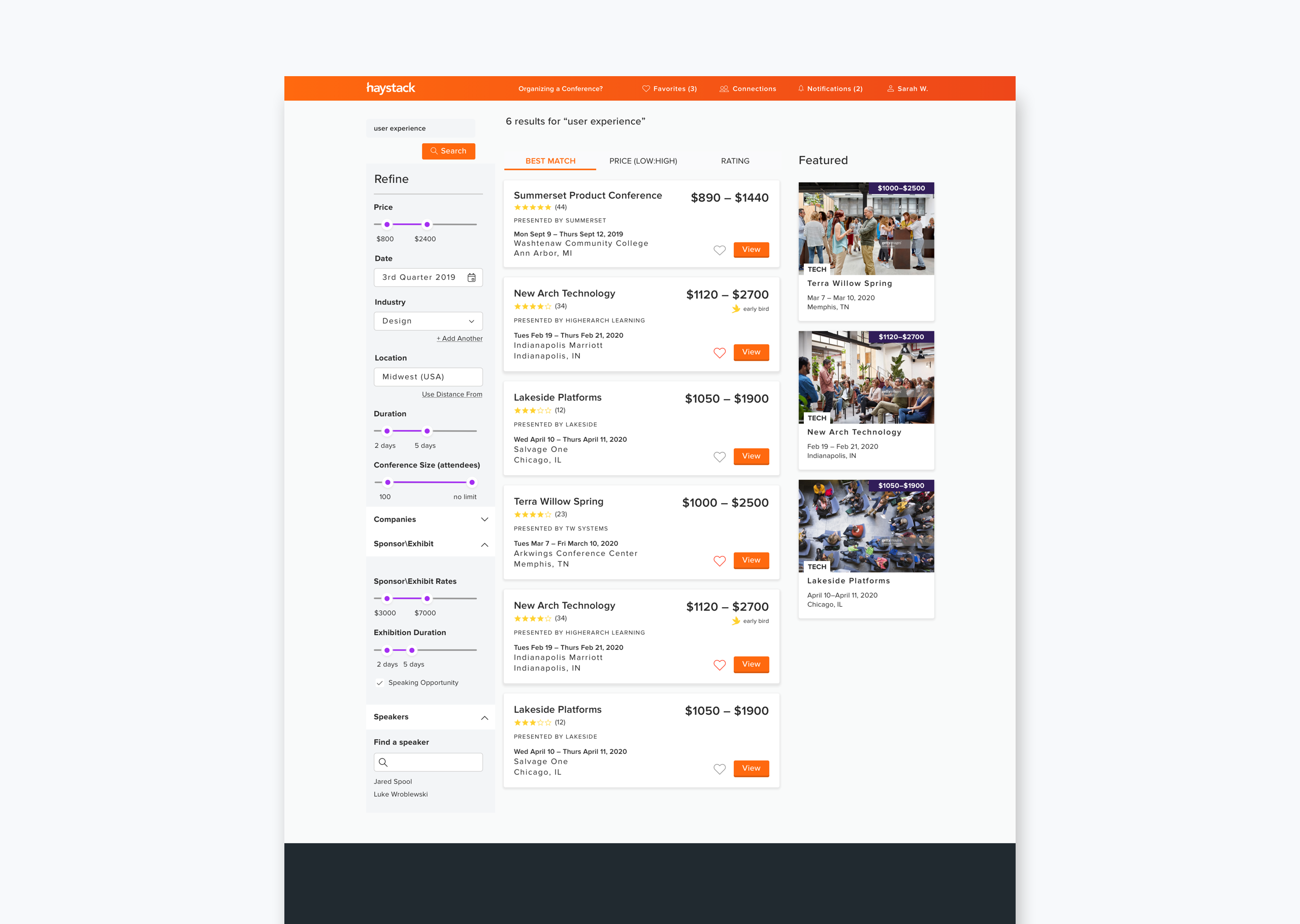
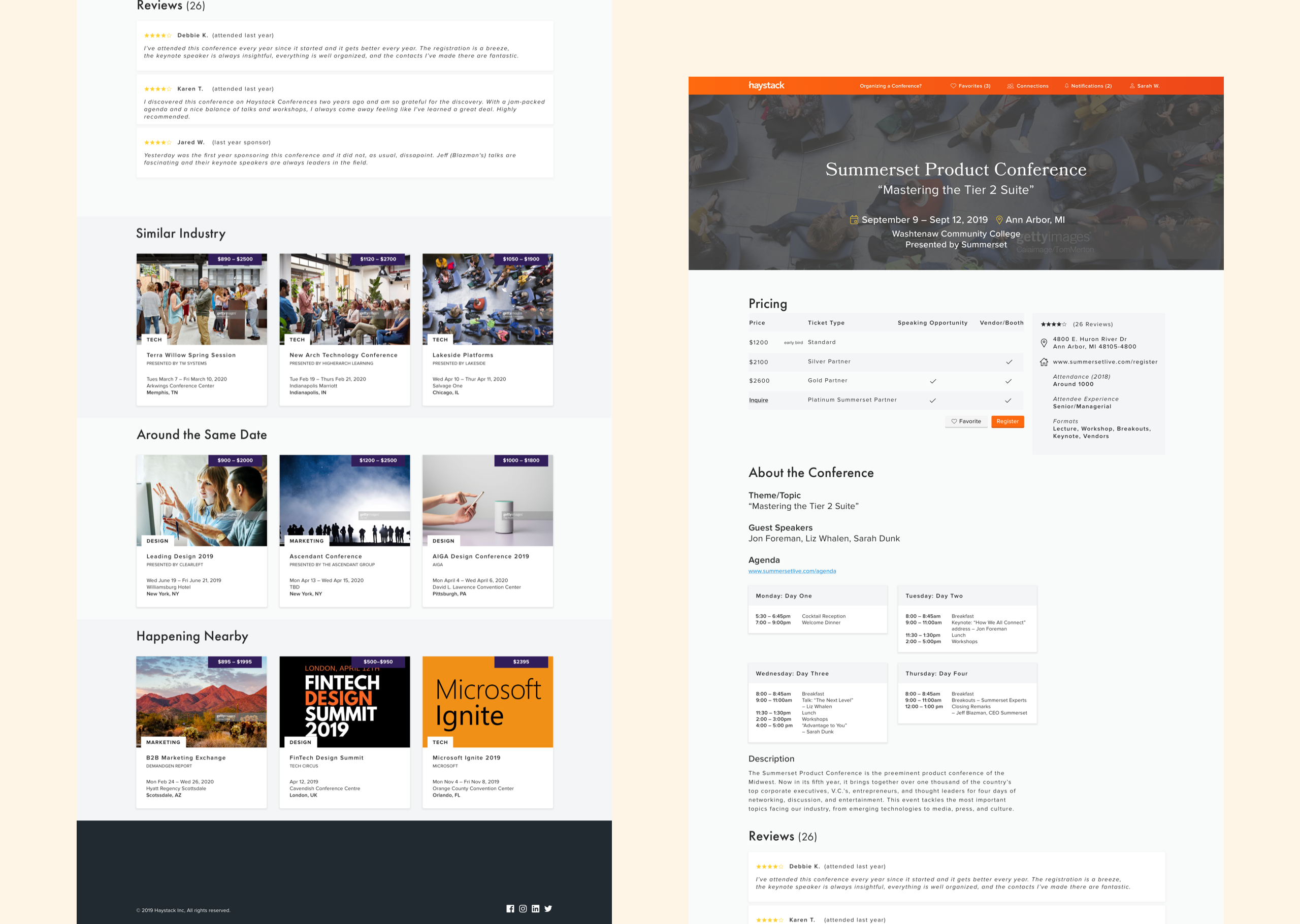
The home, search, and conference views.
The high-fidelity prototype.
This prototype walks you through the primary user flow: Searching for a conference, navigating to its page in order to gather more information about it, and favoriting it. Additionally, it includes the secondary screens (favorites, profile, connections, notifications), as well as Sign up and Sign in modals.
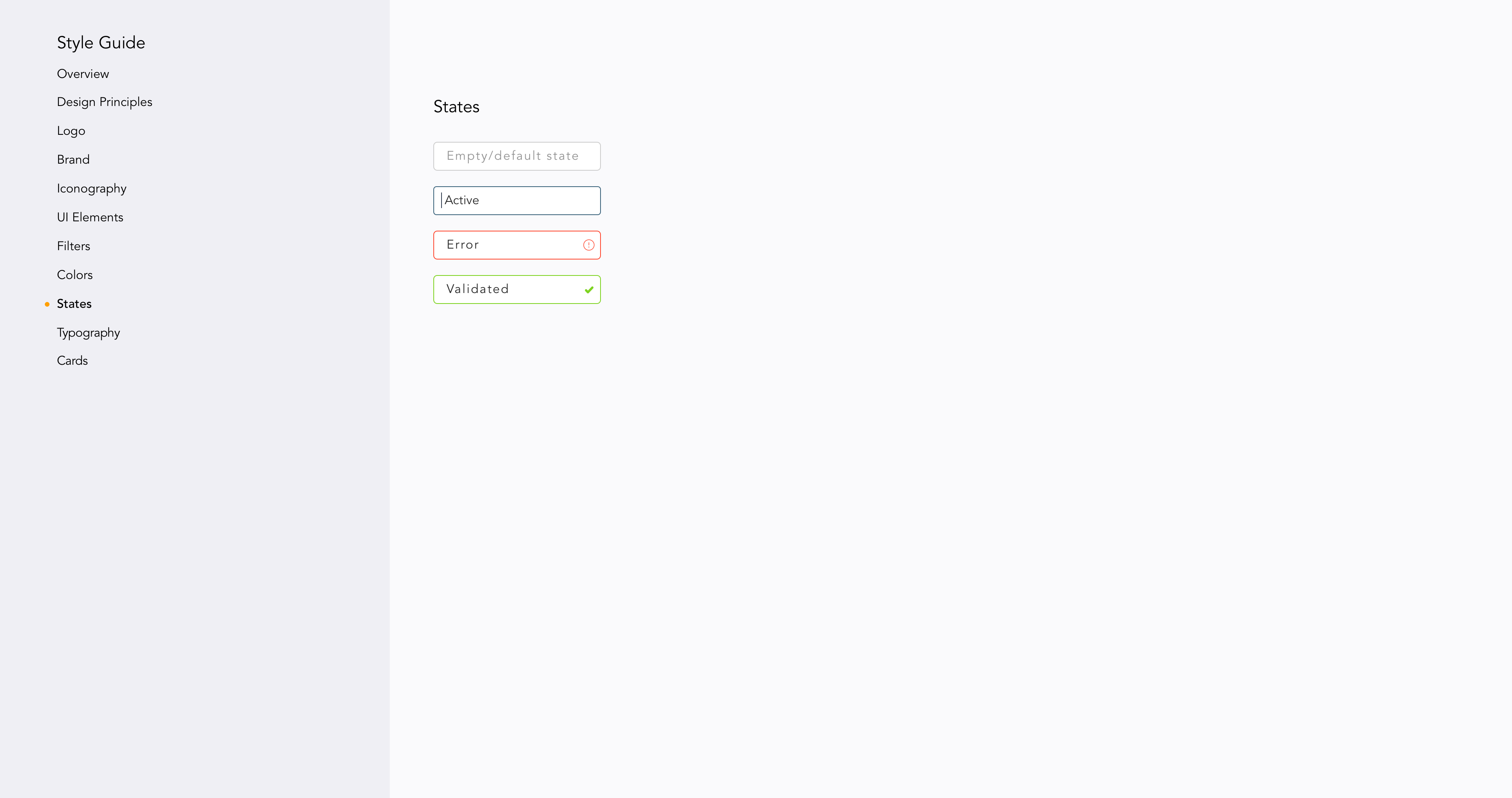
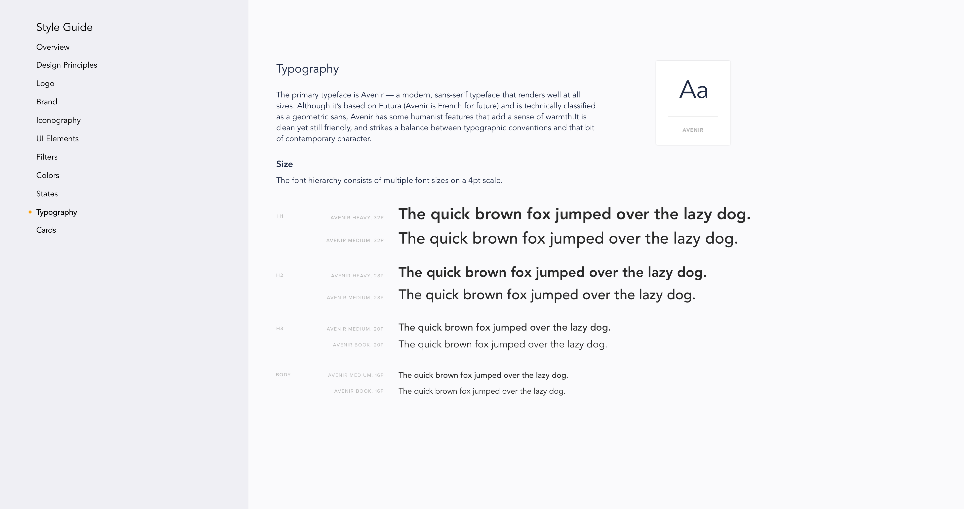
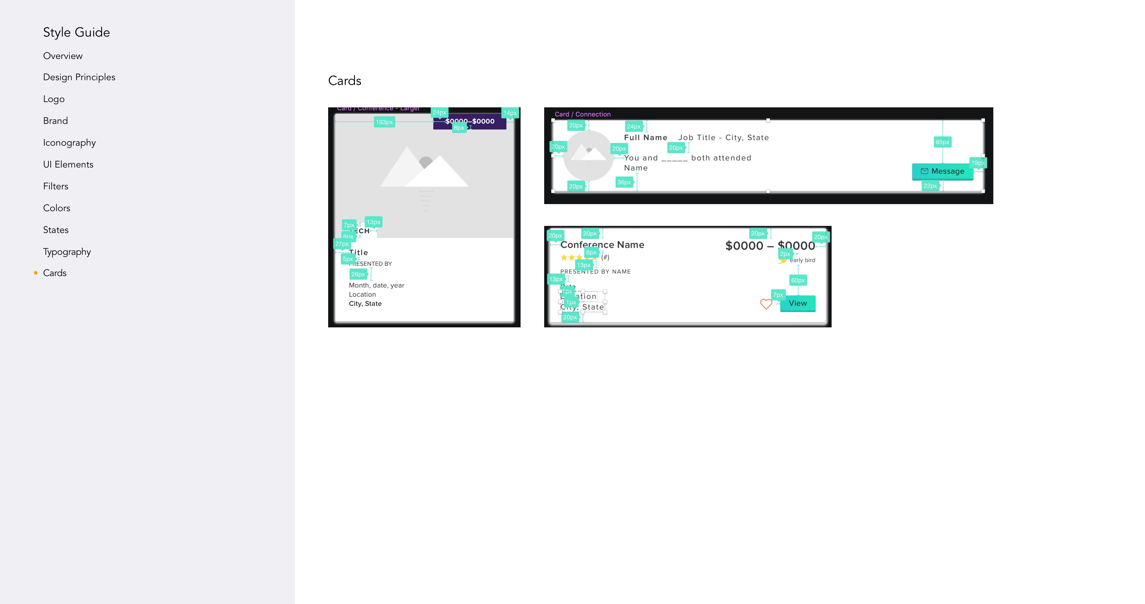
STYLE GUIDE
I designed a style guide in order to ensure the user interface design remained consistent in future iterations, no matter who was working on it. By creating this set of guidelines, UI elements and typography would be used in a consistent manner. Plus, it would help future designers, developers, and stakeholders communicate on the overall design.
Haystack’s design system was, from the get go, built on atomic design. By building the UI in this manner, it showed elements in their final context and helped foster consistency and scalability.
Well, what now?
Future considerations
Our main priority during the three weeklong sprints was to explore and zero in on the aesthetic of the project. Although we were able to help Melissa and Gregory get the project to MVP and fulfilled their definition of success, there were four key areas that, had we had more time or continued working on the project, we would’ve loved to have explored. Many of these quickly venture outside the realm of UI and into UX, but were all directly informed from our user interviews.
First, for great connectivity and a social integration, utilize LinkedIn's API (REST and JSON) for sharing Haystack content on LinkedIn, an option to sign in using a LinkedIn profile, and a button to connect with individuals.
Second, devise a budget planning dashboard which could be used for people who would like to send their team to a conference to get an estimate of how much it would cost both per person and for the entire team. It would have similar functionality to a slimmed down and simplified Google Analytics. With it, they could: At a glance, view and compare all the key highlights of different conferences and export a customized PDF report with breakdowns for individuals and groups.
Third, as there are three different types of high-level users, refine each unique user flow. Consider specific filters for each different type of user, as each would utilize different filter categories. For example, a speaker might search only by ratings and reviews and might not need the additional categories that, say, someone searching for a conference to attend would. Additionally, "How I conference" differs wildly. As such, use that data to create tailored content and a personalized experience for users by considering their differentations on the back end, with one example being that search would return different results and reviews would be pre-sorted to only display content relevant to the user (an obvious example is Amazon).
Last, we would've loved to design, incorporate, and test microinteractions to make the design more novel, engaging, and to inject more whimsical moments into the experience.
Reflections and Insights
I learned how to hone my design process in a truly agile environment: I thought, worked, produced, and learned to let go even more quickly than I had before. I was amazed and thrilled at what our team was able to accomplish in just three short week-long sprints.
I wrestled with my old friend perfectionism, but learned to let that go more and more and really focused on putting the best version of things out there to the client and my Creative Director, even if it still felt unfinished—that way, I was able to get more feedback on my designs and iterate more frequently.
I was also able to really hone in and focus on living and breathing the user-centered design approach—I was much more aware of my design bias going into it. I learned to let go of what I thought would be best for the project and instead listened more intently to what the users needed, even when they either didn’t know it or couldn’t express it themselves.
I also learned the value of being able to synthesize a great deal of, at times, disparate inputs from those very same users, stakeholders, Creative Director, colleagues, as well as my own considerations, and turn all of that into a concrete, actionable action for the design solution.
Other Projects