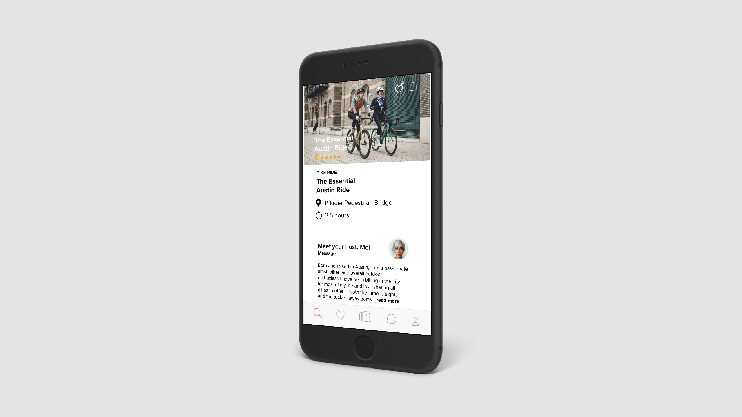
Bon Voyage
And away we go!
Project: Bon Voyage
Role: UI/UX Designer
Tools: Sketch, Illustrator, InVision
Duration: 6 week-long sprints
What I did
Domain Research
Visual Competitive Analysis
User Interviews
User Persona
App Map
Mood boards
Style tiles
Wireframes
Test plan
High-fidelity mockups
High-fidelity prototype
Usability Testing
OVERVIEW
Bon Voyage is an iOS travel app that provides information and recommendations about where people can go and what to see in different cities around the world. It helps people have a more rewarding and memorable travel experience. In this six-week project, I applied user research to determine what the product should do and practiced user-centered design to create the best user experience possible. I was tasked with the creation of design solutions from the ground up and experienced the entirety of the UI/UX design process from start to finish for the first time.
PROBLEM STATEMENT
The price sensitive traveler needs a convenient way to keep track of their travel budget as they create off-the-beaten-path travel itineraries because saving money while having an authentic travel experience brings them an innate sense of satisfaction and pride.
USER GOALS
The user’s goals are to save money while creating a local-themed travel itinerary. This is achieved by connecting with locals and updating the budget throughout the travel-planning process.
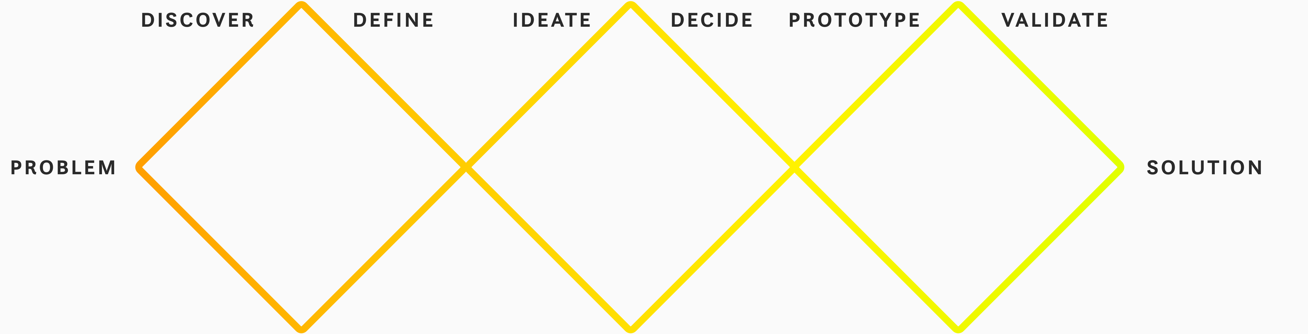
Process
Google Ventures design sprints
UX Research
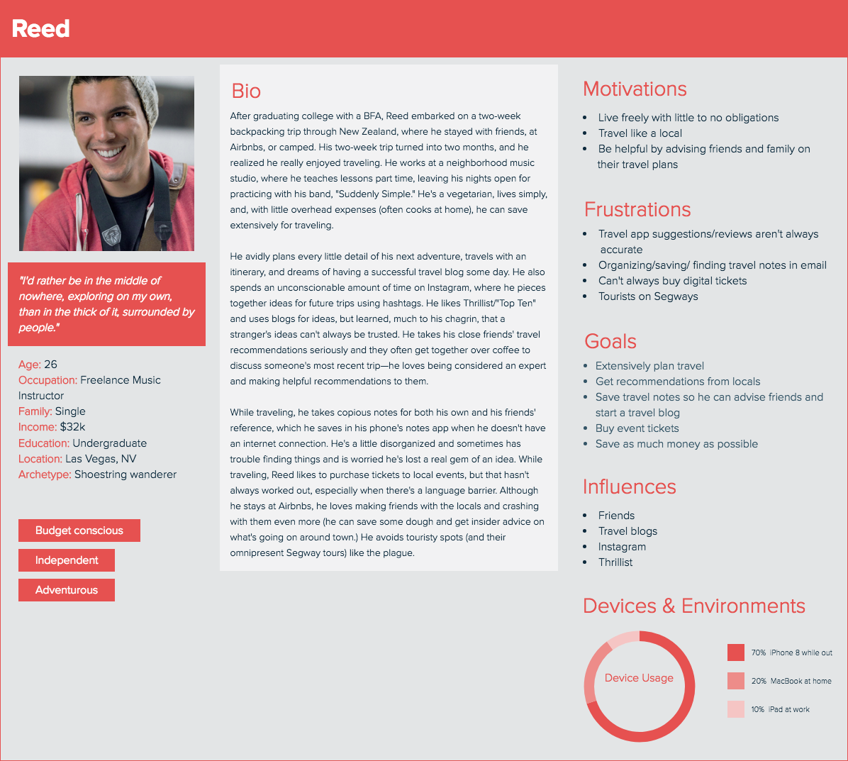
In an effort to better understand the product, domain, and its users I created one user persona, which helped me understand who my user was and things to consider when designing for them.
Domain Research and Competitive Analysis
The next step was completing domain research and a visual competitive analysis of five other travel apps: three direct competitors and two indirect competitors. I did this in order to have context, see what's working or not working, and determine where the product's niche lies—all which will inform the design's direction.
Some questions I asked myself: Are there any emerging trends? Is travel on the rise? What are people using? Who's dominating this market and how saturated is it? I took notes on IA (Information Architecture) and IxD (Interaction Design) patterns, the look and feel, what kind of photography was being used, colors, and typography.
I then synthesized what I'd learned by taking the user research, breaking it down, taking it apart, studying it, and trying to understand the problem I'd been asked to solve. At this point, it's crucial to interpret and draw insights from the body of research and, in trying to understand the data, applying my intuition and creativity in order to create my hypothesis.
Research Synthesis & Ideation
Ideation and Brainstorming
In this part of the design process, I sketched and generated as many divergent ideas as I could; the method I used this time is known as "6-8-5," or creating six to eight sketches in five minutes.
I love to sketch as it's a terrific way to work out my ideas before taking them into a high-fidelity design tool like Sketch or Figma. It's a special time for me to get comfortable thinking through my ideas with paper and pencil before jumping into pixels.
I am very free with concept exploration and use "blue sky" thinking, and don't worry about the eventual limitations; I can always reassess later. At this point, I'm also beginning to think about different IXD patterns for displaying information.
Information Architecture
When I'm ready to begin designing a product, I must first figure out how I'm going to structure all the content and functionality: how to organize it, label it, what its hierarchy looks like, how it can be searched, and guide the user through the interface so they can get what they came for. Much like a real-world architect, I'm planning the informational "space" where people will dwell. This supports usability and findability. As Steve Jobs said, "design is not just what it looks and feels like. Design is how it works."
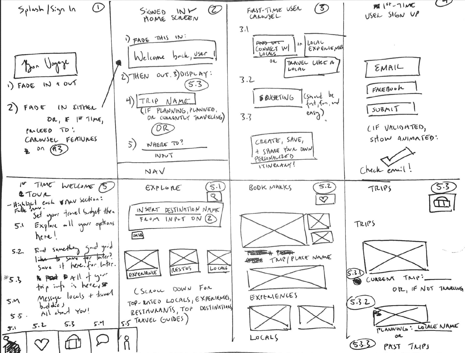
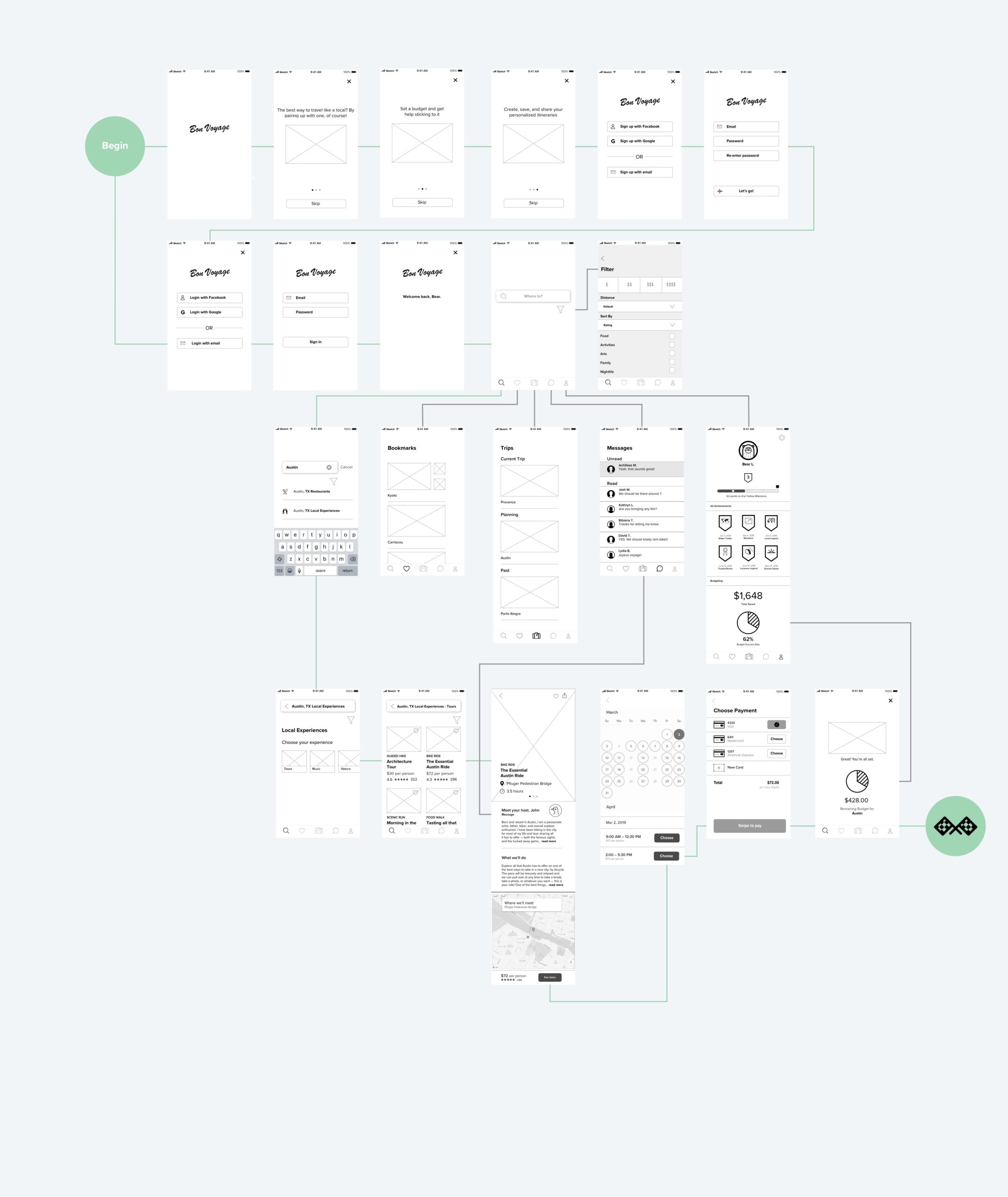
I then designed an app map in order to suss out the app's structure. When building one, I show how the navigation might be structured, how the content is organized, the relationship between different pages, creating a structure upon which I can begin cost estimates, and scoping the work.

Interaction Design
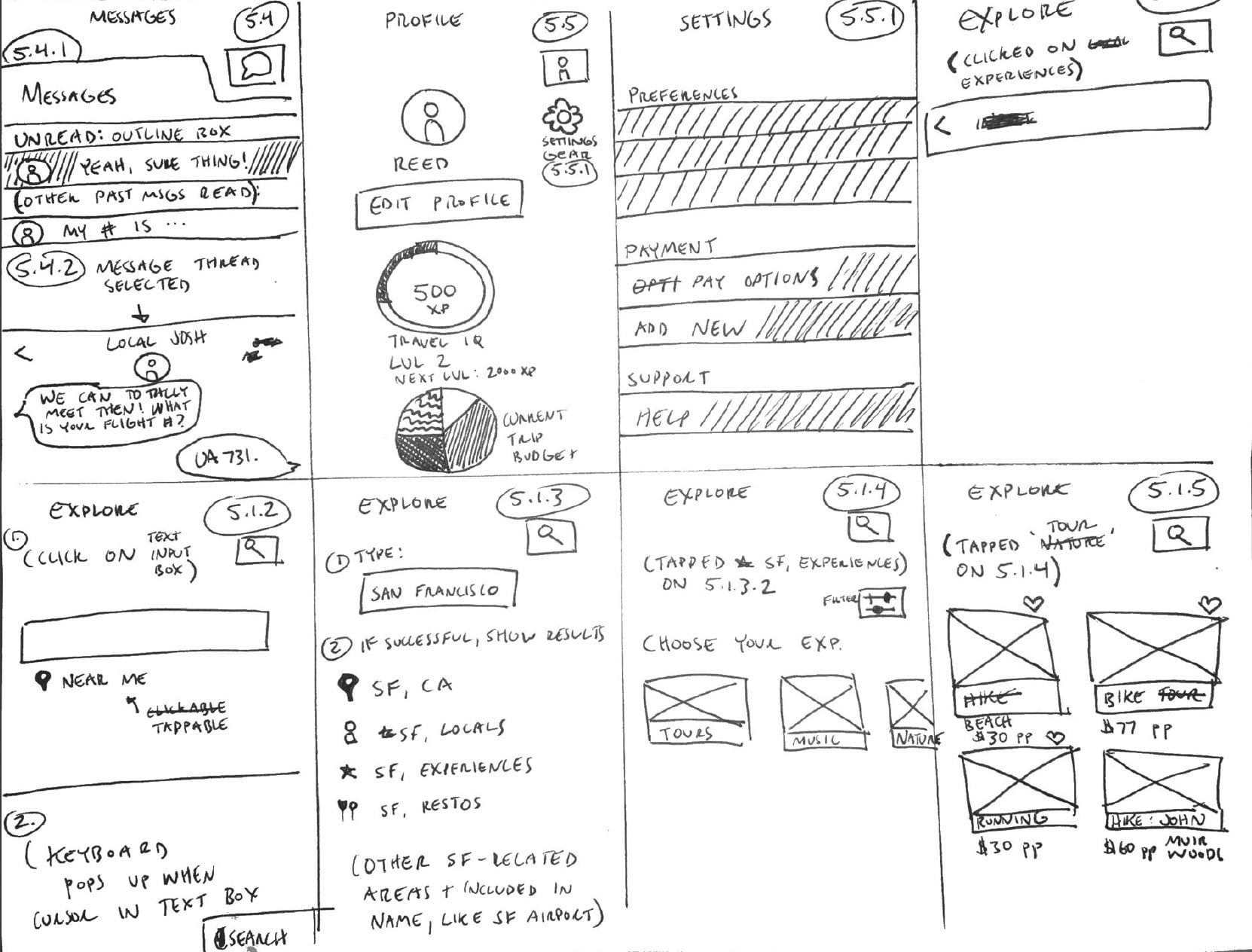
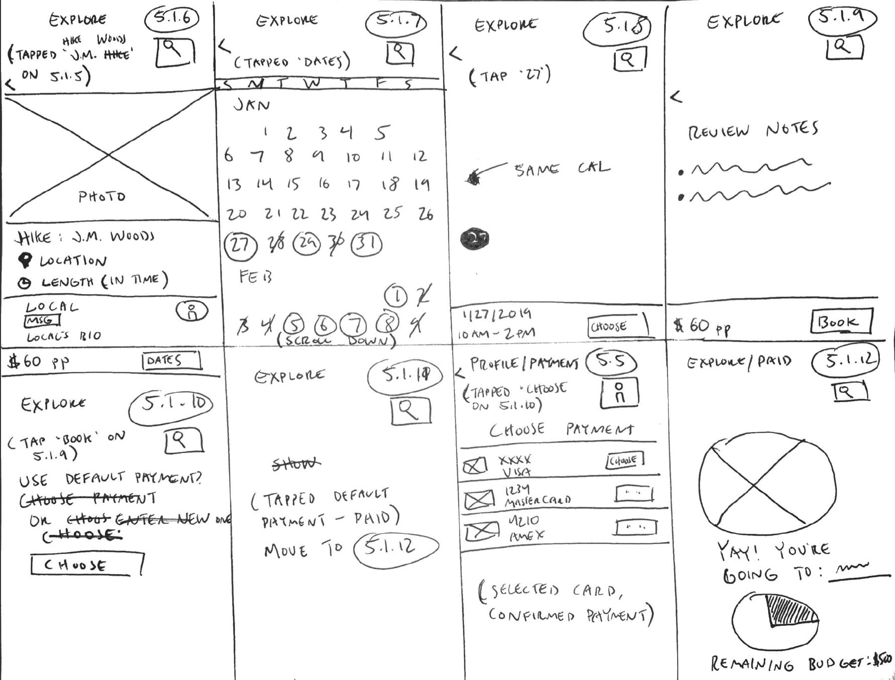
Wireframing
Making wireframes helps me visualize the experience before going into high-fidelity designs. When done well, they help quickly establish what goes where without worrying about or spending too much time on aesthetics. Here I can experiment, play, and work out any visual problems I might encounter before wasting time pushing pixels.
Visual Design
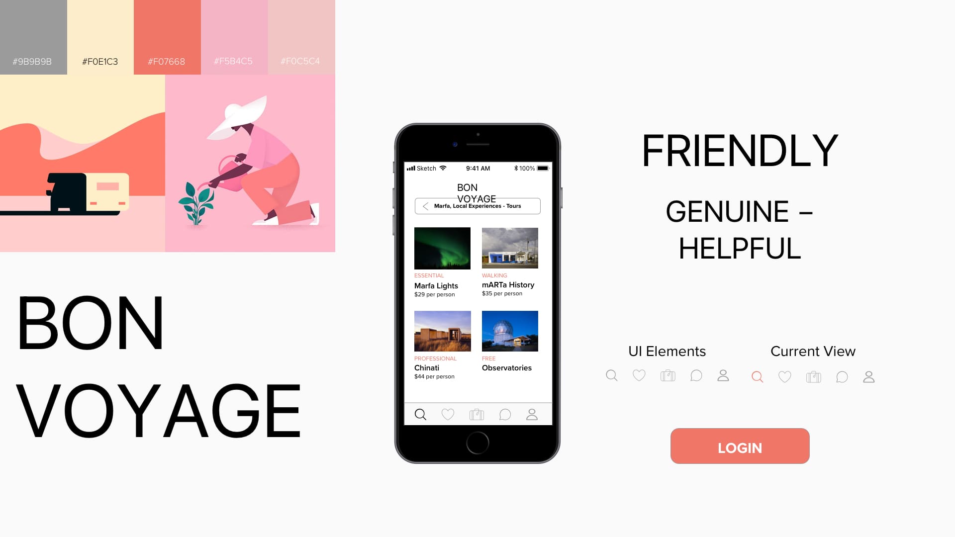
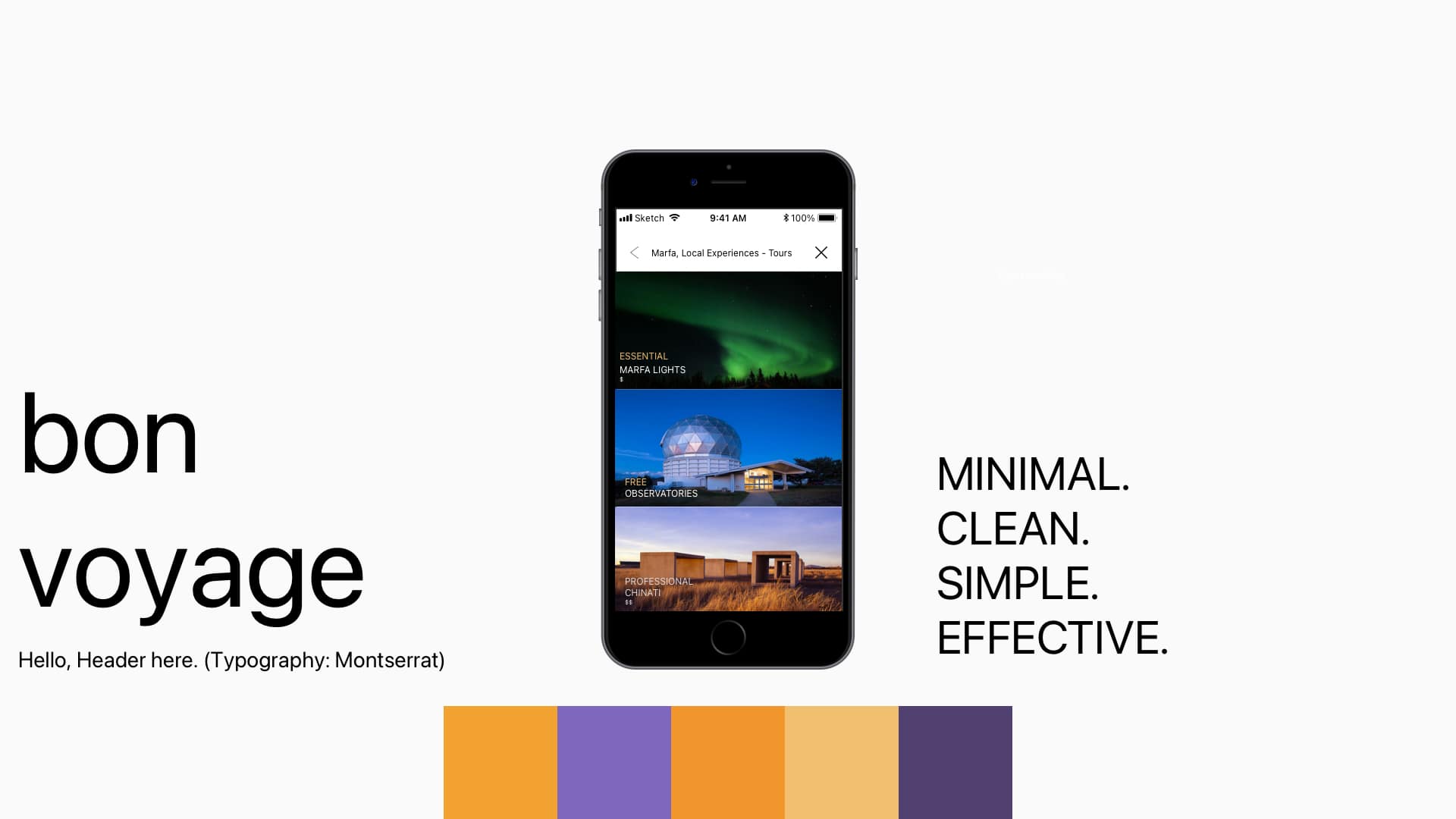
Moodboards & Style Tiles
Once I move into exploring the visual design of an app, I start by collecting inspiration that will inform it: typography, color palletes, UI layouts, symbols, icons, photography, and anything else that evokes the style I'm going for.
Drawing inspiration from the mood boards, I do some more visual exploration of what the design might look like—I translate the moodboards into style tiles with fonts, colors and interface elements that communicate the essence of a visual brand. I do this in order to define the visual system that I'm going to be incorporating. This system is composed of key elements that will help the overall design achieve consistency and unity.
They are a great visual tool to help me communicate the visual language of a design aesthetic without getting mired in the minutiae of the final layout, button placement, and copy. I use these to present my design concepts earlier on in the process so that I can get buy-in on the design direction before executing the full comps.
UI Design
Having completed the UX portion of the design process (how users feel and interact with a design), I was then free to move onto the UI portion, or what users see and perceive. Here I translated all of the UX artifacts into high-fidelity visual execution, which are typically in the form of mock-ups.
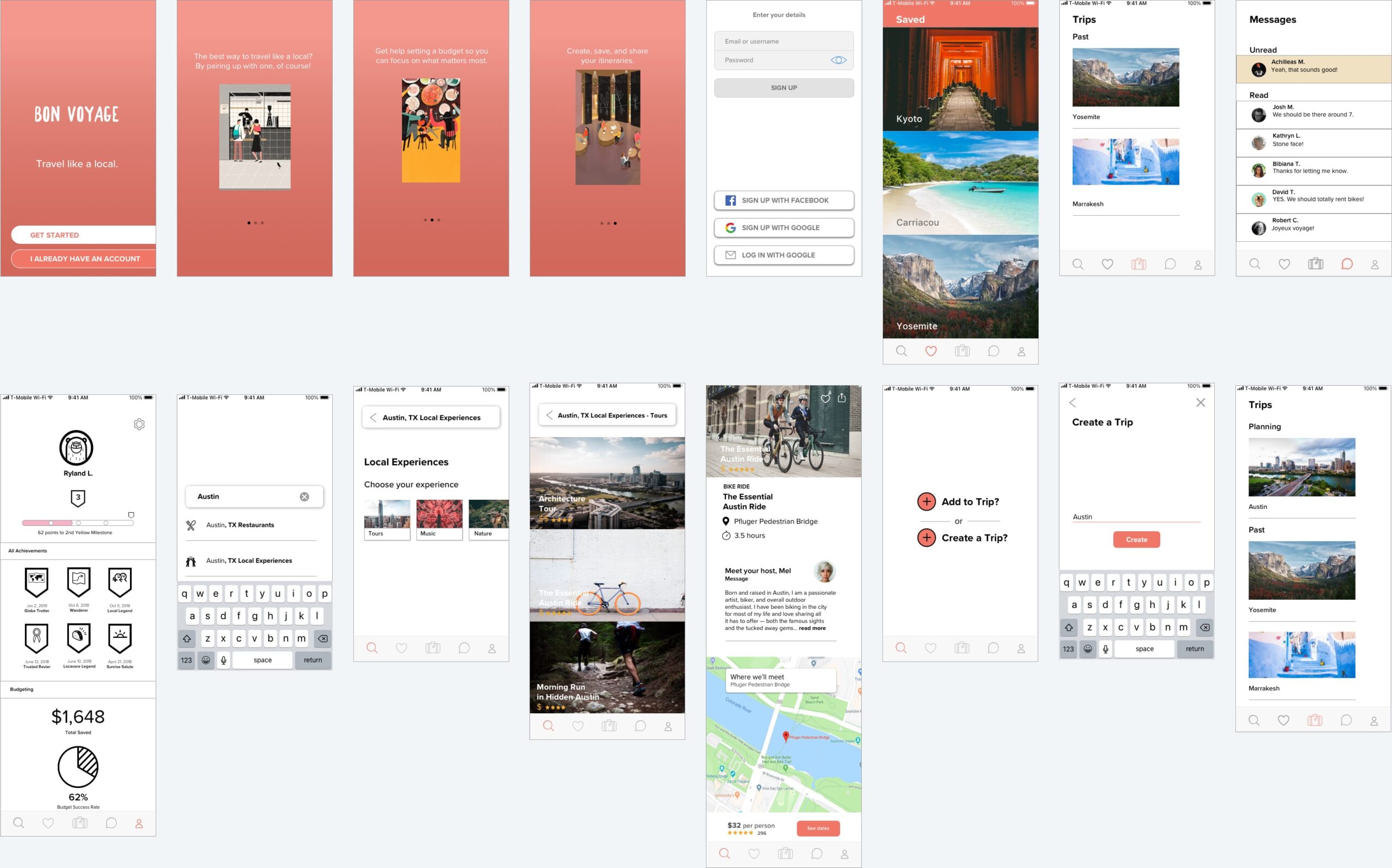
High-Fidelity Prototype
I then made a prototype using the high-fidelity mock-ups so this design direction could undergo its first round of usability testing with users.
User Testing
And here we are at the final phase in the Design Thinking process: seeing how our proposed design solution sits with real people. What works? What doesn't? It's such an important step, as it also allows me to validate my assumptions about what users are looking for. I devised a test plan then did one round of usability testing by letting three people take it for a spin. The three specific goals I tested were:
Create a new trip itinerary
Set a trip budget
Search for local things to do and book them
Results
General sentiment was positive. Overall, the three users were very supportive of the app and all agreed that they would use this if it were real. All three commented on how they liked the aesthetic of it.
Other Projects