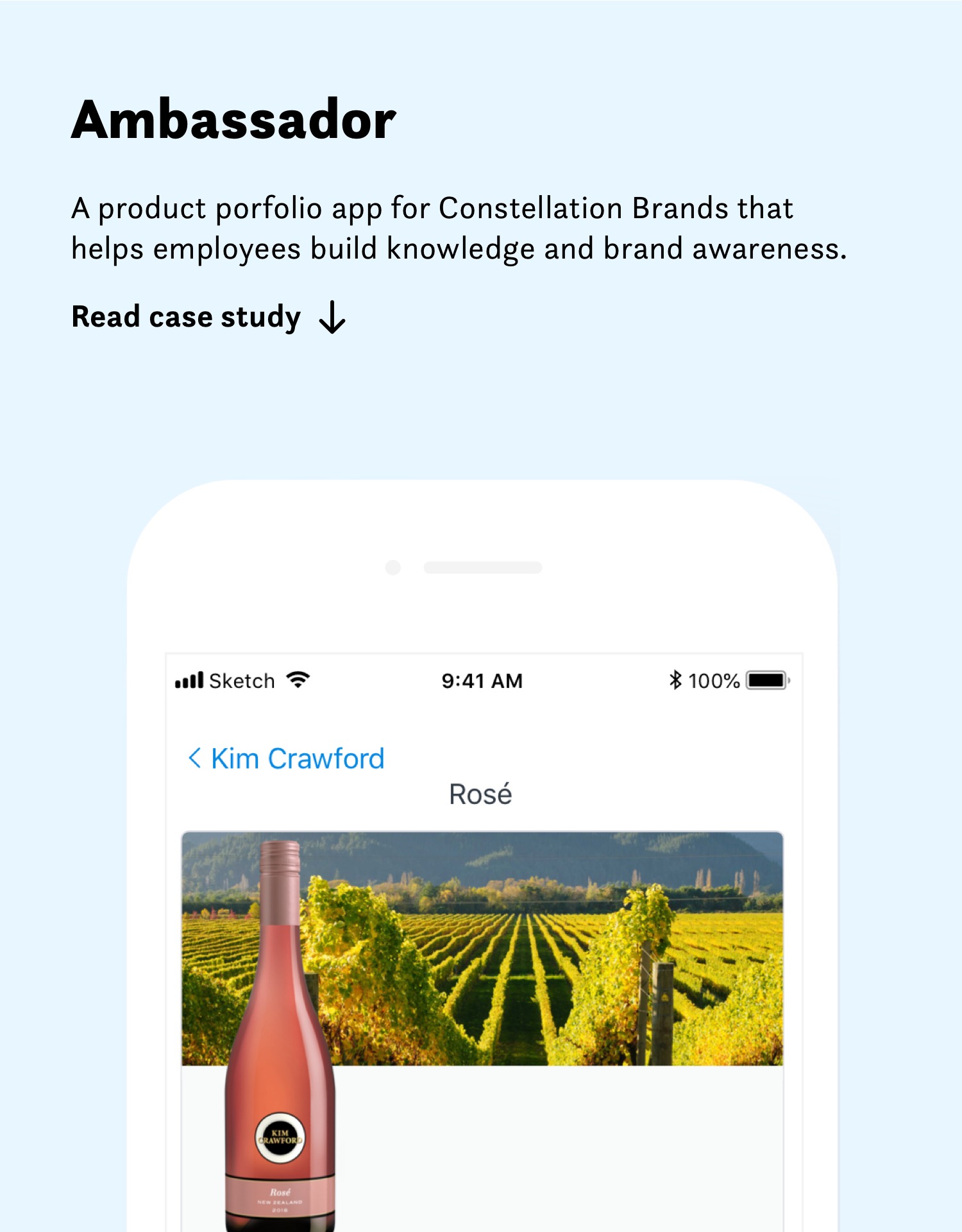
Ambassador
Product and event info made easy
Fostering more connection with Ambassador
An app revamp for Constellation Brands
Project: Ambassador, Constellation Brands
Role: UI/UX designer
Tools: Sketch, InVision, Principle
Duration: five week-long sprints
What I did
Competitive analysis
Branding
Style tiles
Logo design
Web design
High-fidelity mockups
InVision prototype
Desirability testing
UI kit
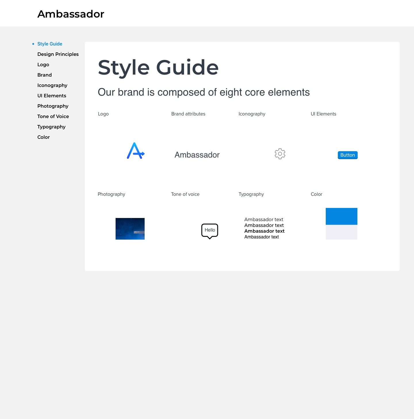
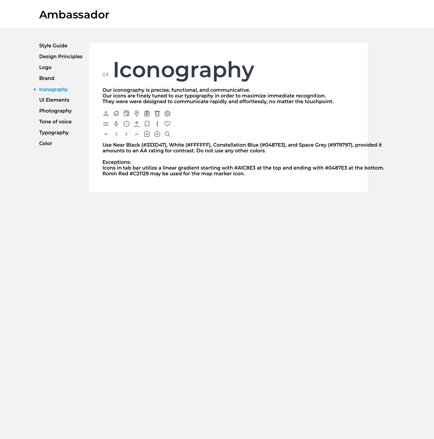
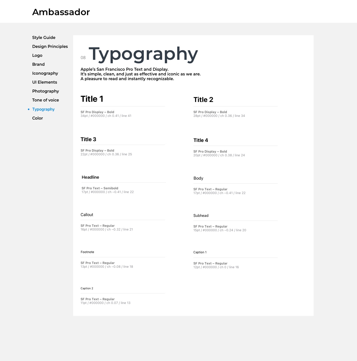
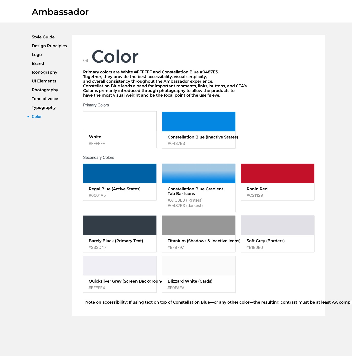
Style guide
Future recommendations
THE BRIEF
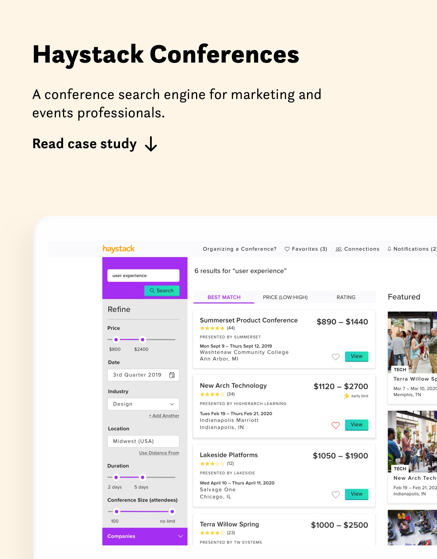
I worked on a team with three other designers from Designation and we were under the guidance of two design directors from Designation. We redesigned the UX/UI of Ambassador, a product discovery, product portfolio, and event search platform for alcoholic beverages. It’s used internally by Constellation Brands (CB), a producer of some of the world’s most iconic beer, wine, and spirits, including Corona, Robert Mondavi, and Svedka.
I utilized the Design Thinking framework and my design deliverables touched on many points of user-centered design: User Research, Information Architecture, Interaction Design, and User Interface Design.
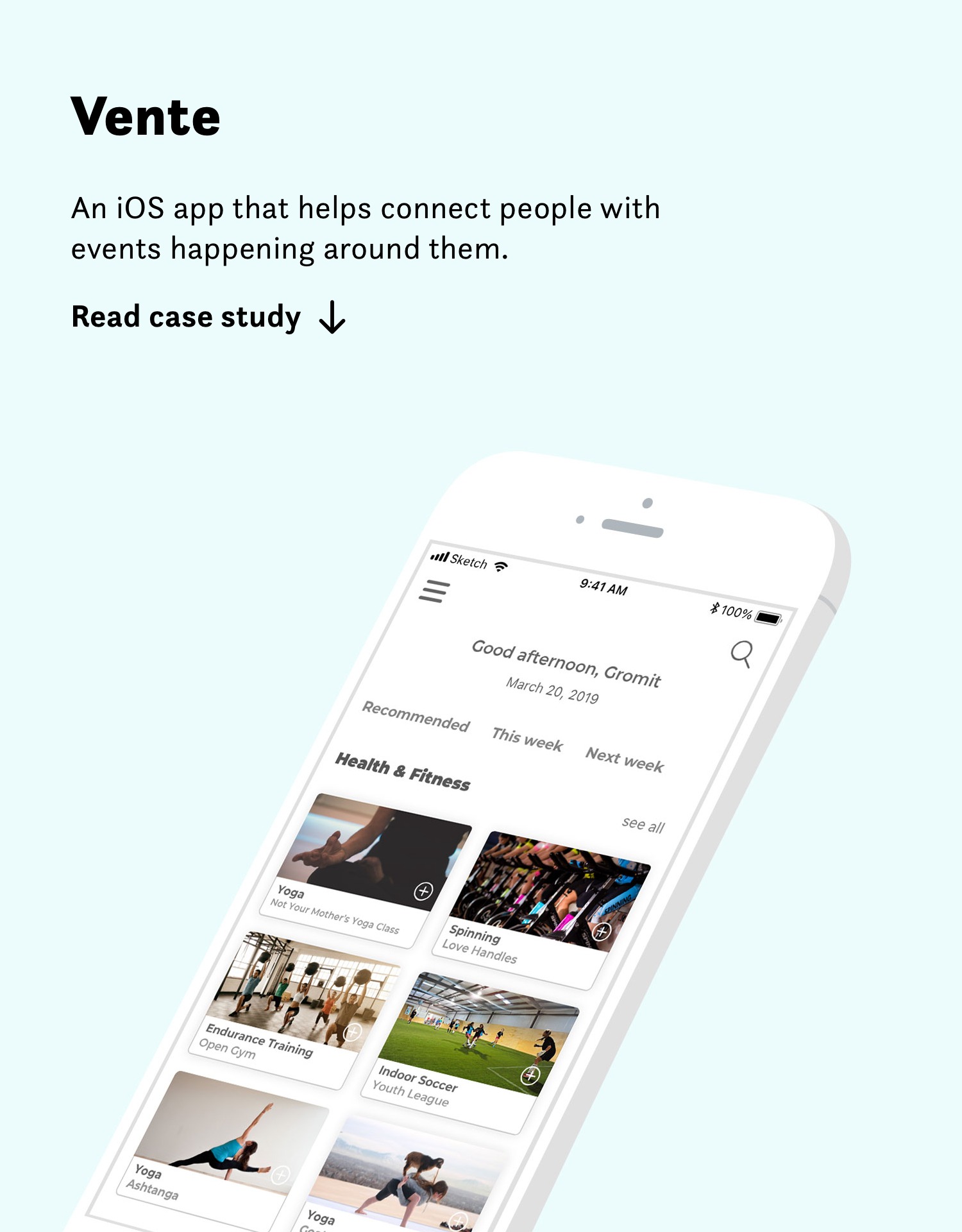
I not only redesigned Ambassador’s product section to enable easier browsing, searching, and organization of products, but also the ability to discover these products out in the real world. I also developed a better event discovery flow to help Ambassador users stay in the loop with nearby company events.
CONSTRAINTS
From the kickoff meeting to sending the final deliverables, our team had just five weeks. As the client was pretty open to the design process and they wanted us to think big, they didn't impose many constraints on either the team or the project's scope.
To begin at the beginning
Looking to update the app’s UI, conduct a second round of usability testing, and better align the app with the user’s needs, Constellation Brands (CB) decided to pay Designation a visit. At our kickoff meeting, our team learned that Ambassador serves as a bridge between sales, marketing, beer, wine and spirits so every team can keep up to date with what’s going on across the company.
CB wanted to improve the app in order to increase employee engagement and product awareness. Their goals for the app included increasing brand awareness and sales within their portfolio, helping employees locate where CB products could be purchased or consumed, as well as keeping them in the loop with company-sponsored events.
“At Constellation Brands, we like to empower our employees to take ownership of the company by our motto: ‘Think like an owner.'"

Michael Thaney
Innovation Partnership Manager, Digital Innovation Team
Process
Google Ventures design sprints
The Approach
Analysis
Before jumping into the design process, we first needed to learn about the world that CB and Ambassador inhabited. To better understand their product, its domain, and our users, we began our research by reviewing the client’s assets. Once we understood where they were coming from, we had a better understanding of where they wanted to go and how we could help them with that.
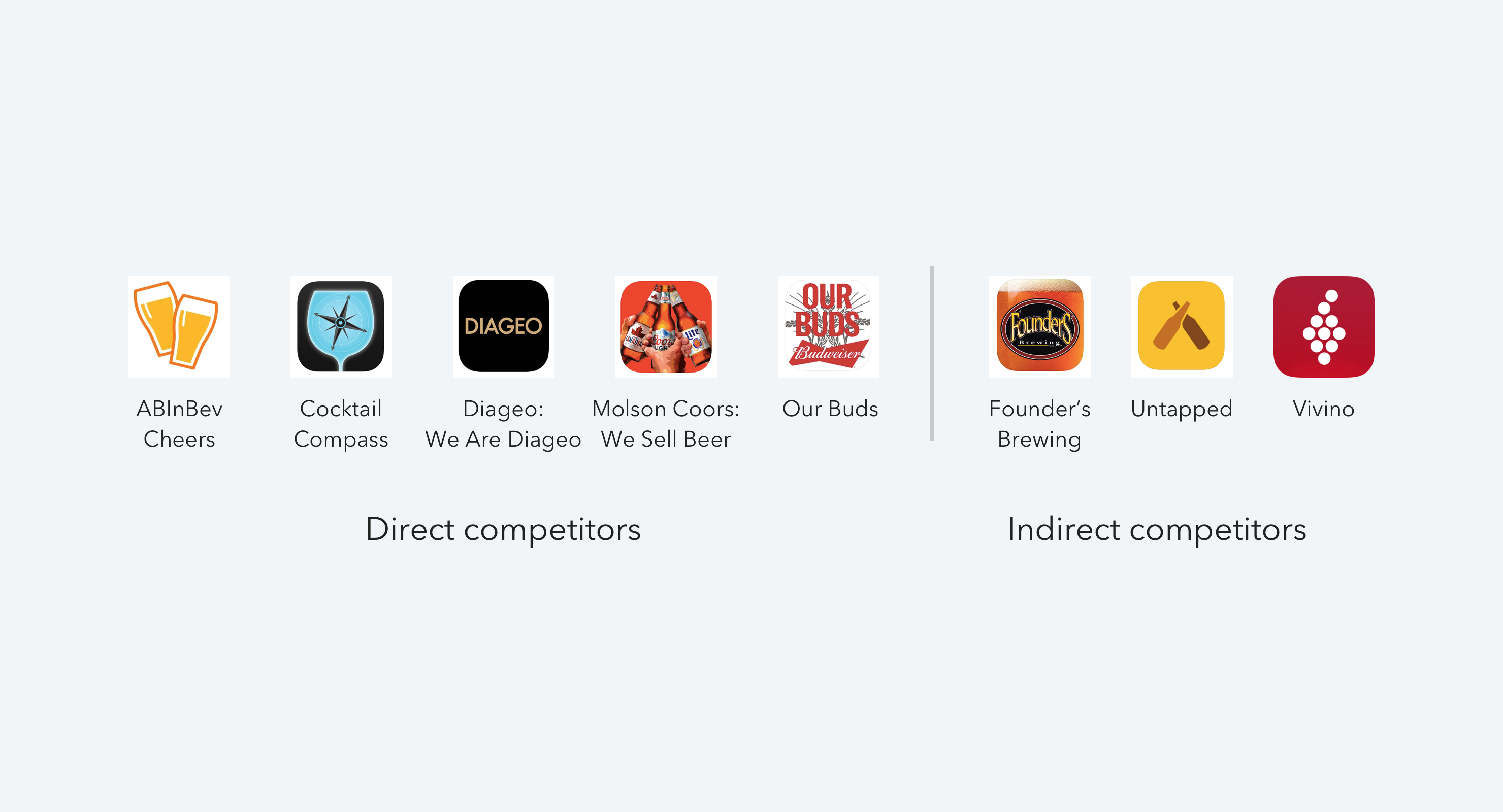
We then conducted a visual competitive analysis, which helped us gain a broader perspective on what their competitors were doing. By observing what was out there and then analyzing what was working and what wasn’t, we began to identify design opportunities that would set Ambassador apart from the rest of the pack. Two of our key takeaways included:
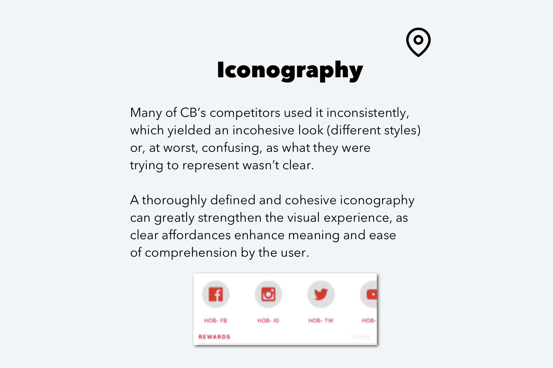
- Iconography: Many of CB’s direct competitors used iconography inconsistently and, in some cases, poorly. At best, this resulted in an inconsistent look. At worst, this resulted in a confusing user experience, as the icons’ affordance—what they were supposed to represent or do—wasn’t clear. A well-defined and cohesive iconography can greatly strengthen the visual experience, as clear affordances help to enhance understanding by the user.
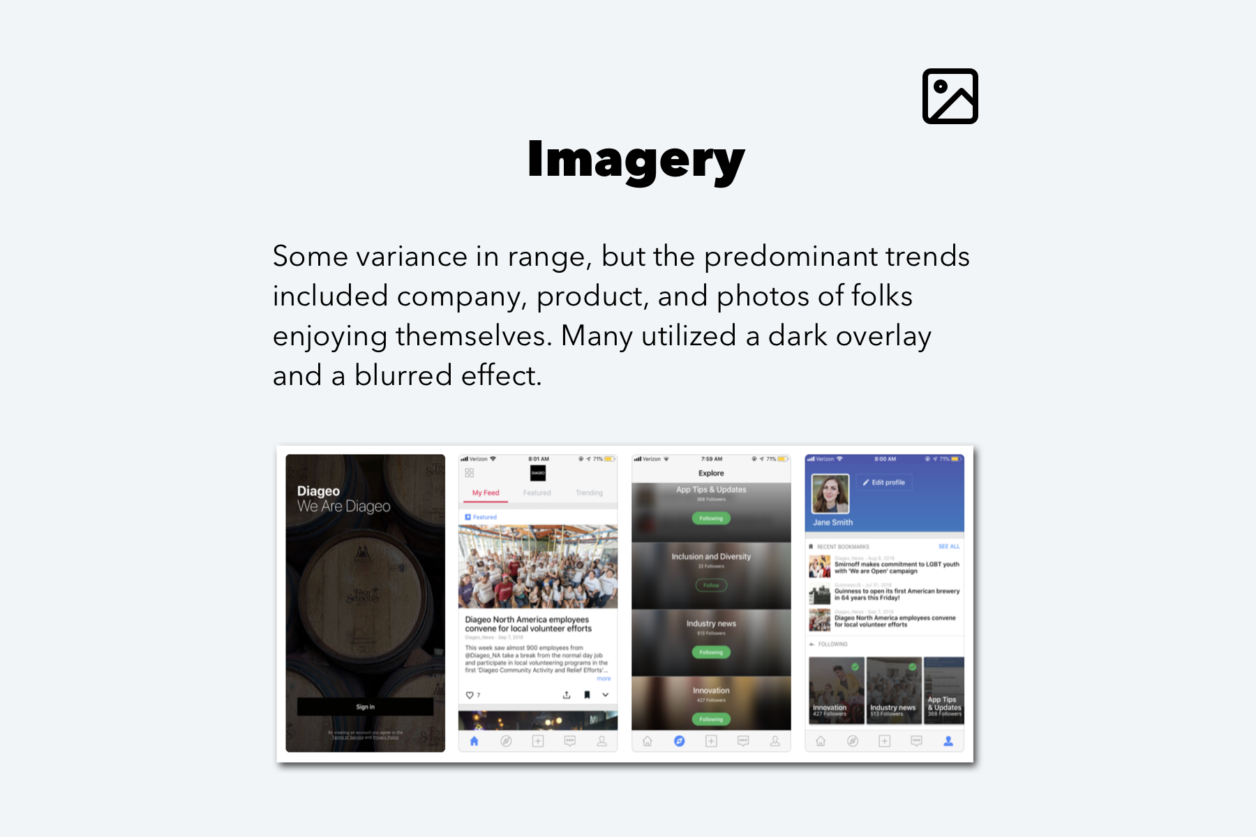
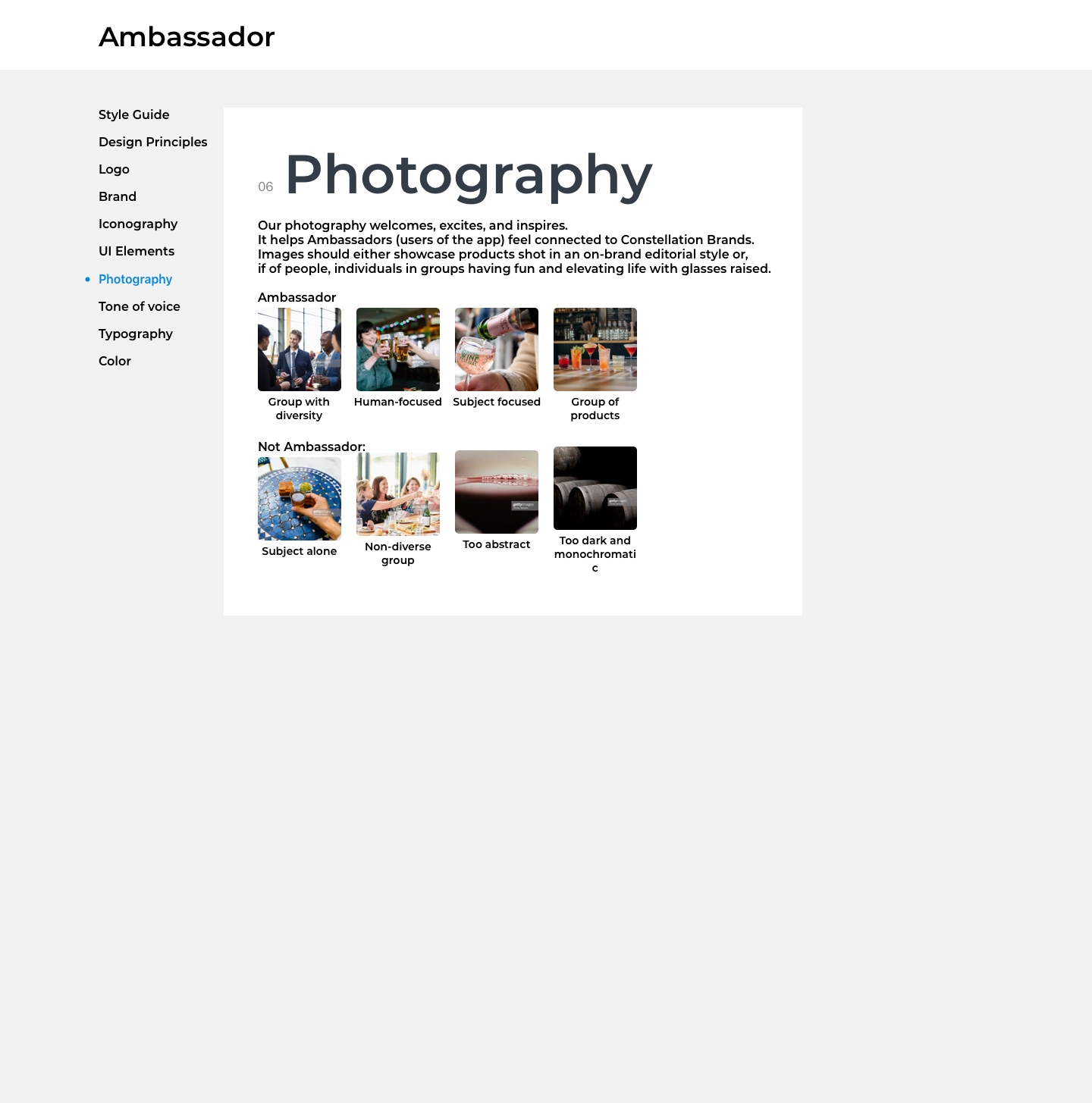
- Photos: The choice of photos could have a two-fold effect in helping CB reach their goals of increasing product awareness and employee engagement. They could enhance employees’ feeling of connectedness to their brands, helping raise product awareness. There was also an opportunity to echo CB’s ethos of “Let the good times roll” and, perhaps more interestingly, also highlight actual employees in order to foster a sense of greater connection to one another, too (employee engagement).


Exploring Style
What should it look and feel like?
We did one round of desirability testing with five CB employees. For user testing, the Nielsen model suggests that you only need to interview five users who fit your target user profile. The rationale being that testing more than five users diminishes the value of return since you will already have identified 85 percent of the problems after listening to five individuals. I tested three moodboards and three style tiles in an effort to hone in on what the tone and look and feel of the app should be. We knew that there must be a balance between professional and friendly, but at this point we didn’t know whether the proposed designs should necessarily skew one way or another.
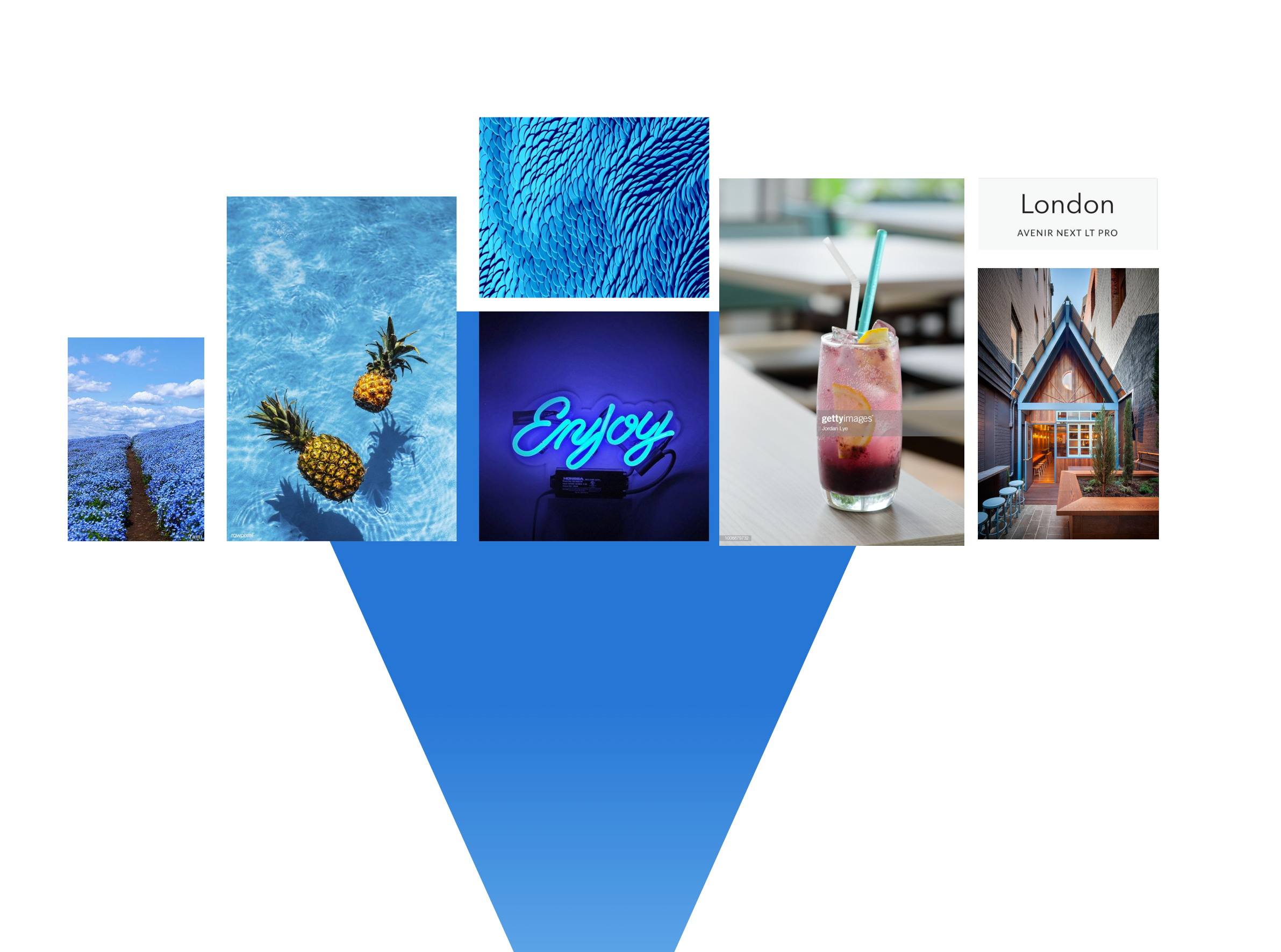
My third design direction's moodboard aimed at being friendly and inviting, with the aim of making the user feel good and relaxed. This informed the design of the style tile, which helped present an initial idea to the users and stakeholders of what the interface might look like. As users gravitated towards this moodboard and style tile, I moved forward with this aesthetic.
Moodboard
Style tile
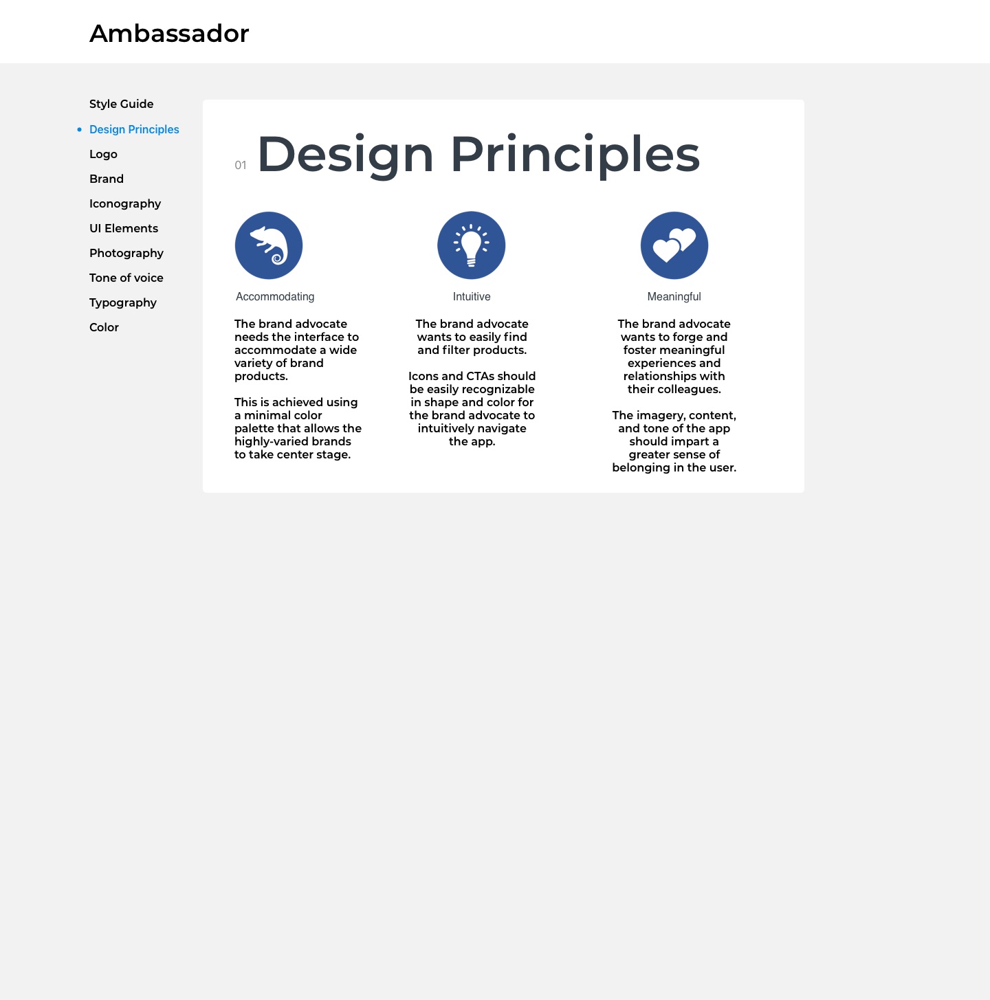
Design Principles
Let's lay down some ground rules
I’ve found that design principles really help me throughout the design process. They act as a guiding star as the design evolves, but even just the process of simply sitting down with the team and brainstorming can be incredibly insightful. As one spends more time thinking aloud and having an open conversation about the principles, the clearer the design’s overarching philosophy begins to reveal itself. This not only helps align the team, but they can also help save a bit of time.
Having a single source of truth to refer back to can really inspire trust and confidence in your designs. If you reach an impasse at any point, in referring back to them you either know you’re on the right path and should keep forging ahead or they help nudge you back onto the right path.
CLEAN AND SIMPLE
The interface should be clean, uncluttered, and simple to let all of the brands’ products shine.
EFFECTIVE HIERARCHY
To let every brand have a home through the visual hierarchy by bigger size, irregular shapes, and contrasting colors.
SENSE OF BELONGING
The imagery and language should be friendly and personable to let users feel like they’re part of the family.
Assessing the UX
UX WIREFRAMES
I reviewed multiple sets of wireframes from the several UX teams that had come before us. There were aspects from each set that looked promising, but there were also a few areas where the UX could potentially be improved.

The initial wireframes I'd received from the UX team.
To lend some credence to my hypotheses, I met with the UX teams, where I learned more about the user’s needs, frustrations, and the results of the most recent round of usability tests. I learned that users gravitated towards three things. They:
Wanted to stay up to date with new products and company-sponsored events
Needed to be able to organize and view product lists
Valued the opinions of their colleagues
Based on the results of my conversations with the UX teams and their conclusions, I chose the best individual wireframes from each group. I ended up doing a redesign of every single view, some more than others.
REFINING THE UX
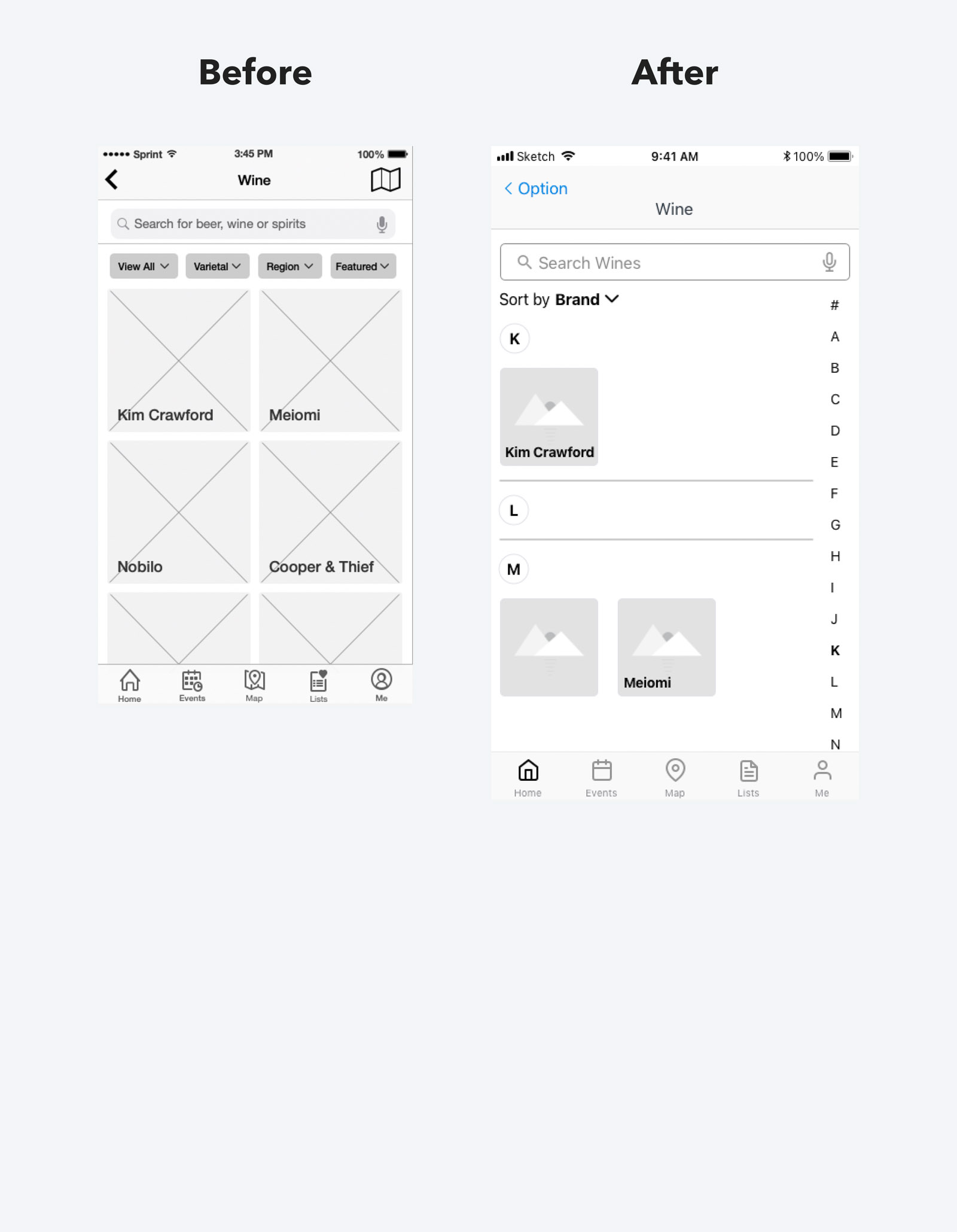
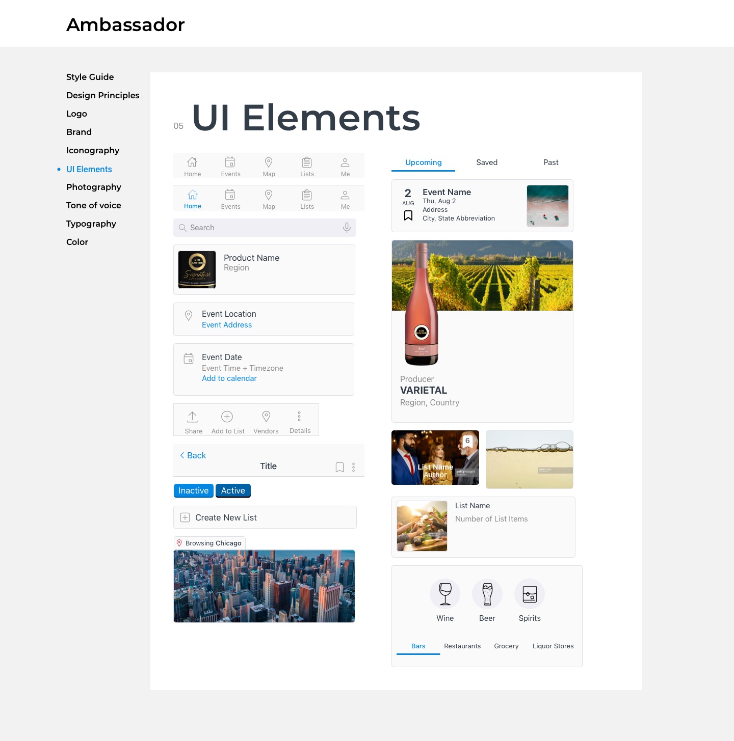
I enhanced the product discovery features by introducing a mental model from Apple Music that would already be familiar to a majority of users. This expedites the user's search process when sorting through a brand with many products, saving them the hassle of scrolling too much to locate what they're trying to find.
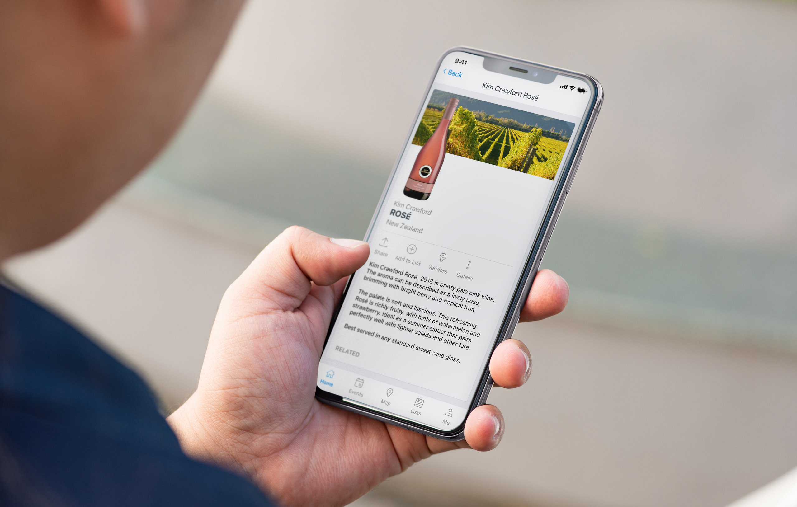
I also revised the product view by adding info that users said they needed while also cleaning things up. I accomplished this by improving the visual hierarchy and adding white space to enhance visual clarity. This helps to increase product interaction by including functionality for sharing, adding it to a list, and finding vendors that carry it.
Product disovery view.
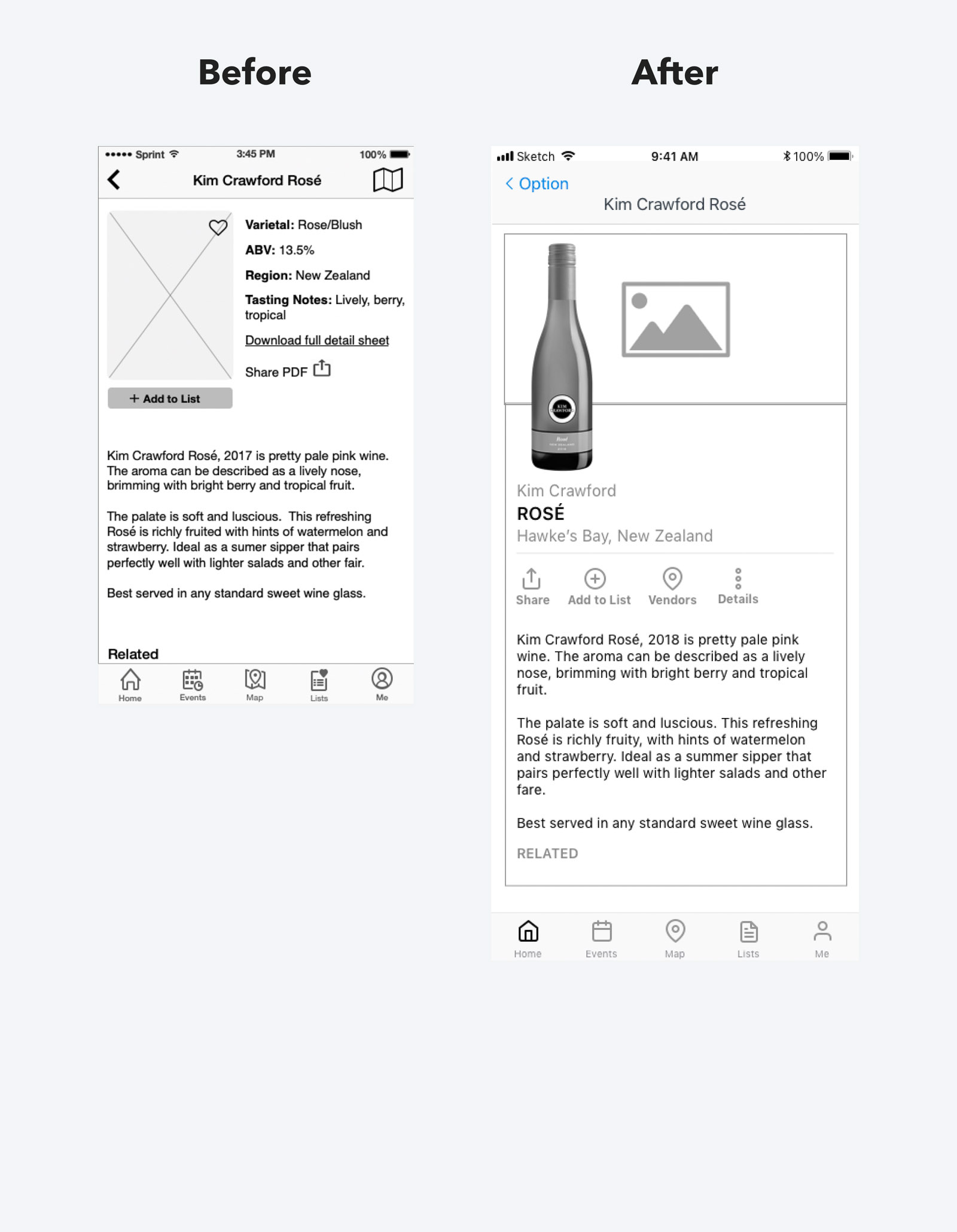
Product view
Each set of wireframes I reviewed had a different take on the map view. Here's one such example.
The original wireframes for the map view.
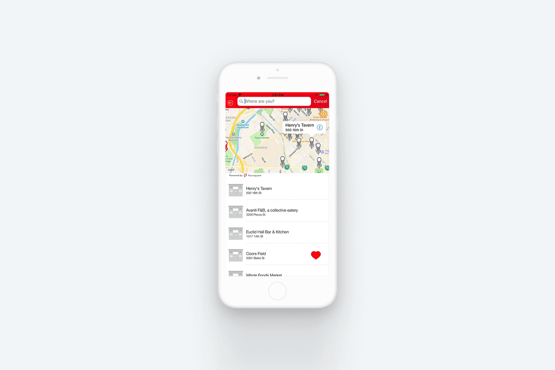
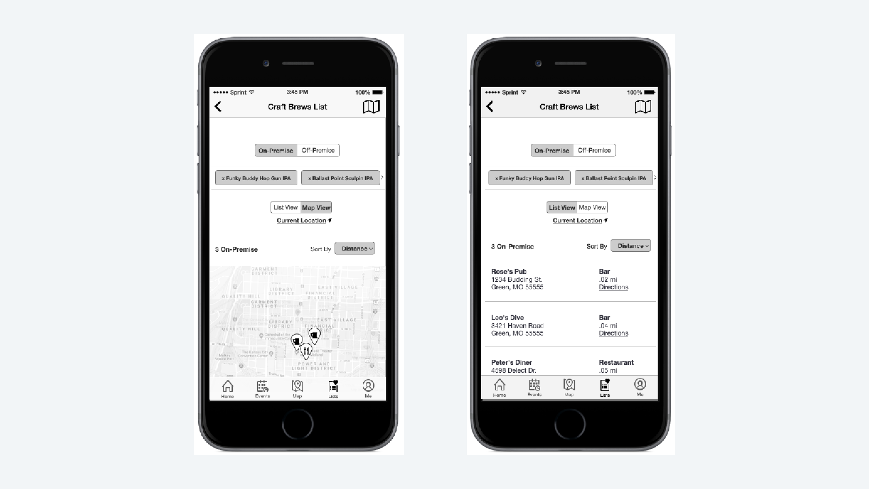
It was off to a good start, but I thought there were a few areas that could potentially be improved upon. The real estate on the top half of the page could be better utilized, potentially to open up the map more. Additionally, I learned that not all users would know the difference betwwen "on-premise" and "off-premise," so that had to go, too. Finally, I wondered if this view could be further de-cluttered, as a lot of the filters that were taking up precious real estate could potentially be collapsed and consolidated into one.
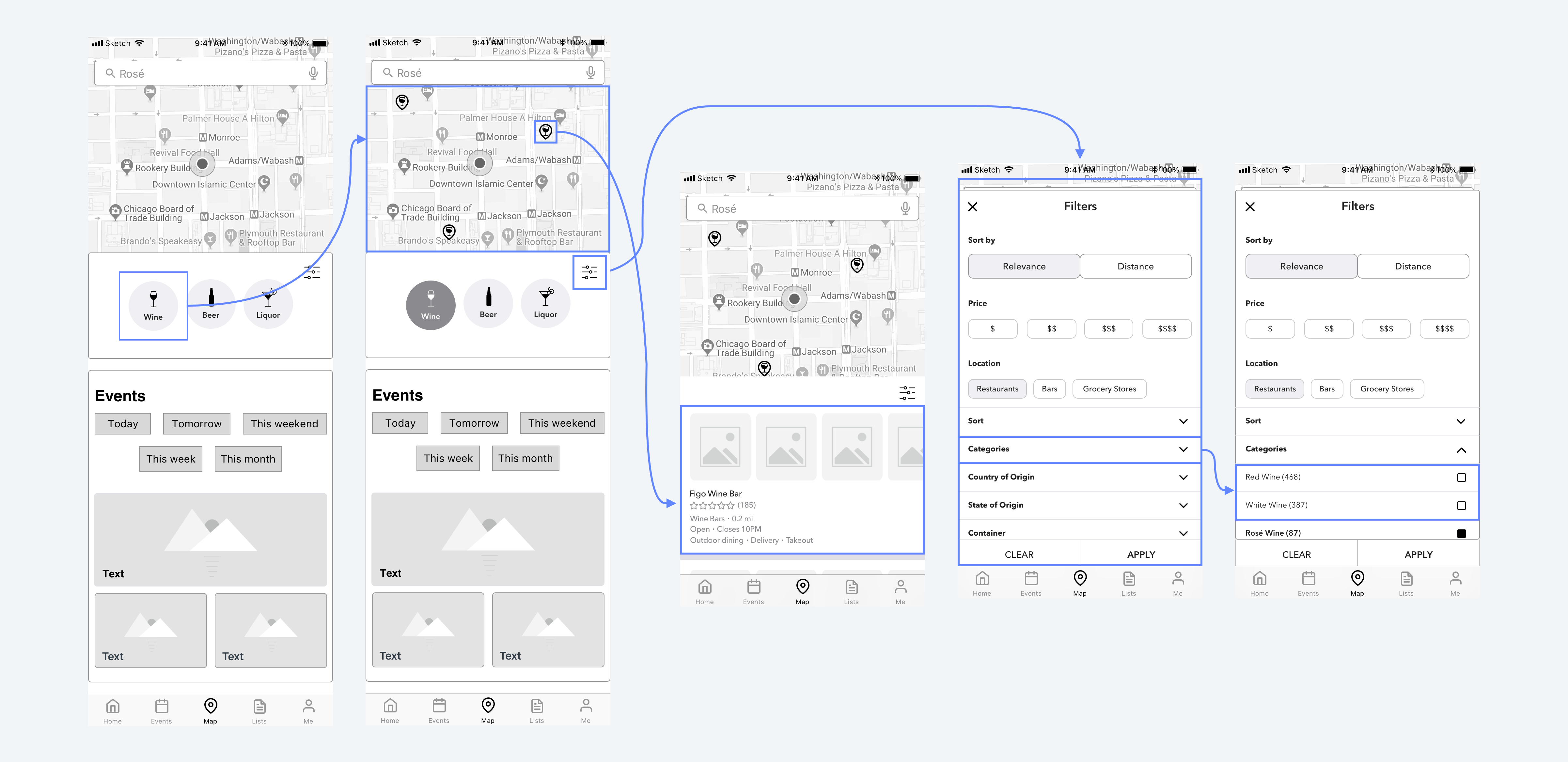
The revised map, complete with a simpler way to filter results. Users can also see what company events are going on nearby.
I gathered the best ideas for the map from each set of wireframes, and, with taking some design cues from Google's Material Design design system—the client had specifically brought up the simplicity of using Google Maps during our kickoff—synthesized it all together for the re-design. By taking design cues such as Google Maps' filters and thereby leveraging existing mental models, this resulted in helping to improve both the form and function of the map.
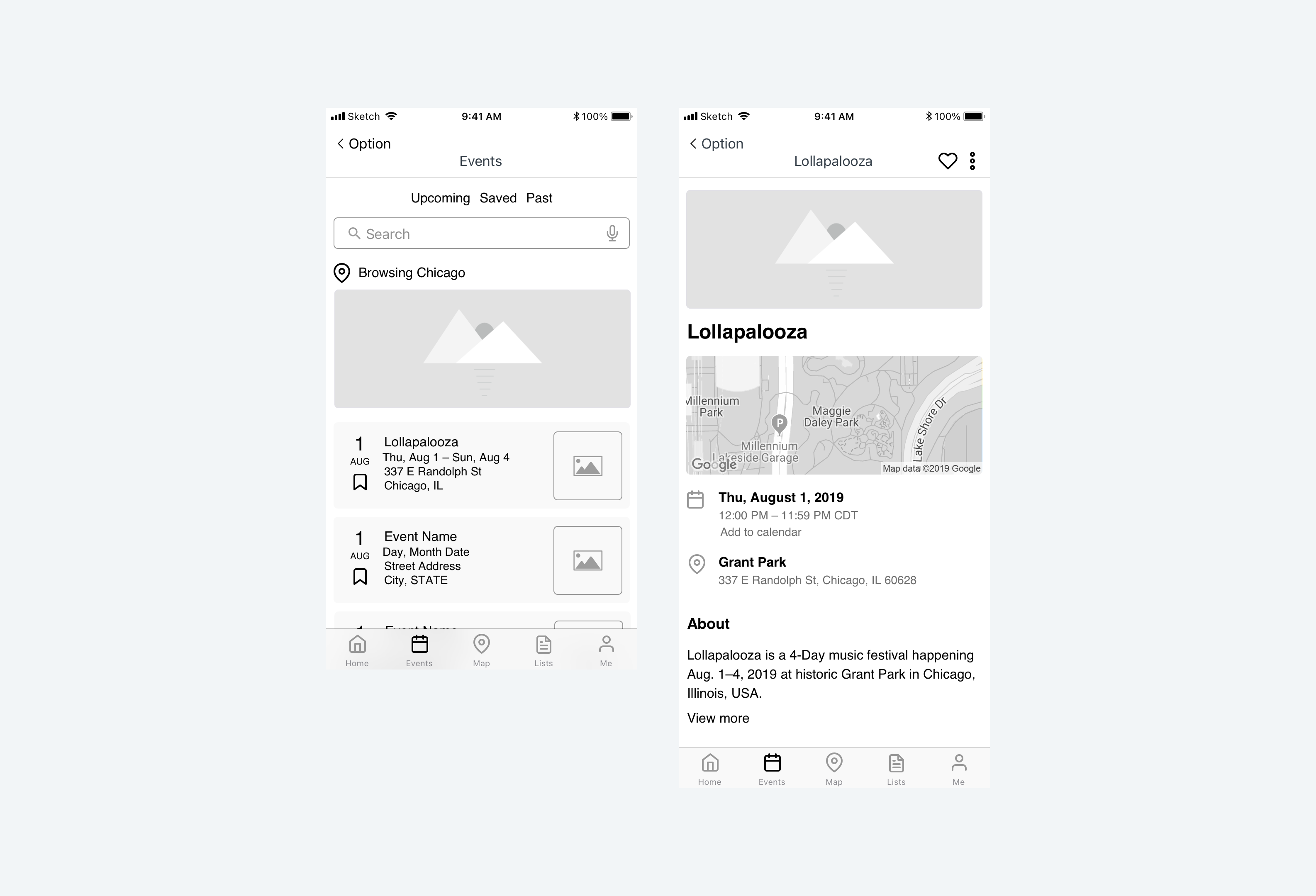
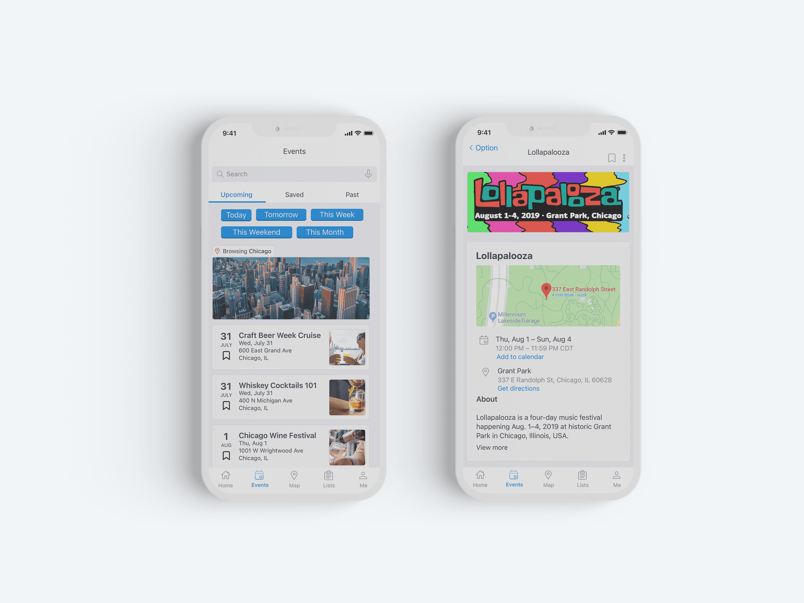
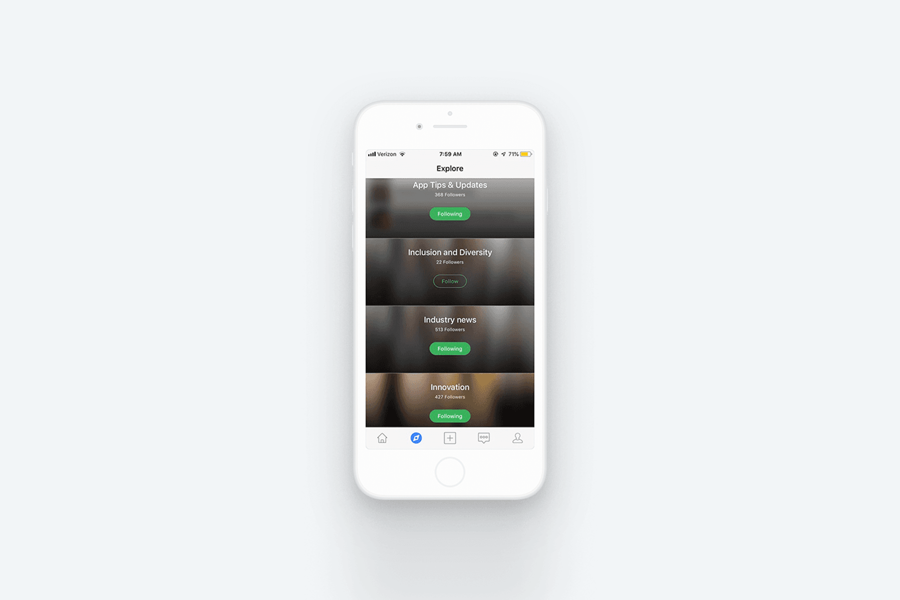
The event views: first, search results and second, the view of a selected event.
A way to locate company-sponsored events in app was lacking at this point, but it hadn't been addressed by our predecessors in any of their wireframes. As both the users and the client were interested in this feature, I brainstormed a few ideas and proposed this design.
In a normal design sprint at this stage of the game, I’d typically meet with our users to perform a usability test to get feedback on what was working, what wasn’t, and then iterate again on my proposed designs. However, as we were operating in an extremely compressed project timeline of four weeks, I didn’t have the time to do so at this stage. However, between the fact that the wireframes I was moving forward with had undergone one round of usability testing and I would be performing a usability test of my high-fidelity mockups eventually, I was okay with it.
High-fidelity Mockups and Prototype
I addressed all the issues from the initial wireframes, summed up the solutions, and moved forward to the first version of the interface’s design.
Two of the main challenges I encountered at this step of the design process were the fact that not only did the app have to live within part of Constellation Brands' existing brand, it also had to be able to accommodate many different brands, too. I carried over the friendly and inviting mood I'd developed in my style tile, paired it with Constellation Brands' blue for the theme and CTA's (Call-To-Action's), kept the content succinct and professional, and gathered images that maintained a tone that, I hoped, would balance feelings of friendliness and professionalism.
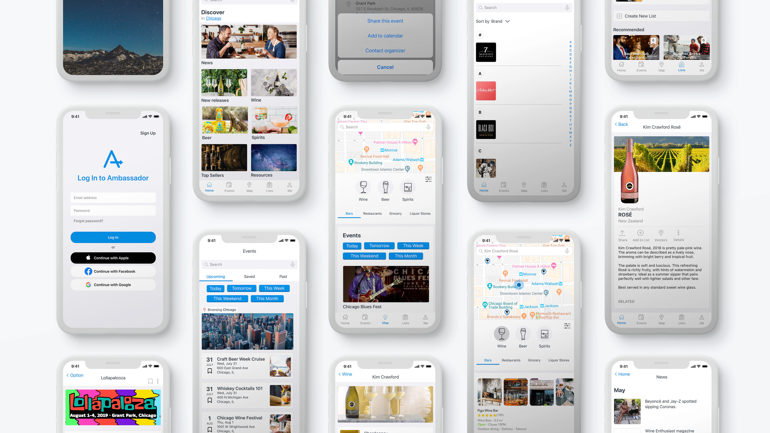
The high-fidelity prototype.
I then tested the updated wireframes with five users, including members of the sales, IT, and HR teams. They thought the flow was intuitive and, in terms of aesthetics, most of the users gravitated towards it, commenting on how it felt clean, simple, modern and professional. Everyone agreed that the use of the iTunes music library pattern (searching brands in alphabetical order) on the product page was exceptionally intuitive, fast, and easy.
The key functionality insights had to do with how users used search, as well as the map. I learned that users strongly favored having the search bar located on the key views of the app, as a majority of them preferred to use it in order to quickly locate information while navigating. It makes sense that this pattern feels very familiar to them, as many modern users’ mental models of search functionality have been greatly affected by Google.
I gained a few usability insights, too, including the fact that no one saw any value in having a “Staff Picks” category on the Discover screen (Home). Instead, they preferred categories such as “New releases,” “Wine publications,” “Influencers,” “Marketing Programs in the Area,” and “Events.” Additionally, I discovered that users gravitated towards content language that was as non-technical as possible so that employees of all departments could easily understand everything (for example, not everyone knew what a “sweet wine glass," as well as "on-premise" versus "off-premise" establishments).
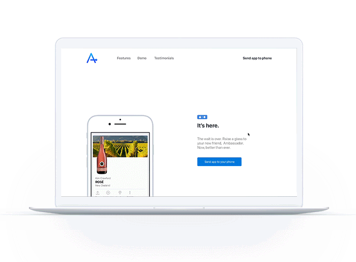
Marketing Website
If a new CB employee heard about Ambassador from a colleague and wanted to learn a little more about it before downloading it, where would they go? With this question in mind, I designed a responsive marketing website for the app. The purpose of the website was to promote the app, show what it looked like, and give a brief overview of its benefits and features.
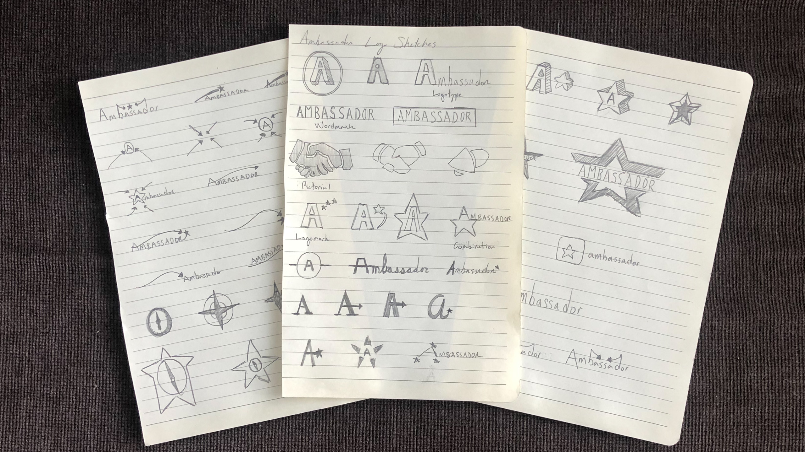
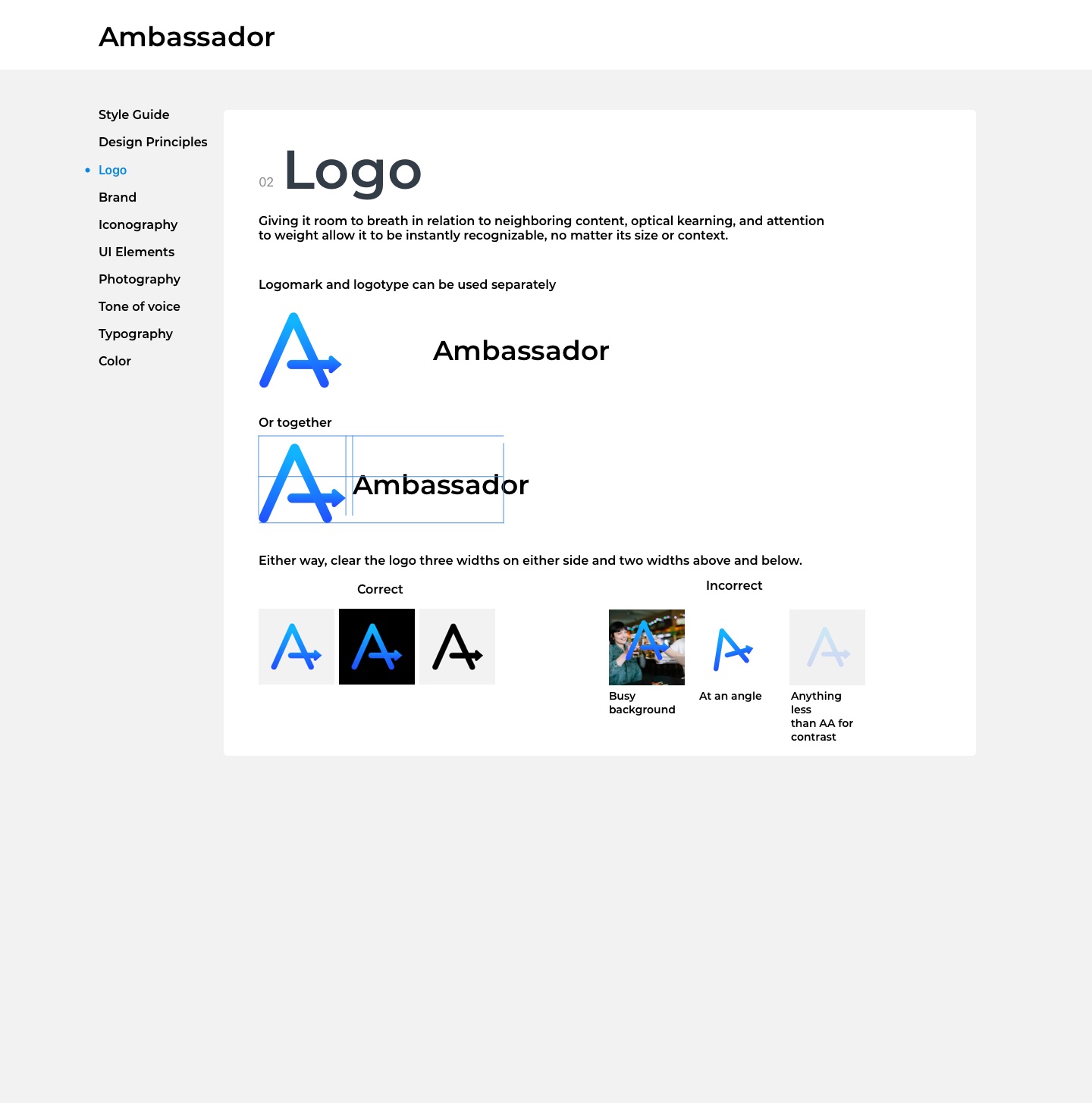
Logo Design
I brainstormed a few different concepts related to this app like fun, dynamic, and exploring. Plus, I couldn't resist the urge to somehow bring together Ambassador as a concept and the celestial overtones of the company's name— putting the 'constellation' in 'Constellation Brands.' and then translated those ideas via sketching.
I struggled to find a way of visually representing the concept of what it means to be an ambassador and all of the logos that included stars felt a bit cheesy, so I pared the logo design down and went in a direction that would more closely align with CB itself: something dynamic and exciting, eventually landing on this logo.
I explored the possibility of creating a microinteraction of the logo in Principle as well.

Normally I love creating several potential microinteractions per project as not only do they truly elevate the user's experience—it's an easy way to heighten the "Wow" factor and to inclue a healthy dose of levity where appropriate—but it's also a lot of fun. However, given the time constraint, I had to instead allocate my time to higher priority items like analyzing and refining the UX, shipping the high-fidelity mockups, and synthesizing the results of user testing.
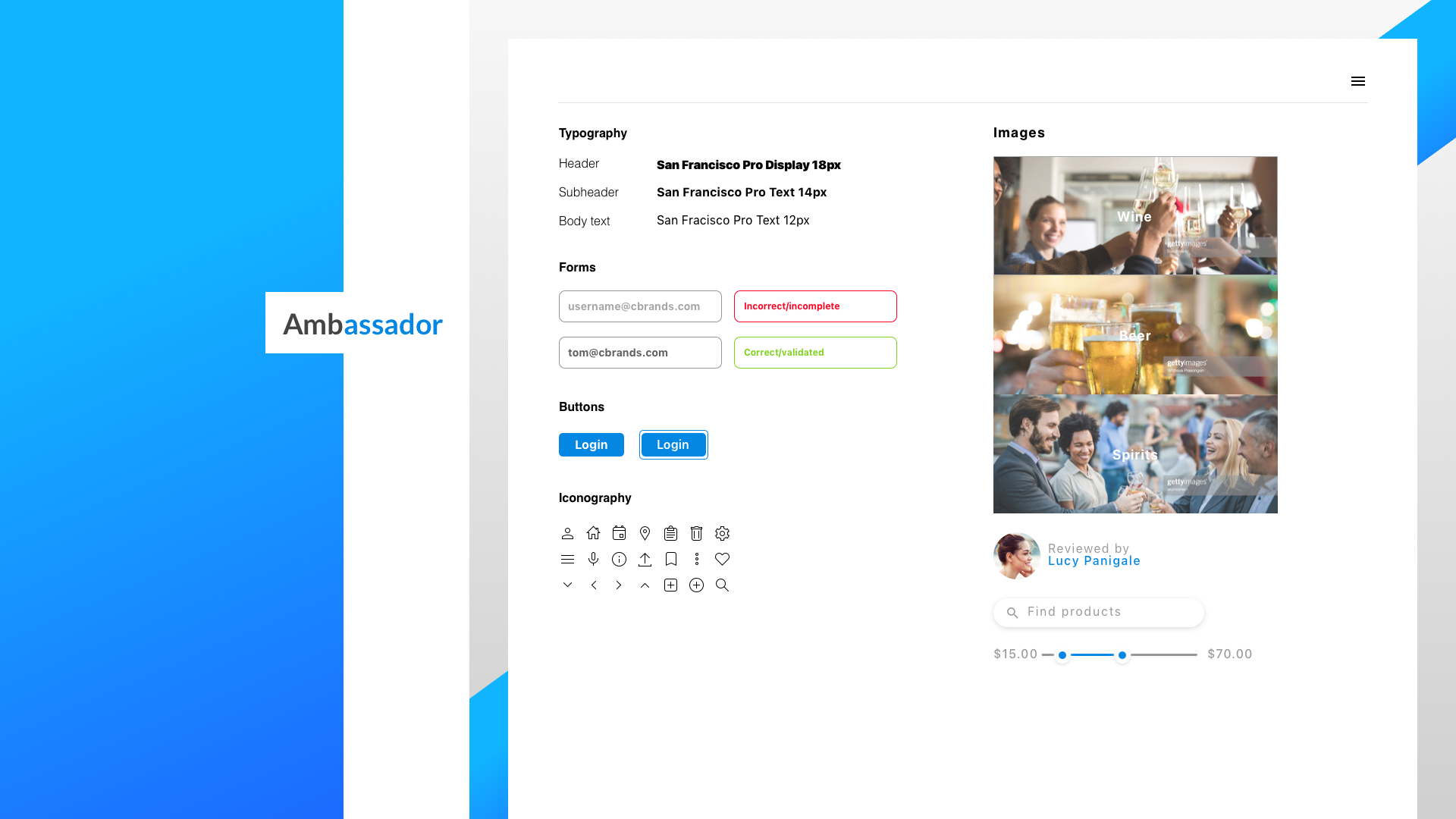
UI Kit
As I was starting with a new design for the app, this was the perfect time to starting documenting my work by starting to compose a design system for it. Design systems help make the UI consistent across all of a company's different apps and websites, fosters more effective collaboration, and creates a more unified tone of voice when communicating with customers across varying channels. Given the project's time constraints I couldn't develop this as much as I would've liked to, but this was a small step in the right direction.
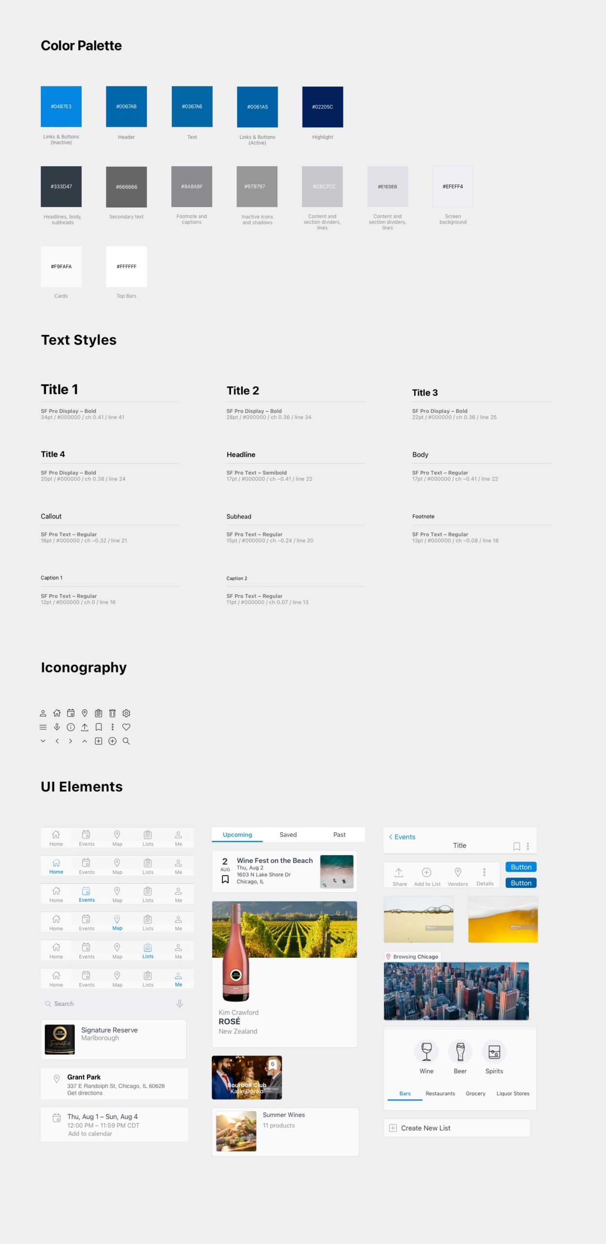
Style Guide
This helps to ensure the UI remains consistent in future iterations, no matter who's working on it. By creating this set of guidelines, things like UI elements, typography, the logo, and the content's tone of voice will be used in a consistent manner. Plus, it stands to help future designers, developers, and stakeholders communicate on the overall design.
Future Recommendations
Implementing a cocktail shaker feature could be a wonderful addition to this app. Utilizing an action-oriented input, the user would shake their phone like a cocktail shaker, which would randomize the results of their search. This microinteraction would create a novel and meaningful interaction within the app while introducing a little levity.
Closing Thoughts
Designing the UI and refining the UX of Ambassador was an adventure in firsts. It was not only the first time I worked with real stakeholders and users from a Fortune 500 company, but also the first time I could make many connection between the theoretical knowledge I’d picked up at Designation and their practical applications. I also learned a lot about myself and just how far I could go, as I found out what it was like to work for 10–12 hours a day seven days a week for over a month. The mental and physical endurance I’d accumulated over the years of training for and running marathons finally came in handy for something!
With only five weeks from project start to finish, there were a few things I had to sprint through: if I’d had another week, it would’ve been really helpful to complete another round of usability testing with my updated wireframes and further explore logos and microinteractions. However, due to the compressed timeframe, I learned just how effective time-boxing can be.
I met the goals I’d set for myself at the beginning of this project: to continue to refine my process, have a clearer idea behind the “why” of my design decisions, and embrace the MVP mentality instead of going down the perfectionism rabbit hole.
However, there’s always more room for improvement. In future projects I’ll spend more time on system-level thinking—doing lots of initial work on this front would’ve made my life easier down the road with this project. On this front, spending more time with Sketch’s symbols and text styles will be helpful in allowing me to work much more quickly as everything starts coming together and I’m iterating on my designs.
Other Projects